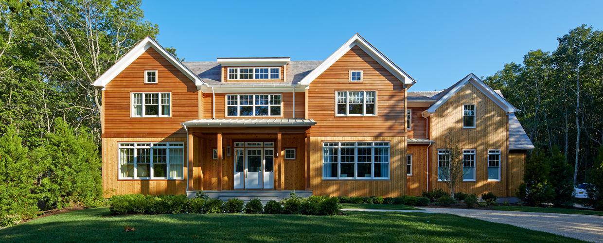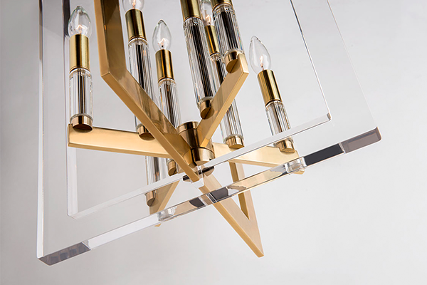
Mitzi is born in the Hudson Valley, where Hudson Valley Lighting’s design team dreams and drafts the fixtures into existence.
In the words of the great bard, Bob Dylan, “A change in the weather can be extreme.” The Hudson Valley, dear friends, has been getting hit with some pretty extreme changes in weather, between warmer temperatures and that feeling of spring in the air and blinding, burying amounts of snow. Lots and lots of snow.
Once the snow stops (and you don’t have to worry about driving in it), it’s actually beautiful but it also lacks color. The sky and the branches and the ground: white, white, white. Oh, wait! A little grey and bark so dark it looks black. Then some more white.
Times like these, color is needed.
When we stood around the drafting table and decided to bring a new brand into existence, connected to but visually distinct from its parent company, color was one of things we felt was essential. The question was how to produce fixtures with color that were up to our standards for quality, while also remaining attainable.
And now here it is! Introducing our new set of fresh, lively colors sure to enhance and brighten any space—Mint, Navy, Pink, and Marigold. (And Cream.)
MINT
A sprig of mint freshens up anything. Think of it in a highball glass with ice and a long, cool drink. Similarly, hinting a room with a hit of mint color, combined with glinting metal in finishes such as Polished Nickel and Aged Brass, is refreshing.
It wouldn’t be totally off to say it has a retro feel, yet at the same time it feels fresh, positive, and of the now. Maybe it conjures happy associations of eating mint chocolate chip ice cream cones, of summer nights, of limitless possibility.
 Blair by Mitzi
  Leigh by Mitzi
NAVY
It’s easy to imagine navy coming across stuffy or old-fashioned, yet if the many great rooms sporting the color in the past few years have proven anything, it’s that it manages to feel cool and crisp—even better when it’s paired with brass or nickel. According to Tara Mastroeni at freshome, “Blue tones evoke feelings of calmness and serenity.” A splash of calmness and serenity is a welcome addition to any space.
Navy conjures associations of “dependability, power, and authority.” All good things, to be sure, but it’s so intense that it might overwhelm tight spaces.
For example, let’s say you have a breakfast nook. Painting that nook and doing the banquette in navy might be too much. However, if you hang a pendant there with a navy blue shade, like our new Avery or Blair, it imbues just the right amount of those feelings of serenity and dependability that we all need. They could also be used to complement a navy blue base to a kitchen island.
 Avery by Mitzi
  Blair by Mitzi
  Carly by Mitzi
PINK
Pink radiates confidence, exudes feminine allure, puts a positive spin on things.
When it comes to our new pink finish, words are hard to come by. Neither entirely salmon-toned nor imbued with the hues that would make it blush, it’s a pink all its own. Something neat happens when you take an old industrial form and pop it in pink. Mixed unexpectedly with our Aged Brass finish, it becomes extra delicious, attaining an air of sophistication and glamour.
 Kiki by Mitzi
  Blair by Mitzi
  Carly by Mitzi
MARIGOLD
Keep on the sunny side of life with a fixture in our new Marigold finish. It’s a great example of the power of yellow as a pop color (which our parent company, Hudson Valley Lighting, waxed on about here.)

Like the sun breaking through the clouds, a pendant in a yellow like this has an instantaneous happy-making effect. For now, we’re only offering one Mitzi family, available as a pendant and as a sconce, in this Marigold finish: Leigh.
CREAM
Lastly, there is Cream. We know—not really a color, right?

Except it kind of is—it’s not white and it adds something to a space the way a color might, though in a more subtle way, and of course depending what colors form its immediate environment.
All we know is our cream is so luscious we want to dip a biscotti into it. And check it out next to that Aged Brass! Especially the way we included it around the bulb in Avery, giving guests something to look up to as they sit around the table, talking and laughing long into the night.