BRANDS
  • View All
BRANDS
  • View All
BRANDS
  • View All
FIND A SHOWROOM
BUY ONLINE
INSPIRATION
Products
Brands
Where to Buy
Search
Nine Questions with Becki Owens

Interview from Las Vegas Market

Eight Rooms with Bold Colors, Patterns, and Wallpapers

Unusual Ways to Use Contrasting Patterns and Bold Colors in a Variety of Rooms

Dining in High Style

Setting the Scene for a Memorable Evening

September 05, 2019
img

Dining in High Style

Setting the Scene for a Memorable Evening

September 05, 2019

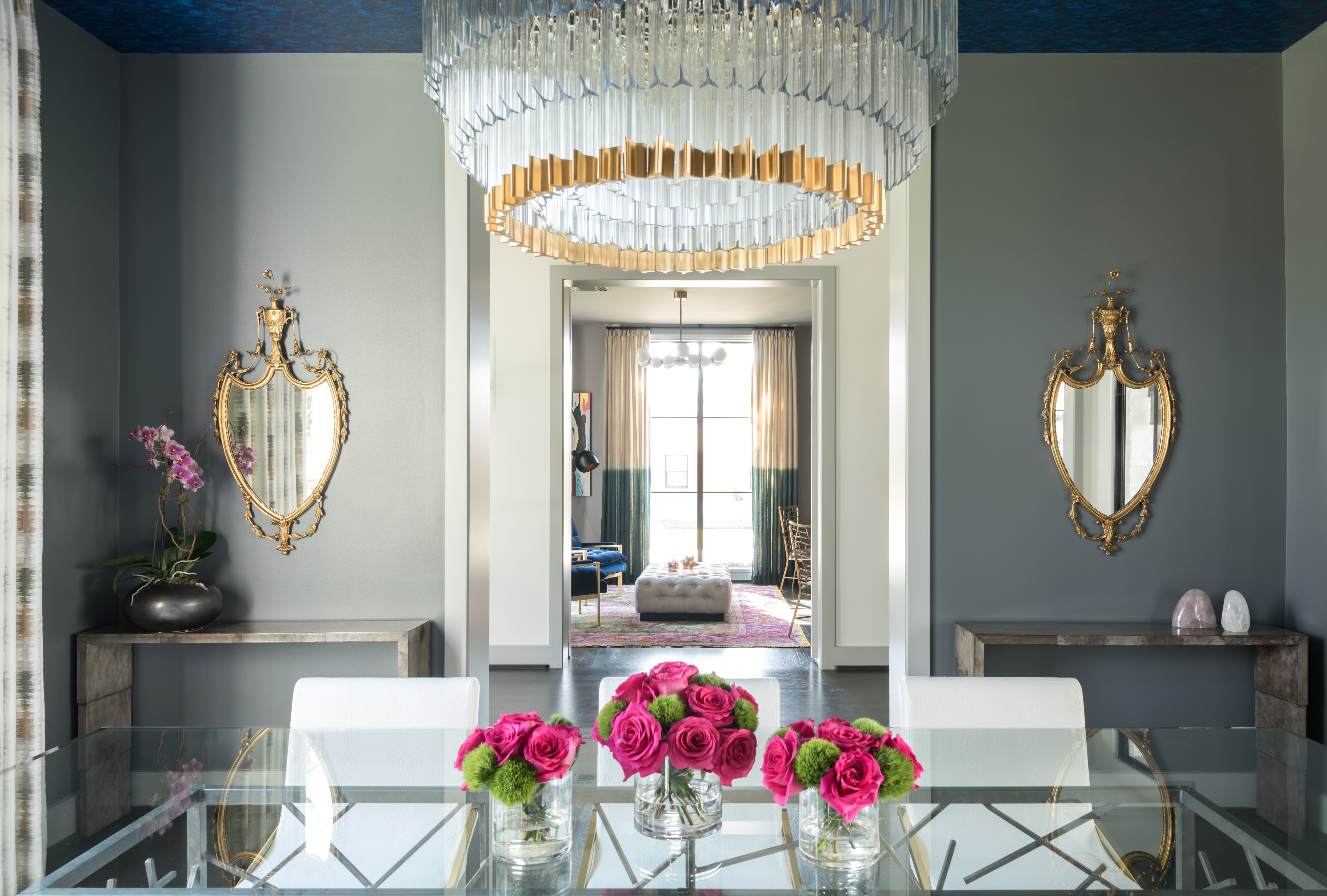
If there's one spot in the house for a dramatic, high-impact chandelier, it may just be above the dining table.

And here's why: It's the center of entertaining.

Setting out a feast for a long night of laughter and conversation to be remembered starts with setting the scene with an opulent table setting matched with dramatic and elegant lighting. 

Where a dramatic ceiling fixture may set a momentary impression in some areas, here, there's ample opportunity to consider the source of light as a work of art—its craftsmanship, texture, contrast, and thoughtful design. There is usually not much else to consider in a dining area: table, chairs, and chandelier take center stage; credenzas, sideboards, bar carts, artwork, and decorative objects play supporting roles.

Accent light will accentuate these peripheral areas as well as anything of architectural distinction, such as custom millwork. Working with candles, wall sconces and lamps will illuminate guests' faces from the front and side, putting them in the best light and making them feel relaxed. Meanwhile, task lighting illuminates a drink-mixing station or side-serving area. A dining room's lighting plan depends on its size and style, but it always includes a striking ceiling-mounted light fixture.


Design: Laura U Interior Design | Charisma by Corbett Lighting


Design: Ryan Saghian | Charisma by Corbett Lighting

Think about that old saying, "bringing out your best." That's the plates, the dishes, the cutlery, the drinking glasses—all the stuff you see when you look down. But what about when you look up? 

Guests sit below a chandelier. As the evening goes on, the chandelier brilliant but set low on a dimmer, they have opportunity to look up and admire its glittering, glistering beauty. Corbett caters to these old-fashioned but not outdated ideas of opulence and the values of hospitality. 


Design: Martha O'Hara Design | Photograph: Joyelle West | Lily by Corbett Lighting

Just because your dining room chandelier is a statement maker, doesn't mean there isn't room for other bold gestures in the space.

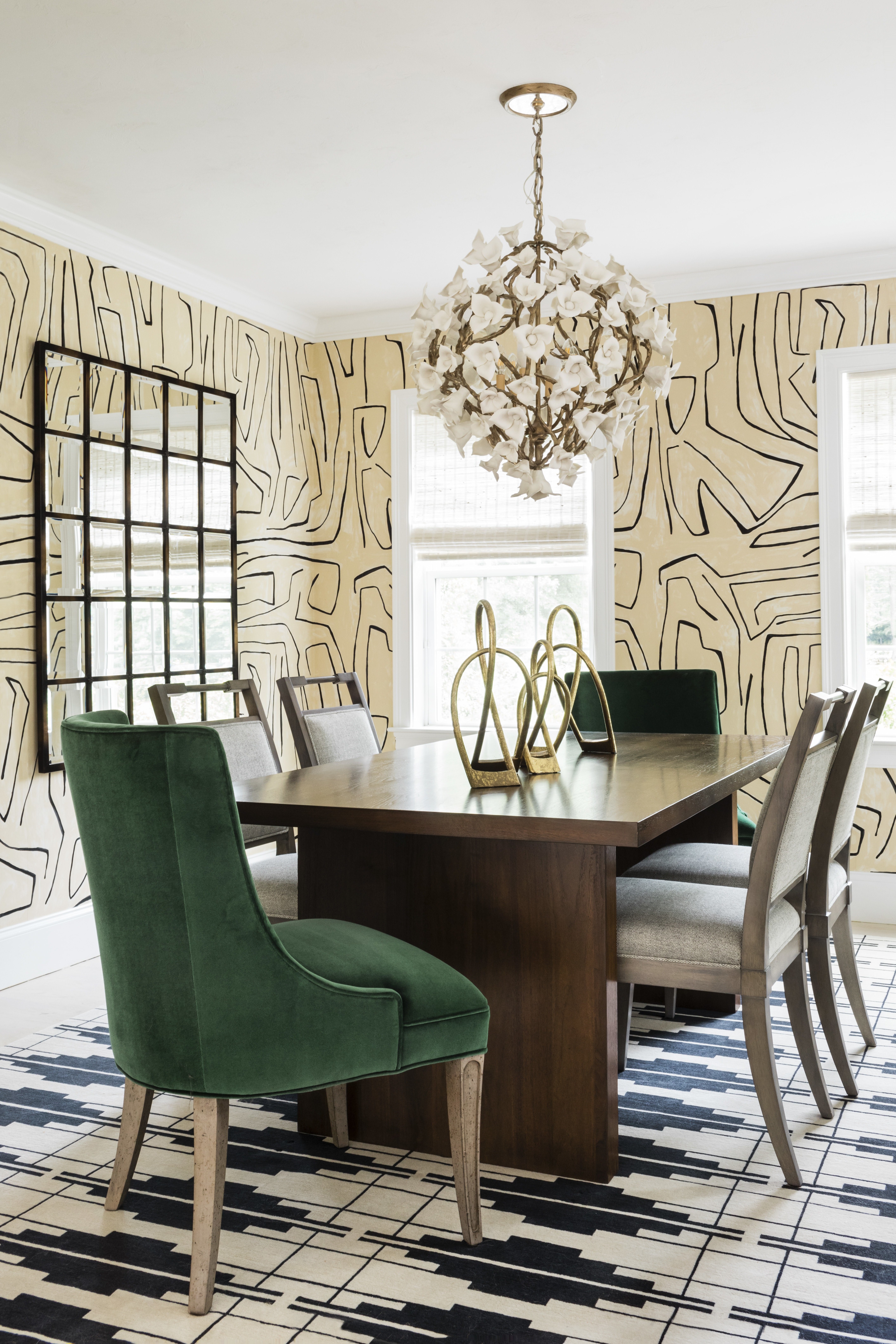
The dining areas above with Dolce and Lily show what we mean. In the latter, an amazing wallpaper's imperfect human lines are answered by a surface area rug with more regimented lines in equally strong black-and-white. Contemporary freeform expressionism on the walls  and traditional indigenous patterns on the floor support an artisanal chandelier whose handcrafted elements fall somewhere in between. Deep emerald velvet in some of the seats only serve to underscore the underlying luxury and drama overhead.

Every flower of Lily is handmade in plaster, set upon a frame of faux-bois wrought iron. This artisanal process, naturally, is pretty labor intensive, but it's the little things that count. Corbett pieces are designed base-to-canopy, and they often have layers, spaces in-between through  which you can gaze up through the fixture. Lily is no exception. Note the canopy's matching patterns and textures, completing as they complement. 


Design: Erin Melkonian | Pulse by Corbett Lighting

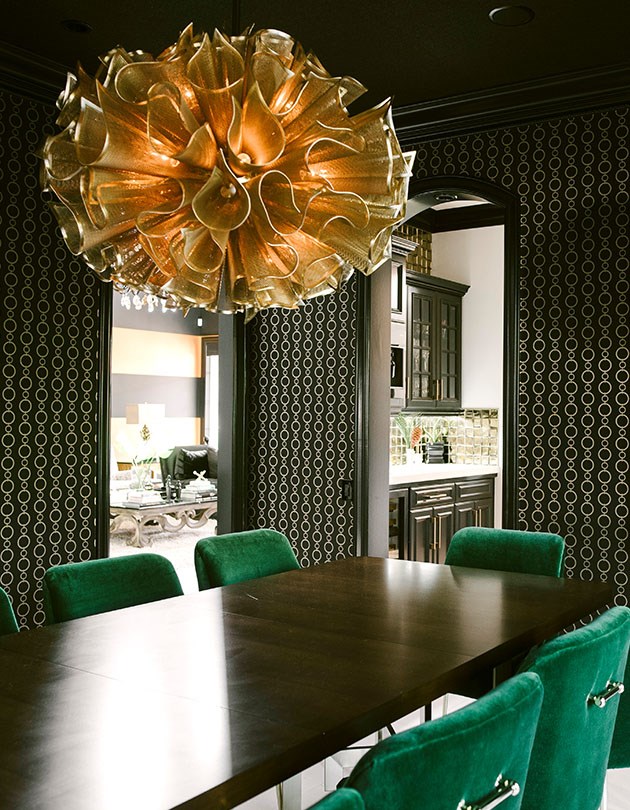
Speaking of emerald velvet, feast your eyes on the drama in this gorgeous Hollywood-Regency-inspired space. Something about this on-trend color together with velvet speaks to a fantastical sense of opulence. The gold of Pulse's finish matches the pattern in the dark wallpaper, while elsewhere, metals are mixed


Chime by Corbett Lighting

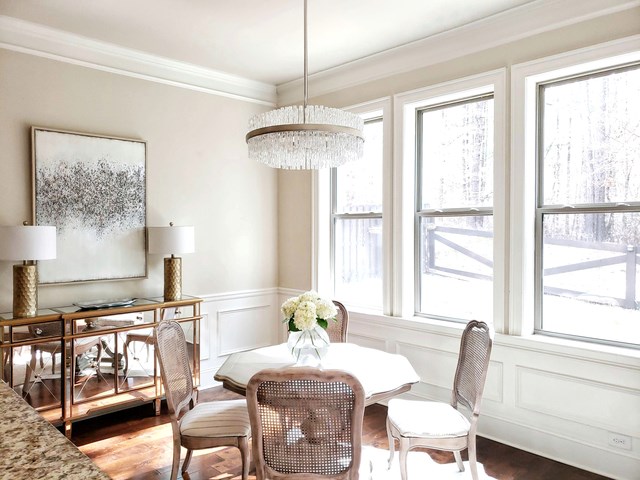
This dining room showcases how a nearby accent light situation, here courtesy of those two table lamps, adds a distinctive touch, a supporting role to the room's lead actor/leading lady. 

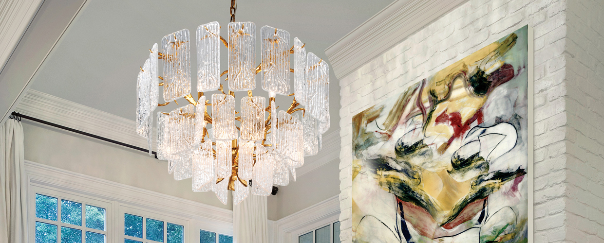
In this kind of white and wintry vibe, Chime's icy class sets the scene. Its frosty fortress of light will do the heavy lifting both from a lighting perspective and a decorative one. Intensely textural and naturally harmonious with its basic circular shape, it gives the room a central weight which defines it.  

In a setting which is essentially transitional, marked by a few traditional classics, this shows the versatility/adaptability of a piece like Chime.   


Designer: Laura U Interior Design | Carayes by Corbett Lighting


Designer: Laura U Interior Design | Carayes by Corbett Lighting

Realistically, not every dining area is going to be outfitted with every layer of lighting.

In situations like this, it's a good idea to use an overpowering chandelier, a large statement-maker. This is something that will define the space while putting out plenty of light. 

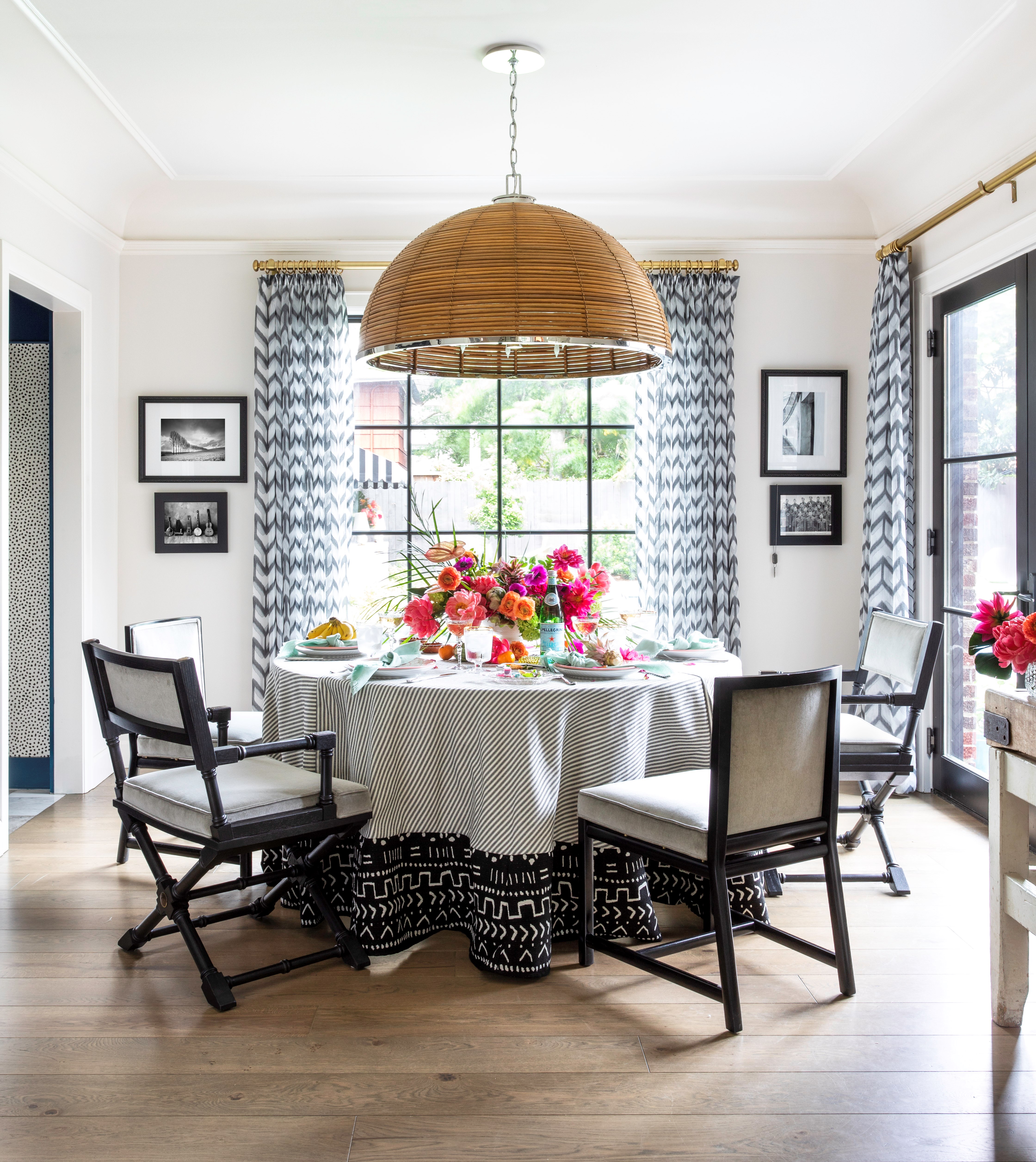
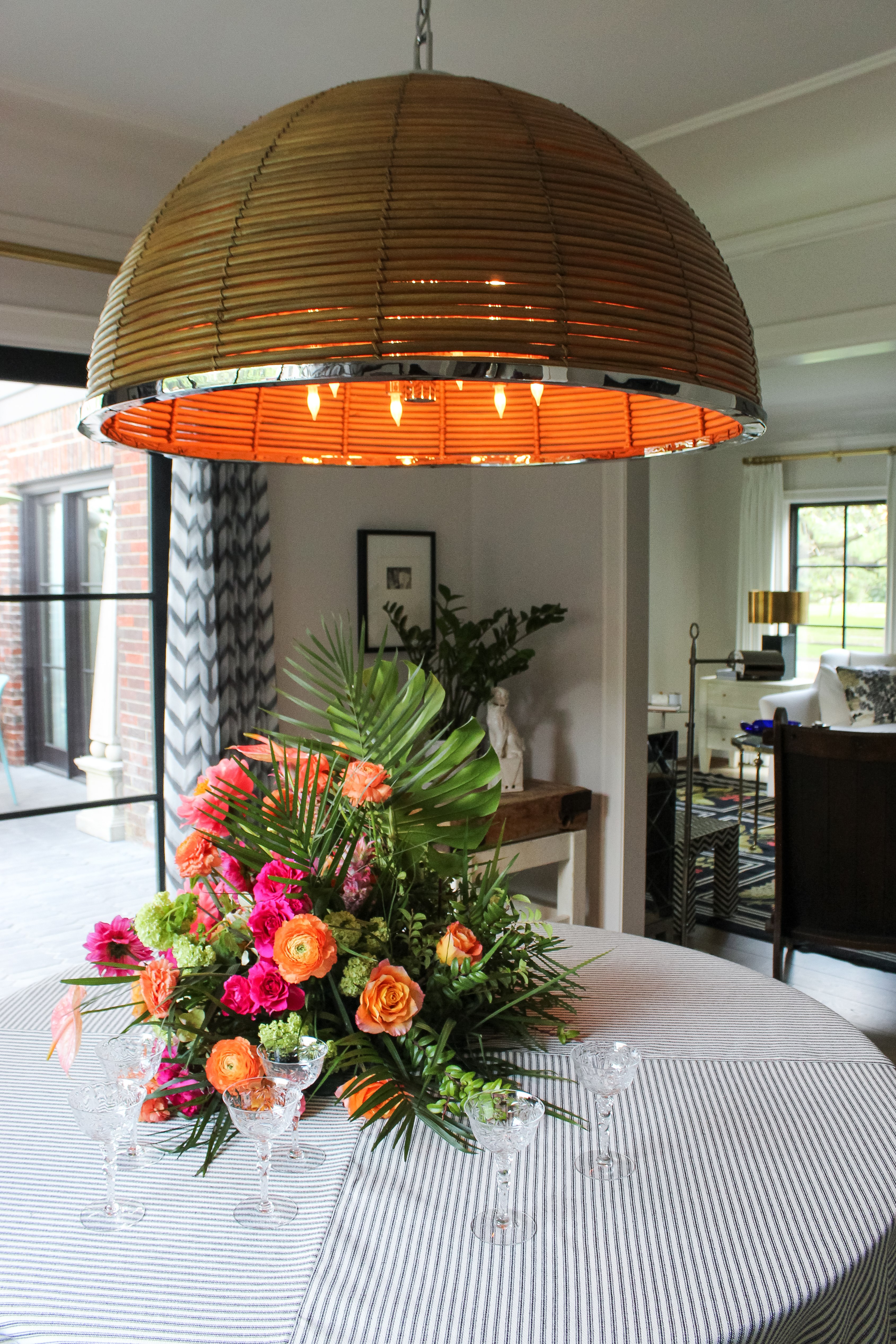
Above, Carayes from our collection with Martyn Lawrence Bullard does exactly that.

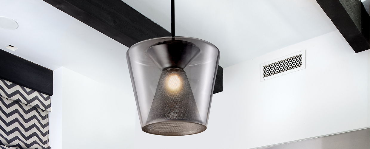
This space has plenty of other strong visual elements at play, with a black-and-white color scheme that doesn't shy away from the black, a bold chevron window treatment. Here, Carayes's rattan shade creates a great piece of natural texture and visual interest in the center of the room. Merely by occupying that much space and neutralizing the dark tones, it creates balance.

While certain guidelines exist for classical proportions in suspending light fixtures over tables, there's something to be said for leaning into the oversized for this space.


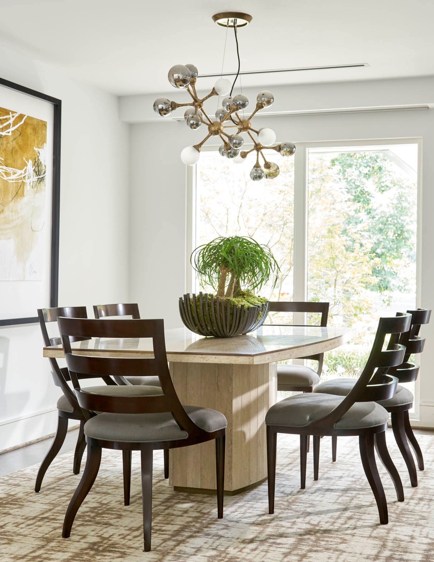
Photo: Nathan Schroder Photography | Element by Corbett Lighting

There are two basic approaches to selecting lighting. The first is to design the room and find lighting that ties in nicely. The other is to find a fixture you love, go for it, and pick out the room's other elements to complement it. With Corbett, this latter method is likely to be the approach, and the dining area is an especially relevant room to do so with.

Here, Element is at once organic and opulent, while its natural, neutral hues easily connect to a transitional color palette of easy earth tones and beiges. Its abstract tendencies are reflected in a large adjacent work of art.


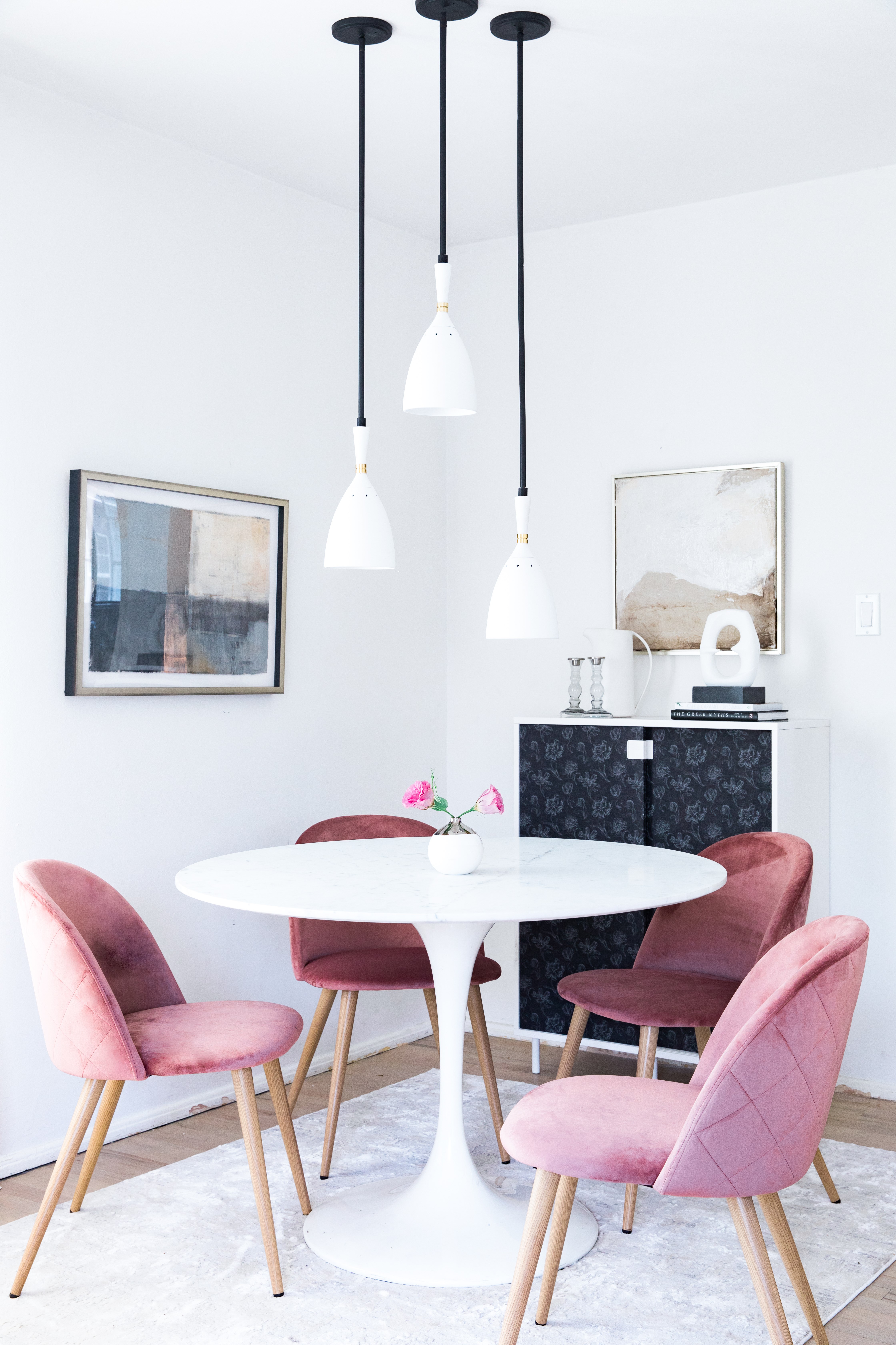
Design: Anne Sage and Caroline Lee | Utopia by Martyn Lawrence Bullard for Corbett Lighting

Some spaces, given their style and size, might be unbalanced from a large, ornate chandelier.

This more intimate and light, bright contemporary setting chooses the smart solution of three Utopia pendants. Suspended above a Saarinen Tulip table, its tulip-like shades are a perfect match. Glossy white finishes and brass accents play perfectly in light and airy contemporary spaces. These white shades are in perfect harmony with the millennial feminine vibes here.

In dining areas arranged on a more intimate scale, the staggering drama of an oversized chandelier would be uneven—the room wouldn't be able to support it. Topheavy, it would topple from a visual standpoint. The application of the three-light pendant series staggered like this gives it a more current sensibility while providing plenty of light for the main event. 

In the room below, the chandelier delivers on the "glam" part of the farmhouse glam equation. The sturdy size and heft of the wooden farmtable balances it out, and from there, it's all about accents.

In parting, here are some general guidelines—nothing written in stone. These guidelines are useful in gauging distances and sizing, without consideration to personal aesthetics.

Lighting a Dining Area

As one layer of light, a dimmable chandelier, linear light, or pendant(s) over a dining surface makes a dramatic impact on the décor and keeps guests and food lit. Consider scale and use these tips for optimal lighting.

  • Keep 36” of space between the table surface and the fixture’s lowest-hanging point, its base.
  • The fixture’s width should be no more no larger than ¾ of the table’s width.

Rectangular Tables

  • Ideal width is 6” less than all edges of the table.

Round Tables

  • Comparing diameters of the round table and the chosen fixture, aim to keep the latter’s 12-18” back from the edge of the table’s.