Hudson Valley Lighting launched its own Instagram account recently and it's been thrilling for us to see all the creative, gorgeous applications to which designers and builders are putting our lights. Behind each picture is a story and in today's post we're going to get into one of those stories.
Alyssa Colagiacomo is a young interior designer based in Toronto. After finishing interior design school, she worked for an internationally recognized designer. She decided to start her own thing in time and launched Hillsboro and Company Interiors. It was on her Instagram page where we came across a beautiful guest room she made for some lovely clients of hers. The space had formerly been the bedroom of the couple's child, now grown and off to college or a new home. These "empty nesters" decided to redo the room as well as create a great space for work and sewing in another room.
Though all the picture showed of Hudson Valley Lighting was a single wall sconce, we were intrigued. Talking on the phone with Alyssa later, we found there was much of interest in the room's transformation, especially for those of you looking to conquer small spaces or make peace with climate-based non-negotiables, such as radiators. Ms. Colagiacomo agreed to dish on some awesome pro tips and trade secrets, as well as wax philosophical on the role of an interior designer in the larger movements in the lives of clients, so you're in for a treat. Read on for the full interview and pictures of the exquisite space.

Alyssa Colagiacomo of Hillsboro and Company Interiors | Photo by Stephani Buchman Photography
Tell us a little about Toronto, the spaces and the market. What’s the architecture like? What are some common challenges the savvy interior designer takes on in your area?
There's quite a mix of architectural styles in Toronto, many of which incorporate both the old and new. While Toronto has seen an influx of tall glass condominiums being built, I'd say an old Toronto home could have characteristics of Georgian, Victorian, and Edwardian architecture. Historically influenced by the British, these style homes are still desirable, as the brick is the most economical and desirable way for keeping warm during some of our harsh winters. Many homeowners try very hard to keep the outside original details, while renovating the inside of the home.
This can lead to many challenges as a designer! Of course, taking an existing floor plan of a home on a small footprint of land and working with what you have can be exciting and challenging at the same time. Thankfully, older homes are known for their symmetry—a characteristic I find rare in newer homes. Other challenges can be smaller rooms, less bathrooms, little closet space, existing radiators to keep warm during winter, and lack of air flow that would keep the house cooler in the summer.
Your clients were empty nesters, looking to reclaim some spaces in their detached house, is that right? What were their goals for this project? How do you see redecorating as an opportunity to demarcate new chapters in life or new goals and directions? How do you see yourself in that role?
What I loved most about my clients was their young spirit and love for design. They were taking this new chapter in their life and really making it all about them, starting with making a home comfortable for them to grow old in. They worked so hard for their beautiful life, and I think coming home to a beautiful home is a very important way to celebrate. I think it's so important for any one interested in a project to bring on a decorator/designer/architect, as it not only brings fresh eyes and a second opinion, but also creative approaches and a master in the field.
I helped facilitate this project by collectively taking into account each of their needs for the two rooms in their home, while figuring out ways to make better use of the space. The featured room in this blog post is the Guest Bedroom; the other space I did was a home office and sewing room.
As we grow, our homes should, too, and I think this project gave them an opportunity to restrict what they allowed back into their home. It was a way of cleansing the old and preparing for the new.
.jpg)
The room, bare and awaiting transformation.
Did you use online tools to share ideas and inspirations for this project, things like Houzz and Pinterest and Instagram, or did you refer to tactile magazines and books?
I am constantly reading design books of the classic designers—Barbara Barry, Darryl Carter, Thomas O’Brien—the list is endless! While I love their books, I find Pinterest and Instagram really useful tools for further inspiration. The design world is really changing through these online tools, such as social media, as it's bringing designers from all over the world together with an ability to share their thoughts, inspirations, and day-to-day work. All together, it helps paint a picture of how and what inspired them to create their beautiful portfolio. I am finding that even some of these great designers' Instagram accounts have immersed the online audience into their beautiful lives, allowing an artistic appreciation of their surroundings.
We talked on the phone a little before we did this more formal interview. You shared some amazing tips on how you transformed this room and dealt with space challenges. Can you walk us through that?
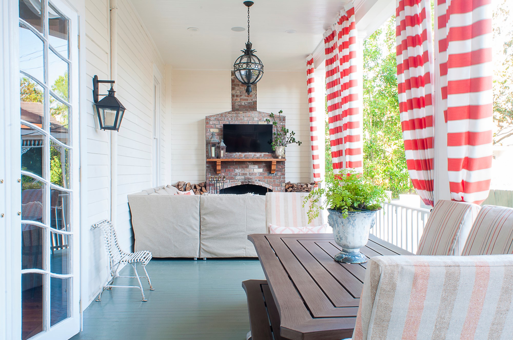
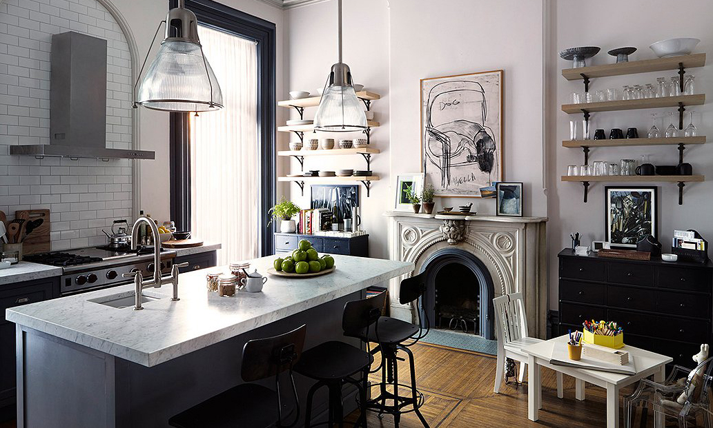
There are quite a few design tips that really helped transform the space. The room was quite small to begin with, and there was some renovating involved. I replaced the old floors with new hardwood and added simple crown moulding profile to bring more architectural details to the home.
I then had the walls, crown, and baseboards all painted the same colour, to make the room feel like a cocoon in a soothing blue. While the size of the room was small, the room had 9’ ceilings. I didn’t want to break the eye from the height of the room, so I painted the walls, crown, and baseboards all the same colour. By doing this, I was able to make the boundaries of the room disappear.
The double-rod system of drapery and sheers added further height to the room. The sheers help distribute natural light into the space, while the stunning Kravet silk drapery with black-out lining ensures a good night's rest.
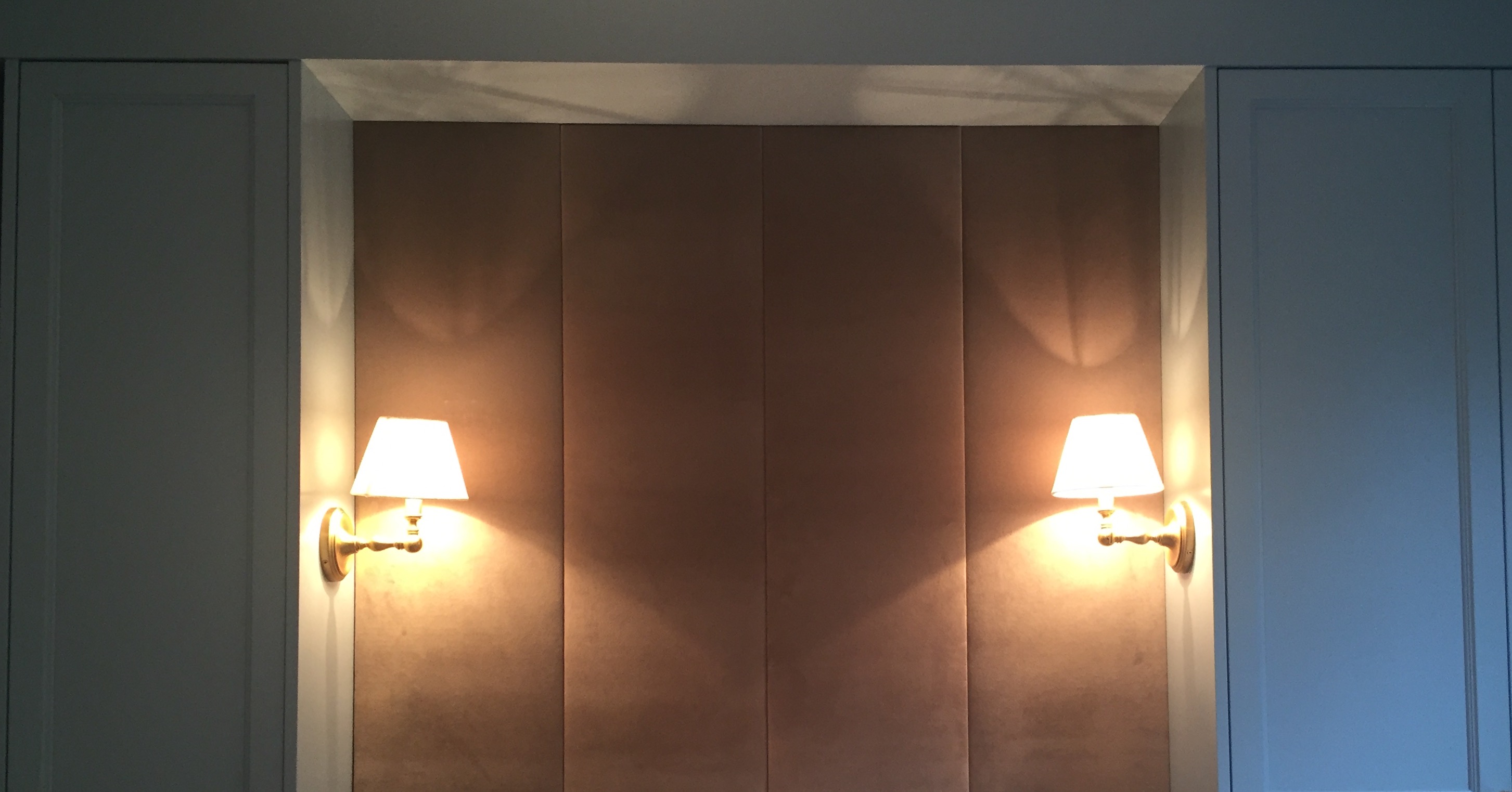
There was an existing radiator that had to be incorporated in the design. I designed a built-in for storage surrounding the bed. It included cupboard and drawer storage, and a pull-out tabletop in one of the drawers next to the bed to replace a bedside table. The radiator was spray-painted black to ‘disappear’ when looking through the grates. Radiators need yearly maintenance, so I had to make them easily accessible.
I had custom fabric panels made to act as a headboard—an actual bed would have taken up too much room.
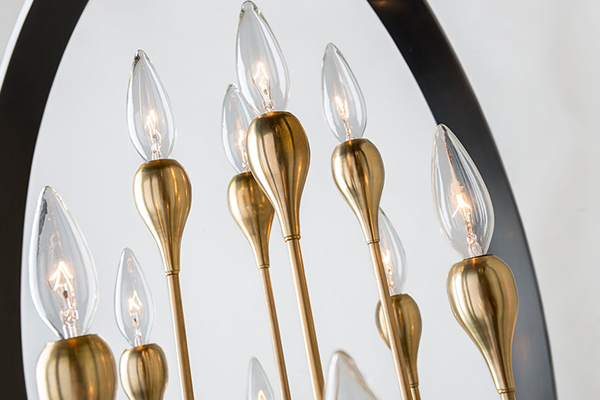
The beautiful Sidney wall sconces were installed to flank either side of the bed for bedside reading. A ceiling fan was mandatory because of poor air circulation in the summer, which didn’t offer a lot of lighting. The sconces were a perfect touch.

You found some wonderful, subtle ways to unify the design of the space through really small details. Would you please tell us more about that process and how it came about? Did your selection of Hudson Valley Lighting’s Sidney wall sconce figure into this?
One of my favourite sayings is, “Simple is not simply done”—an approach I bring to every project. I like to start off every project by meeting my clients and finding out their design aesthetic, as well as what their needs for a given space are, so I can begin to figure out how to make a space more functional for them.
These clients had very sophisticated taste and refined style, yet they were fun and young at heart in the spirit with which they approached this project.
That said, the pieces I chose for the room were well-crafted and sophisticated, yet with a contemporary flair so as not to look too stuffy.
The Sidney sconces were one of my favourite pieces in the room that helped achieve this refined-yet-fun look I was going for. The unlacquered brass from the hardware and the aged brass finish of the sconce brought the warmth to the room, contrasting nicely with the cool blues of the walls and built-ins. Another detail was how the spherical elbow of the sconce perfectly matched the Samuel Heath knobs—that elevated the custom look of the room.
Other details came into the styling that helped draw the eye around the room. For example, the hint of mulberry from the casually-thrown blanket drew the eye to the tightly-bundled fuchsia roses; the collection of brass accessories parallel to the aged brass Sidney sconce and unlacquered brass cupboard fittings.
The details are endless, but they are truly what makes the design!

The finished guest room, so inviting | Photo by Stephani Buchman Photography
If someone is looking to redo a space but can’t do it all, what are the essentials they should prioritize covering?
I always find this to be the toughest to explain to my clients, as I believe a project is most resourcefully executed when they are fully ready for the complete overhaul of the project, especially when it comes to renovating.
That said, it is always best to aim for the best quality, craftsmanship, or service available for whatever a client is ready to redo or purchase. My advice is to be honest of what is required for their space, and why they really want the item. Mixing high and low is always a combination I bring to any of my clients, no matter what the budget. For example, for a bedroom project; I would say splurging on the bedsheets is a definite must; especially because you spend a good portion of your life in bed!
One example in this project specifically, was that splurging on improving the air conditioning on the second level was not an economical option for my clients. Especially when sometimes we may only get hot summer temperatures for two months of the year. Instead, we upgraded the ceiling fan that was still well-priced, and left room for the budget to add luxurious sconces for bedside reading.

Since this sconce does not have an on-off paddle, Alyssa had a light switch installed discreetly onto the cupboard.
Is there a design trend you see emerging you’re excited about? Is there one you’re really ready to wave goodbye to?
Good question. I think one of the good design trends emerging is the focus on mixing textures, materials, and metals within the design. I’ve noticed this for the past couple of years and it seems to only be shifting stronger this way. Designers are focusing on raw, natural materials, as well as quality craftsmanship in the construction of these pieces. The rules of decorating are slowly shifting to no real rules of dos and don’ts; this is good because these rules were once limiting to the use of certain materials together. Now, previously forbidden matches are being proven to cohesively work well together.
I believe good design doesn’t date, but if there is one trend I am ready to wave goodbye to, it is theme overload; keep it understated.
Speaking of goodbye, that's the end. Thanks so much, Alyssa. Be sure to check out more of her great work at her Instagram, @hillsboroandcompanyinteriors.