We’re listening to Kate Bolick’s fascinating, inspiring memoir-manifesto / study in the self-imposed single life, Spinster, and, in addition to marvelling at its prose, pondering its many fascinating bits of history and biography and social psychology, (and stifling back tears in its more affecting moments), it also has us reflecting on the many difficulties of cohabitating.
How much do we give up when we choose to live with someone? And what do we gain?
While there are plenty of deep and abstract questions like that to explore when it comes to the subject, that's not our beat to cover. We're here to talk about an area where it gets real, where all the vague discomforts might come spilling out over a curtain rod, or an ottoman, or a shade of paint. That's right: decorating a space two (or more) people live in together.
A brief note: we tend to assume most of you reading this are women. (Well, okay, Google knows everything and it told us so). In this post, we’re going to eschew assumptions in the hope not to offend or—even worse, that default setting of today's internet user—outrage. We won't make cliché references to tattered band posters, La-Z-Boy recliners, or the color pink. Same-sex couples or cohabitating men and women, serial monogamists or married duos, either accurately represented by gender stereotypes or disserviced and vexed by them.
But before any of that, what about "gender neutral?"

The term gender-neutral may sound unexciting, but it can just as easily remind us that good design is good design, and that much of what constitutes gender is arbitrary, anyway. For example, in the above shot Ralph Lauren uses to promote their Oculus Blue paint, nothing about the room declares it unmistakably to be the residence of a man or a woman. What is clear is that whoever resides there has good taste.
As colorful and personality-stamped as the above room is, gender-neutral can swing the other way. For a couple who loves white, black, and grey, or who can't agree on a color, the below room, featuring our Lynden, is both neutral and elegant. Lynden's natural alabaster diffuser mirrors the marble below it, Are the canvas-draped chairs a shade more feminine and the café-style ones a touch more masculine? Maybe, but it seems a stretch. The room is calming and poised, and contains little to which one could strongly object.

When Tobi Fairley took on the Hamptons Designer Showhouse a couple years back, specifying Hudson Valley Lighting fixtures, she set out to create a bedroom that was at once grand and intimate, as well as balancing masculine and feminine styles. She discusses her choices in these two brief video segments.
There are a few key takeaways here. One of the first things to establish is a color palette that’s both pleasing and makes concessions to both parties. She used grey to speak to the masculine and that vibrant orange for the feminine.
Then there’s form and pattern.
The geometric grey wallpaper is the masculine, while the floral toile is the feminine. This notion of form continues to be important and intensifies with the addition of texture in the choice of furniture. The sofa’s clean hard lines and grey linen again represent the masculine, as conceptualized by Fairley (she’s using associations and thinking of a grey linen suit).
Meanwhile, there’s another seating area with curvy, feminine chairs, upholstered in playful patterns. The choice of art paired with these two sitting areas—one for the more masculine partner, one for the more feminine partner—also call upon these design principles. A work of art involving colorful flowers hangs above the feminine seating area while a modern abstract oil painting hangs above the masculine one.

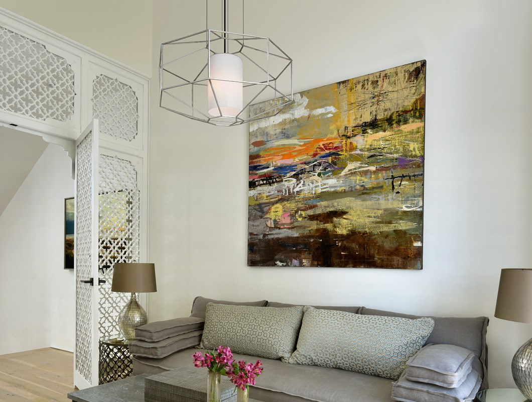
Here’s another example of how to achieve a gender-neutral balanced space that doesn’t wimp out or skimp on the drama and the glamour.
Hang a geometric, faceted fixture. Maybe something with inert, textured metal. Then, crush it by adding crushed velvet sofas, possibly in a shade of blue, such as teal.
Now, a kind of masculine-feminine balance is achieved. Complement the faceted chandelier with a similarly faceted side-table, then top it with a vase of fresh flowers. The result is a space showcasing sophistication, that feels both contemporary and gender-balanced.


The above-described room would be an example of balance, but not every room should be like this. The end result might feel too compromised. Compromise is a good thing; feeling compromised isn’t. Another approach you could pursue at the same time is that of matching & balancing styles throughout the rooms. One room where you go all out, one room where your partner goes all out.
Deciding upon who gets what room should take on several considerations. Which person is more affected by daylight or the lack of it? Which space has the most to gain from one partner’s predilection over the other’s? A small room that doesn’t get much light, for example, might be a good room for a pale color, glossy paint, or even white for the partner who likes it light. The tradeoff would be a room with more natural daylight gets a darker treatment for the partner who feels nourished by that.
If the space that’s done dark is the living room or a space that is going to be inhabited too much of the time, it can still be ameliorated by balanced touches. To return to the example just given, let’s assume the darker color chosen for the large space with generous windows is grey. Pop in brass fixtures, gold frames, a gilded Louis XIV mirror, and you’re well on your way to subtly feminizing the space. Now both parties are satisfied.


One key to making the space feel true to both of you moves beyond decorating trends and traditions. It’s the art of displaying both of your hobbies, passions, and pastimes. Maybe she has a collection of small animal figurines carved out of glass and stone. Maybe he has a collection of flies he uses fishing. Or one partner has a ton of books and the other has a rock collection. Maybe they can both be mounted to the wall, even side by side. Look for ways for color to connect things.
Or, look for pleasing juxtapositions. Maybe one partner does gravitate toward traditional masculine stuff and the other partner is drawn toward stereotypical feminine objects. Could you artfully arrange a pair of worn boxing gloves and a curvy vase of fresh flowers side by side?


Yes, kids are part of cohabitating for many people. It's okay to let people know that. Current reading & flowers at blog author's home.
So, consider: what would make the space feel like both of yours? What do they have or admire that you enjoy seeing or appreciate? Always prioritize the things you actually love to see—the things that lift your spirit.
Remember: "the most beautiful designs come from opposition."
What’s a post without bulletpoints, right? In parting, here are a few really good tips we read on similar blog posts by interior designers. Each one has the source with a link to where that piece of advice came from—we recommend these articles if this is a subject obsessing you at the moment.
- Start with a consistent color palette and stick to it. (Emily Henderson)
- Create a Pinterest Board and talk about each pin with your partner—what do they like and what don’t they want. This starts the discussion with clear communication and ideas about what to go for and what to avoid. (Lauren Conrad)
- Make a list of things that require both partners’ approval. This way, expensive, large items—maybe even non-returnable—don’t suddenly show up, bringing with them tension, wounded feelings, and even outright argument. (Melisa LeBancz-Bleasdale)
- Pass along, sell, or throw things that have strong associations to previous relationships or were purchased with a previous partner. (Comments section Apartment 46’s Houzz post)
Do you have any victory stories or—gulp—sobering cautionary tales about decorating a shared living space with a loved one? We'd love to hear them in our Comments below!
Featured Image is of Edie and Marvin Schur's Palm Beach residence, designed by Vicente Wolf, photographed by BJÖRN WALLANDER. Read AD article here.