Barcelona Pavilion, by Mies van der Rohe, 1929, one of the catalysts of brutalism.
“The movement of space has velocity, for space flows much in the manner of water from one volume to another. Especially important are the ‘connections’ between one spatial volume to another.” –Paul Rudolph, “Enigmas of Architecture”

Sketch of Barcelona Pavilion by Rudolph, figuring out how its layout allows space to flow.
Eye Toward Design: An Introduction
At Hudson Valley Lighting, we are really interested in the many periods and schools of design. Especially, we are fascinated with the rate at which problems of living were addressed by new and innovative design strategies, small and large, throughout the twentieth century. Of almost equal fascination is the lasting genius of these designs and the criticism that faces them, both at the time of their creation and many decades hence. From a better coffeepot to the ultimate lounge chair to a city within one building, we are in awe and appreciation of design’s attempts to enhance and improve life within discrete sets of limitations. With this post, we inaugurate an ongoing series that will appear once a month here of in-depth looks at schools and movements of design and architecture, as well as key figures within them. When we say “in-depth,” we really mean it. These posts will usually run twice the length or more of our longest usual posts. It is our hope you keep a tab open and come back to them as time allows, or take the plunge on your commute or at home and read them in one go. Many of the subjects we hope to take on here have entire books written on them; the present case is no exception. While we cannot hope to adequately cover an entire movement, we try to hammer down a few essential points and find something new or interesting to say about one work or creator. To begin our series, we are exploring the brutalism movement, an outgrowth of modernist architecture, because it is a matter of local interest and because it has been receiving renewed appraisal and debate.

Orange County Government Center, from the side
The Orange County Government Center & Its Architect
Is it a monster or a masterpiece? Or is it both? In Orange County, New York, where Hudson Valley Lighting is based, the Government Center in the county seat of Goshen has been a subject of much debate over the years. It is again recently, as it faces the possibilities of meeting the wrecking ball or being partially demolished with an aesthetically dissimilar addition grafted onto it, as common opinion and taste seem to be against it and it has some structural issues. However, it is also considered by many in the fields of architecture and design to be a very significant work worthy of preservation. Local authorities argue the cost-effectiveness of restoring and preserving it (67 million) versus destroying it and building a new government center in a traditional style in its place (136 million). Meanwhile, Manhattan architect Gene Kaufmann has offered to purchase the space (for 5 million) and convert it into an arts colony. At present, it seems that total demolition has been deferred, with partial demolition planned and new design and construction by Clark Patterson Lee to be integrated. The Orange Country Government Center has stood vacant for over two years, since two consecutive hurricanes introduced leaking in through some of its eighty separate rooftops and flooding in the basement. Additionally, window casements (and there are a lot of them) are rusty. It is worth noting these structural issues are not inherent in Rudolph’s design but the result of deferred and neglected maintenance, which may or may not be directly linked to the animosity that has often been hurled at the building. Meanwhile, government offices are spread throughout the county for the interim. Always divisive, unforgettable to all who behold it, Orange County’s Government Center—and the fight between preservationists from the field and local authorities fifty years later—is a quintessential example of a school of architecture off-shooting from Modernism called brutalism. As we will see, what this term actually refers to is debatable. The building’s architect, now deceased, is a genius by the name of Paul Rudolph. Revered as one of the most daring and interesting men in his field in the fifties and sixties, appearing frequently in magazines ranging from Progressive Architecture to Vogue, he was nearly forgotten by 1997, the year he died.
For those of us who grew up in Goshen, the Orange County Government Center was just a part of life, but one which often gave pause. The town is conservative and Victorian in much of its appearance. The Government Center was hence an aberration, but an undeniably interesting one. To associate such a structure with government says plenty in itself. Coverage, both local and far-reaching, of its fate has brought it up again as something worthy of longer consideration. Dovetailing neatly into this were two articles that serendipitously fell into our lap: a brief but fascinating article in Man of the World called “The Brutalist Upstairs,” about Paul Rudolph’s penthouse apartment in New York City, where he lived out his final years and experimented to the end, and this intriguing piece, “Growing Up Modern,” from 1st Dibs’ online magazine, Introspective, about one woman’s experience growing up in an apartment he designed in Manhattan and her reflections on how it may have molded her psychologically.
These two articles illuminated that Rudolph had been attempting new things with his architecture that had powerful (and not always positive) effects on people. David Mann, writing of Rudolph’s 23 Beekman Place penthouse in Man of the World, reports, “In 1975, Rudolph bought the building for $300,000 and proceeded to design a four-story addition to the top of the townhouse to use as his private residence, turning the lower four floors into rental units. The penthouse became a laboratory for his ongoing architectural and design ideas, which he would sketch as the impulse occurred and then just as quickly hand off to his builder. This design-build approach left the lasting impression that the penthouse was never finished. Indeed, Rudolph continued to work on it until his death in 1997.” Mann continues, “Guests did not always enjoy the overstimulating experience of visiting Rudolph’s home. In it he created many ‘implied spaces,’ ambiguously defined interior and exterior areas. Surfaces appear to glide past each other; gaps exist between walls, floors, and ceilings; numerous openings connect inside and out.” It gets weirder. “The extensive use of Plexiglas, polished metal, glass, and other reflective surfaces make it difficult to tell where rooms begin and end. It was noted that at parties one would frequently hear the sound of breaking glass, as guests would misunderstood where a surface was and put down a drink, only to watch it fall to a distant floor below. One woman fainted and was removed by a stretcher. Another guest found himself out on the ‘bird walk’ (an exterior cantilevered perch with a wire mesh floor), where he was ‘never so scared in all his life.’”* Before Mann calls for the space, which has been preserved by the New York Landmarks Preservation Commission and is now for sale, to be purchased and open to the public like Mies van der Rohe’s Farnsworth House and Philip Johnson’s Glass House at the end of his article, he points out yet one more fantastical element : “Perhaps the most unnerving feature in his home is the internal penthouse elevator, composed of Plexiglas walls, floors, and ceiling.” (Charlie and the Great Glass Elevator, anyone?) In bestowing permanence on 23 Beekman, chairman Tierney stated its “juxtaposition of modern and traditional forms creates a dialogue between the old and the new, and makes this building one of the most provocative landmarks in New York City.”

23 Beekman Interior Shot
This mind-altering design is not unique to his private residence. In “Growing Up Modern,” Peggy Edersheim Kalb notes of the Rudolph-designed apartment she and her parents moved to when she was eight: “The same oatmeal-colored, low-pile carpeting that covered the floors extended to the walls, which Rudolph gently curved (no right angles), and he had many of the custom furnishings built in and upholstered in a soft velour or made of white Formica. The apartment was both very designed and very practical — except that someone had to regularly vacuum the walls. Indeed, there was a uniformity that visitors loved, but that I, at least initially, found extremely disorienting.”

From "Growing Up Modern," on Introspective. Kalb's apartment, designed by Rudolph.
These odd details from his later New York experiments and private apartments are less emphasized in his public spaces. Here, he genuinely gave thought to people and architectural design’s effect on building community. The moment he decisively transformed from a man with a lot of talent and potential to one of the most important architects of his age was when, after teaching at Yale for a few years, Rudolph designed and built the Art & Architecture Building for the college, a monumental powerhouse in which he set forth to exemplify all his beliefs about architecture and its potential in that historical moment. This was the debut of his signature bush-hammered corrugated concrete usage for both exterior and interior. It was built to consider and complement the architectural variety of the street on which it is placed. As Timothy M. Rohan writes in The Architecture of Paul Rudolph (Yale University Press, 2014) at the beginning of his entire chapter on the building, “Few architectural events in the postwar United States were as eagerly awaited as the completion of Rudolph’s Art & Architecture Building at Yale University (1958-63).” Considered a milestone worthy of much attention and reviewed mostly positively when it was finished in 1963, it was perceived by radical students by the end of the decade as a representation of authority and “the man,” the opposite of its intended autonomy and self-expression. In 1969, “a calamitous, mysterious fire … gutted the building, reduc[ing] him to traumatized silence,” Rohan writes. He continues, “It was widely rumored that students had set the fire as a protest against Rudolph’s type of architecture and Establishment values it represented. Though he had left Yale before the conflagration to pursue his own practice, notoriety from the incident clung to him afterward just as the odor of smoke would permeate the building for decades to come.” Architectural critic Robert Campbell, on recently revisiting the restored Art & Architecture Building—now named Rudolph Hall after its architect—on Yale Campus, writes, “Seeing the building again, I'm struck by its success as a social arena. Rudolph understood how to create a world that brings people together. His interior is concentric. Each major floor has a big space in the middle, often two stories high, which is ringed by studios and offices at various levels. These central spaces are the equivalent of a city's public squares: People emerge from their private quarters to meet and mix as citizens of the school.” The Orange County Government Center demonstrates these same design principles, as balconies and stairs vault above and cascade around large open spaces for people to mingle. The pictures below demonstrate this.


While 23 Beekman has been put on the NYC Landmarks list for preservation, and the Government Center is arguably and tentatively safe for now, so many of Rudolph’s buildings have faced destruction that one person, Chris Bottalini, took it upon himself to travel to some of the ones still left but slated for demolition and document them. The result is a book called After You Left / They Took It Apart. His focus is mostly the experimental and fun vacation homes around Sarasota, Florida on which Rudolph first made his name. It was the virtuosity in design and innovation in materials employed that earned Rudolph the reputation of a maverick and much admiration. Rudolph’s work, however, is not unique in the wider context of brutalism in being constantly threatened with annihilation. After a long battle, Chicago’s Prentice Women’s Hospital just went the way of the dodo. And there are many more like it.
The Critics: What’s in a Name
Often, the name of a theory or subculture or school comes not from the scientists or artists who created them, but its initial detractors and critics. One might reasonably suspect the unflattering name “brutalism” would be an example of this phenomenon, but its origins are linked to the French name, béton brut, for its primary medium, raw concrete. Initially a neutral term appropriated by some architects making buildings in the style, over time it became a pejorative. Concrete, a substance not praised for its beauty, is the favored material in brutalist construction and in many of Rudolph’s signature buildings. Concrete was chosen at first, in the buildings that got the movement started, because it was cheaper than steel while still dependable for the massive structures it would be used to create. This was right after the second World War ended; Great Britain and France needed much rebuilding and they needed it quickly, efficiently, safely, and cheaply. Displaced people needed to be rehoused. Robert Campbell, an architecture critic who is sympathetic to Rudolph, writes of his use of concrete: “The Service Center and UMass-Dartmouth are both fashioned out of a material the architect invented [Rohan disputes his invention]. Rudolph made the walls by having concrete poured into molds that gave them a vertically ribbed surface, like corduroy. He would then have the construction crew attack the walls with hammers, in order to break chips off the ribs so as to roughen them. The result is an architecture so aggressive that people often feel nervous about even touching it.”

Corduroy concrete is not for everybody. Initially chosen for pragmatic reasons, the designs chose to accentuate possible aesthetic ones inherent in the medium. Le Corbusier, in France, made several deeply impressive buildings in raw concrete. These works, both intensely aesthetic and motivated by a real ethic, were catalysts to brutalist architects. Rudolph loved concrete, especially when textured in his ribbed and hammered way. Rohan reports, “Corrugated concrete [as Rudolph preferred to call it] represented the end product of Rudolph’s years of investigation into how to produce complex, shifting patterns of light and shadow and give texture and depth to the surfaces of his buildings.” To Le Corbusier, to Louis Kahn, and to Rudolph, these patterns and slants of light moving through a space were of primary importance. However, many people feel that concrete is a depressing substance to look at and work in, and many brutalist buildings are for public use; some of the most famous examples are libraries, hospitals, academic campus buildings, government centers, and national theaters. Architectural critic Vincent Scully took Rudolph to task on this in his review of the Art & Architecture Building. As quoted in Rohan’s The Architecture of Paul Rudolph: “the slotted and bashed surface is one of the most inhospitable, indeed physically dangerous, ever devised by man. Brushing against it can induce injuries roughly comparable, one supposes, to those suffered in keelhauling. The building repels touch; it hurts you if you try.”** Scully put this aspect of Rudolph’s work perhaps a bit more gently on a separate occasion, stating that his buildings of the sixties, “a will towards sculptural body sometimes puts demands upon the individual user which not every psyche will be able to meet.” Rohan notes that “The signature corrugated concrete was quickly imitated internationally.” By the eighties, this concrete and other aspects of brutalism popularized by Rudolph had come to represent many things wrong with government and society to enough people that in Terry Gilliam’s classic film Brazil, brutalist architecture and design convey much of the movie’s message and menace, implying a monumental government force that beats the average man into submission through byzantine bureaucracy, crushing out his romantic spirit and forcing him to live a separate life through his imagination.***

Courtroom in Orange County Government Center
It’s been speculated that the movement’s very name perpetuates its negative perception. Vanessa Quirk, reviewing Clog’s brutalism book of essays for ArchDaily, writes: “Another stand-out of CLOG: brutalism is Michael Kubo, Chris Grimley and Mark Pasnik’s brilliant articles ‘BRUTAL’/’HEROIC,’ which also contend that the bane of brutalism’s existence is its name, which helped to reduce the movement from a philosophical expression to a ‘stylistic label’ – and a pernicious one at that: ‘Originally seen to reflect the democratic attributes of a powerful civic expression—authenticity, honesty, directness, strength—the forceful nature of brutalist aesthetics eventually came to signify precisely the opposite: hostility, coldness, inhumanity.[...] Separated from its original context and reduced in meaning, Brutalism became an all-too-easy pejorative, a term that suggests these buildings were designed with bad intentions’ (166).”
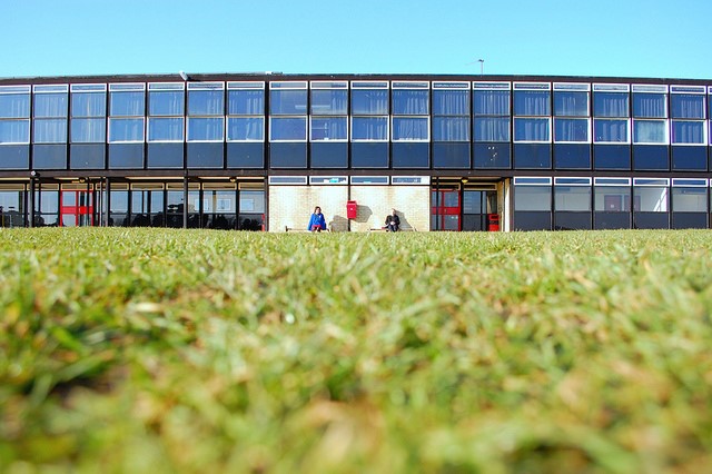
Initially called “The New Brutalism,” British idealist architects Peter and Alison Smithson constructed the first building earning the appellation in their Hunstanton School; it was the prestigious architectural critic Reyner Banham who coined the term along with them in Architectural Review 1955, where he wrote of the building:
“[I]t is almost unique among modern buildings in being made of what it appears to be made of. Whatever has been said about honest use of materials, most modern buildings appear to be made of whitewash or patent glazing, even when they are made of concrete or steel. Hunstanton appears to be made of glass, brick, steel and concrete, and is in fact made of glass, brick, steel and concrete. Water and electricity do not come out of unexplained holes in the wall, but are delivered to the point of use by visible pipes and manifest conduits. One can see what Hunstanton is made of, and how it works, and there is not another thing to see except the play of spaces.”****

Photo of Hunstanton School by Anna Armstrong under Creative Commons
As time went on, a binary developed between projects like these: social, public works in Europe, and concrete works of monumentality in America. The word shifted in meaning, from referring to the ethics and intentions of the Smithsons and Goldfingers to the aesthetics and dimensions of the Rudolphs and Kahns. Banham was a very important critic and a formidable intellectual; he went on to write an entire book, The New Brutalism, on this subject. Rohan writes, “To [Banham’s] dismay, by the mid-1960s his original hopes that brutalism might put architecture on a more ethical basis were entirely overlooked whenever the term was employed. Misunderstood and misused at first by journalists who employed it in a sensational fashion to criticize modernism, and then by everyone else, the term ‘brutalism’ became associated during the 1960s with the large-scale, rough-surfaced concrete buildings designed by the ‘Johnsons, Johansens and Rudolphs of the American scene,’ as Banham explained, most often the Yale A & A Building by Rudolph.’ Although Rudolph never used the term describe his large-scale monumentality, ‘brutalism’ was forever used to characterize his buildings."
The Light: Day & Night


Images of Sainte Marie de La Tourette from Ecomanta
One of the movement’s earliest architects and visionaries was Le Corbusier. His approach was philosophical; he wrote several books espousing his ideas. His most famous utterance on the subject was "A house is a machine for living in." Le Corbusier was especially gifted in designing religious structures. In them, one can see how much he believed in what he said when he wrote, “Space and light and order. Those are the things that men need just as much as they need bread or a place to sleep.” In his spiritual spaces in France, such as the Monastery Sainte Marie de La Tourette and Ronchamp, he created odd openings in the concrete of which the entire structure consisted, plotting the way daylight would fall through these openings. In Ronchamp, small stained glass were set in the differently sized and shaped openings, monochromatic and featuring a word, such as la mer (the sea) or etoile (star). The effect is numinous.

Ronchamp, exterior

Ronchamp, interior
Louis Kahn designed some truly jaw-dropping buildings, strategically leaving openings in the concrete to allow for beautiful plays of light within epic spaces. (See this post's Pinterest board for much more Kahn.)

Exeter Library. 1965. Architect: Louis Kahn.
Both of these men shared an empassioned obsession with light—more specifically, natural light and the way it falls into a space, creating angles and lines. The primacy of natural light continued to drive brutalist design, and Rudolph carefully considered placement and size of windows in the Orange County Government Center and other spaces, especially spiritual ones. Speaking of his plans for Tuskegee Chapel, he said “When working on the Tuskegee Chapel, I suggested a continuous slot of glass around the perimeter just below the roof, so the natural light enters the sanctuary diagonally.” The finished product has no 90-degree angles and looks like this:

This generous alotment of light is great for diurnal use, but what about night and the rooms that don’t have windows or openings? Unfortunately, this is an area where brutalism comes up short. Like the way these buildings often fail to adequately consider the needs of disabled persons, it might be a by-product of the time. Brutalist residential spaces may have tastefully appointed lamps, but the public buildings tend to punish with fluorescent light or use dim recessed lighting, hidden in the walls and ceilings. The result can be cave-like or a dated feeling of futuristic.

Image of Main Lobby or Rudolph's Burroughs-Wellcome HQ in 1972. Photo: (c) Joseph Molitor // Accessed via Paul Rudolph Foundation
Conclusion
Formed on noble ideals, the public were often less than grateful or enthusiastic. Brutalist buildings are an assault to conventional notions of beauty. They are often monolithic and monumental, towering in size, massive in visual weight. These elements, taken as a whole, can inspire a feeling of awe, which is a strange kind of beauty, but not one that is readily apprehended by many people. For people who have to work in some brutalist buildings, the exposed concrete and the lack of refinement and details—not to mention the overemphasis on fluorescent and recessed lighting—can be depressing. Due to a combination of neglect and the way some of these buildings’ concrete and glass have interacted with the climate over decades, some brutalist buildings have a sad effect; they can look like a failed experiment, a misplaced hope, a dated and lonely eyesore from a world that has moved on, utterly incongruous with the smooth contours of our digitalized age. Increasingly, however, there is a revival in appreciating them thus as aesthetic objects and also reappraising them on their own terns. Restored and used as their creators intended, they could again be captivating, energized spaces, such as the Yale Art & Architecture Building (Rudolph Hall), but legislators and the public need to be convinced that they are worth preserving in the first place.

A 3-D computer-rendered visualization by Lasse Rode of the Smithsons’ weekend home, as it would look new, is achingly beautiful, waiting for a warm life to be lived within its walls and windows.
To preserve these buildings, some of which are undeniably works of art in which one can move, they must be deemed to have historic value. While there are watchdogs and committees on this front, not enough time has passed from their creation for the public to recognize these buildings as "historic." Older buildings with less intrinsic value are more likely to get the mark of permanence. It takes foresight to realize what value they may have, given the passage of more time. Right now, brutalist structures are likely to be victims of temporary tides of taste.
•
Update 02 February 2016: Eventually, local legislators opted in favor of gutting the Orange County Government Center.

Photograph by Richard Librizzi, Principal Archtiect of Domus Studios
Update 04 December 2017: The Orange County Government Center has been in the process of being restored, and is looking much like its original form from the outside, as a new addition with an all-glass exterior has been built behind it, forming a sort of visual foil.
•
Head over to our Pinterest board to see a huge sampling of buildings, drawings, and interiors tracing the evolution of brutalism, or "heroicism," if you prefer. If you follow the images to the pages they are from, there is much more to discover!
We would love to hear from you. What do you think of these buildings and their architects? Did you enjoy this post? What schools of design would you like to see featured?
---------------------------------------------------------------------------------------------------------------------
A Note on this Post: While “we” is regularly used for consistency and ease here on the HVL blog, it should be noted that opinions in this piece are those of the blog author and not Hudson Valley Lighting as a whole, nor its President. We are a heterogeneous group of people; in our diversity lies our strength. In the process of writing this post, for example, I, resident writer and social media strategist, discovered Jeff, who works closely with two other people to engineer and design the lights and on whom we will be doing a feature soon, does not have a high opinion of Paul Rudolph. His opinion, which is much more informed than mine, is that long-term environmental impact and people’s needs were not considered enough in his designs. He pointed me in the direction of Louis Kahn as someone who got it right, and we had a lovely talk about the brilliance of Mies, especially his Barcelona Pavilion andchairs, which we have versions of by the entrance to our headquarters, looking over Rudolph’s drawing of its plan.
*Since the first residence he owned, 31 High Street in New Haven, he had been taking chances with his interior design that people found offputting. The living room there had a staircase of cantilevered boards protruding from the wall with no railing. After a few bourbons, people at his parties had a hard time negotiating it. To get to his office in the attic of this building, one had to enter it through a hole in the middle of the room via a vertiginous stairwell. William Grindereng, one of hif former employees who worked in that office, said, “There was an element of danger in most of what Rudolph did, both for himself and sometimes for other people.” (Quoted inNorman Foster: A Life in Architecture, by Deyan Sudjic)
**This is simply not true. In the course of researching and writing this entry, the author revisited the Government Center and laid hands on it. It is not cuddly, but it is certainly not dangerous either. The biting, bitter February wind was far more threatening. Indeed, in taking out a smartphone to take pictures, it was some hours before feeling was completely restored to my fingers.
***Brazil is not the only movie to incorporate brutalist architecture. In a similar fashion (and before it), genius Stanley Kubrick cast the Brunel University Lecture Centre in London as the fictional Ludovico Medical Facility, an arm of the state meant to rehabilitate criminals through aversion therapy, in A Clockwork Orange. Ian Fleming was so opposed to the designs of brutalist architect Ernö Goldfinger that he transferred his name to the most famous Bond villain. Not all writers held the precepts of the school so offensive. Theodore Geisel, aka Dr. Seuss, was such a major patron of the Central Library on the University of California, San Diego, campus, that in 1995, it was renamed the Geisel Library and became permanent home to a collection of his manuscripts, drawings, and effects. Designed in 1968 and built in 1970, it appeared in the final episode of Mission Impossible and was the basis of the Snow Fortress in Christopher Nolan’s mindbender, Inception.
****Rudolph made two government centers: one in Boston and one in Goshen. If he did follow this ethos, which is up for debate, one must oblige it is a forward-thinking and appropriate choice to house the offices of government in a space that makes a metaphor of transparency.


