BRANDS
  • View All
BRANDS
  • View All
BRANDS
  • View All
FIND A SHOWROOM
BUY ONLINE
INSPIRATION
Products
Brands
Where to Buy
Search
How Many Lumens Do You Need?

A Guide to Getting Enough Light

Wallpaper on the Ceiling

Making the Fifth Wall Pop

Five Elements to Make the Perfect Classicist Vignette

The New Classicism and How to Totally Nail It

March 12, 2020
img

Five Elements to Make the Perfect Classicist Vignette

The New Classicism and How to Totally Nail It

March 12, 2020

Looking to give your space a classicist reboot? For a style that references things centuries old and even ancient, integrating classical elements into a contemporary setting has an astonishing way of making a space feel fresh.

The new classicism is irreverent, sophisticated enough to include a sense of humor and still come up spades, like the iconic book design for Donna Tartt's debut, The Secret History, Chip Kidd & Barbara de Wilde did in 1992, but brought to your living space. 

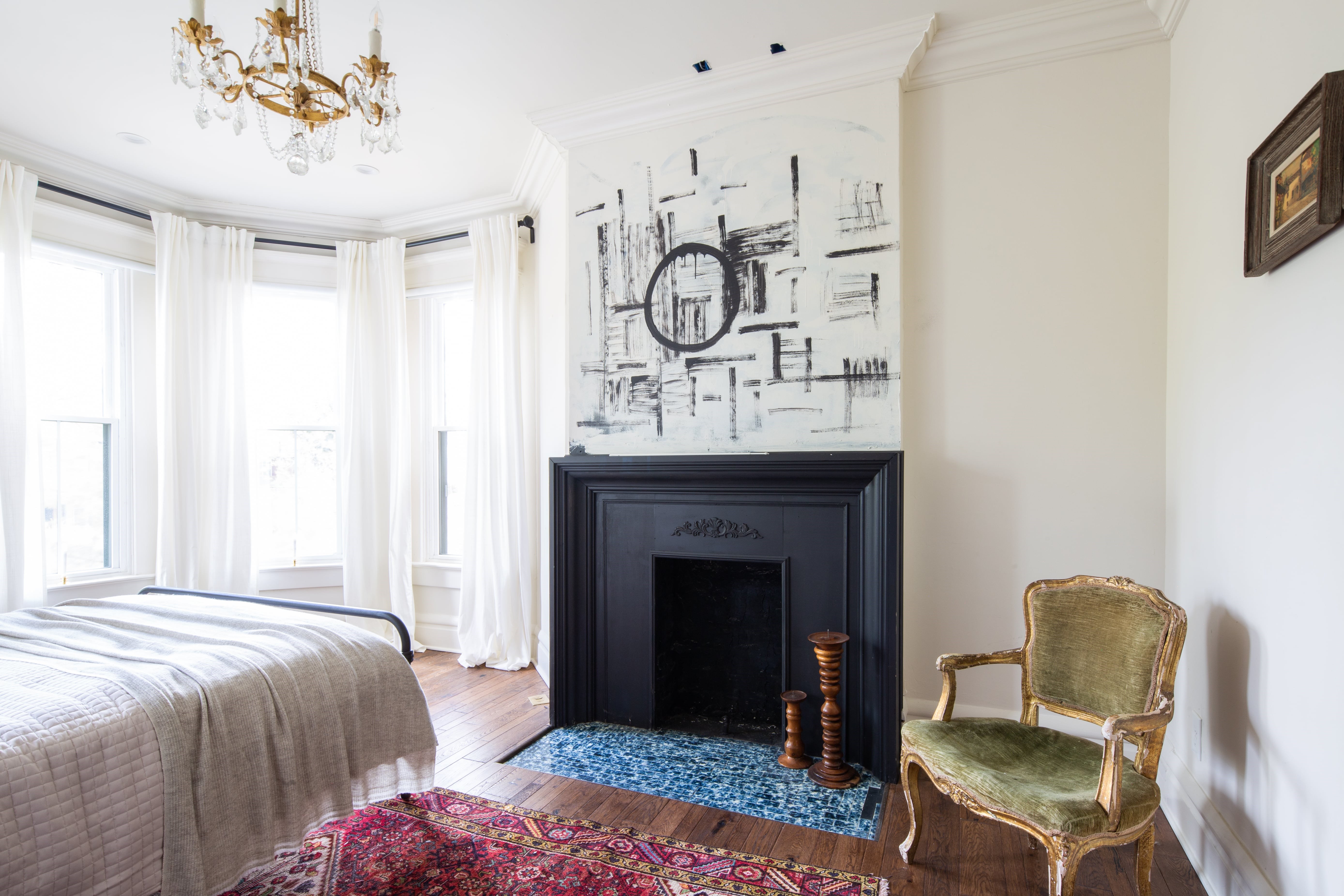
Millwork, high ceilings, and an old-world chair all have that elevated traditional flair, but an easy way to bring this style to life in your home is through vignettes, or "moments."


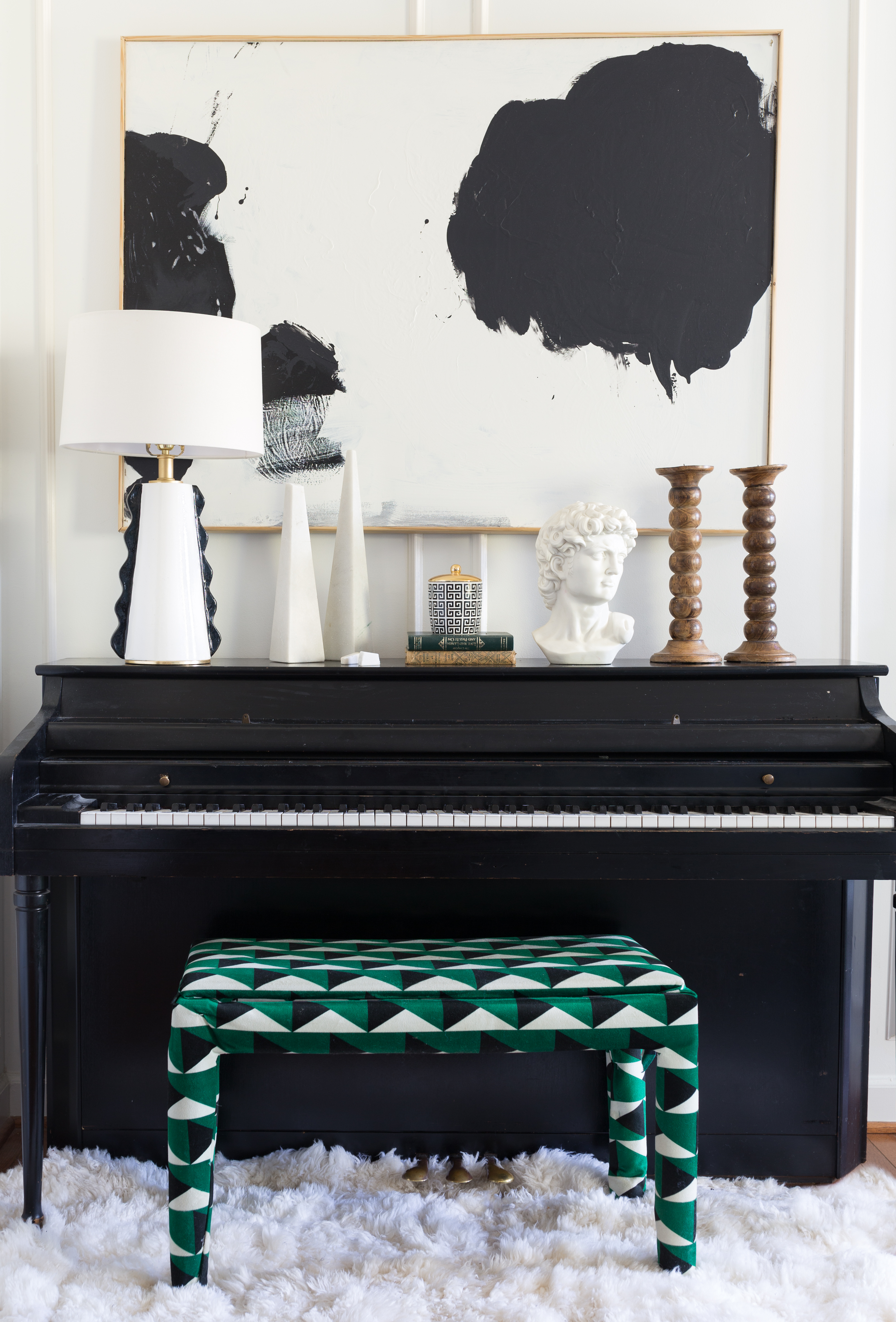
Jewel Marlowe of Jeweled Interiors | The massive modern art mixed with the classical bust is great; the Ancient Greek meander pattern on the urn tying into both is inspired.

1. Add a bust

Begin by selecting a place you'd like to have the vignette. Common locations include the mantel, a sidetable, or a shelf.

Now put a bust there. Maybe it's something you found at a flea market, maybe it's something you sought out, maybe you just found it in the garage while spring cleaning. Dust that baby off and give it pride of place.

Don't have one lying around? Pick a favorite classical composer and get a bust of them. They're easy to find. A bust conjures antiquity and the world of western culture that it entails. No bust, no deal.

You can drape necklaces on them, festoon them with paper crowns, or just leave them as is. 

Voila! You're well on your way to creating a classicist vignette. 


Homeowner: Veronica Solomon of Casa Vilora Interiors | One often sees a lot of white with classicist style, but you can go dark and juice up the drama.

2. Oil paintings & heavy frames

Staggered around the focal point, a collection of small oil paintings, especially with some heavy-duty frames, increases the aura of classical prestige. 

Taken together they can have as much impact as one statement piece. A gallery wall, a mini-collection accumulated around a theme, gives your space a museum mood of its own. 

Grouping together a bunch of artworks in a small space is clearly a more contemporary decorative idea, so it helps create that smart traditional-modern contrast that is an essential feature of this new classicist look. And if you don't have several, even one such painting and frame can go a long way, either as part of a vignette or the room at large.


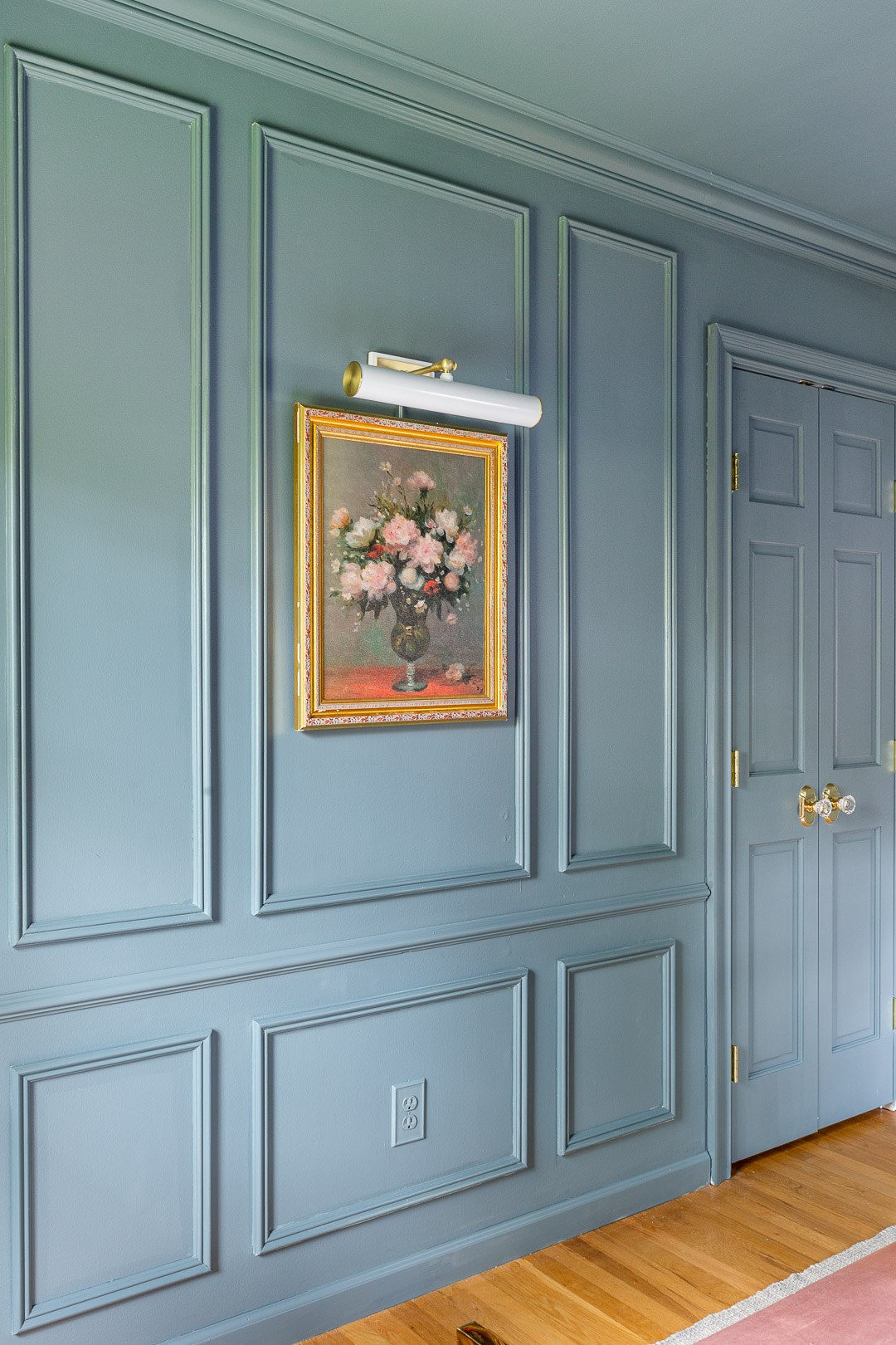
Homeowner: Alisa Bovino of A Glass of Bovino | Mixing modern Mitzi picture light with old-fashioned oil painting and paneling for an oh-la-la effect.

3. Mix it up with the lighting

A lot of the verve coming with this contemporary wave of classicism is thanks to the lighting. By setting lighting fixtures whose design ideas come from obviously different time periods in the same sightline as your vignette, you introduce a temporally eclectic contrast that just works. Conversely, if the room is very modern, selecting lighting fixtures that are classics hearkening back before the 20th century helps set the vibe. 

This lighting might be the main event, such as a space-defining chandelier, or it could be something as simple as the picture light above. Smart, studied contrasts between contemporary lighting and historical art forms or décor make these moments pop. 

Look for ways to connect two or three elements in the room to give it a sense of unity, lest this mix-and-match goes too far, straining the boundaries of good taste.


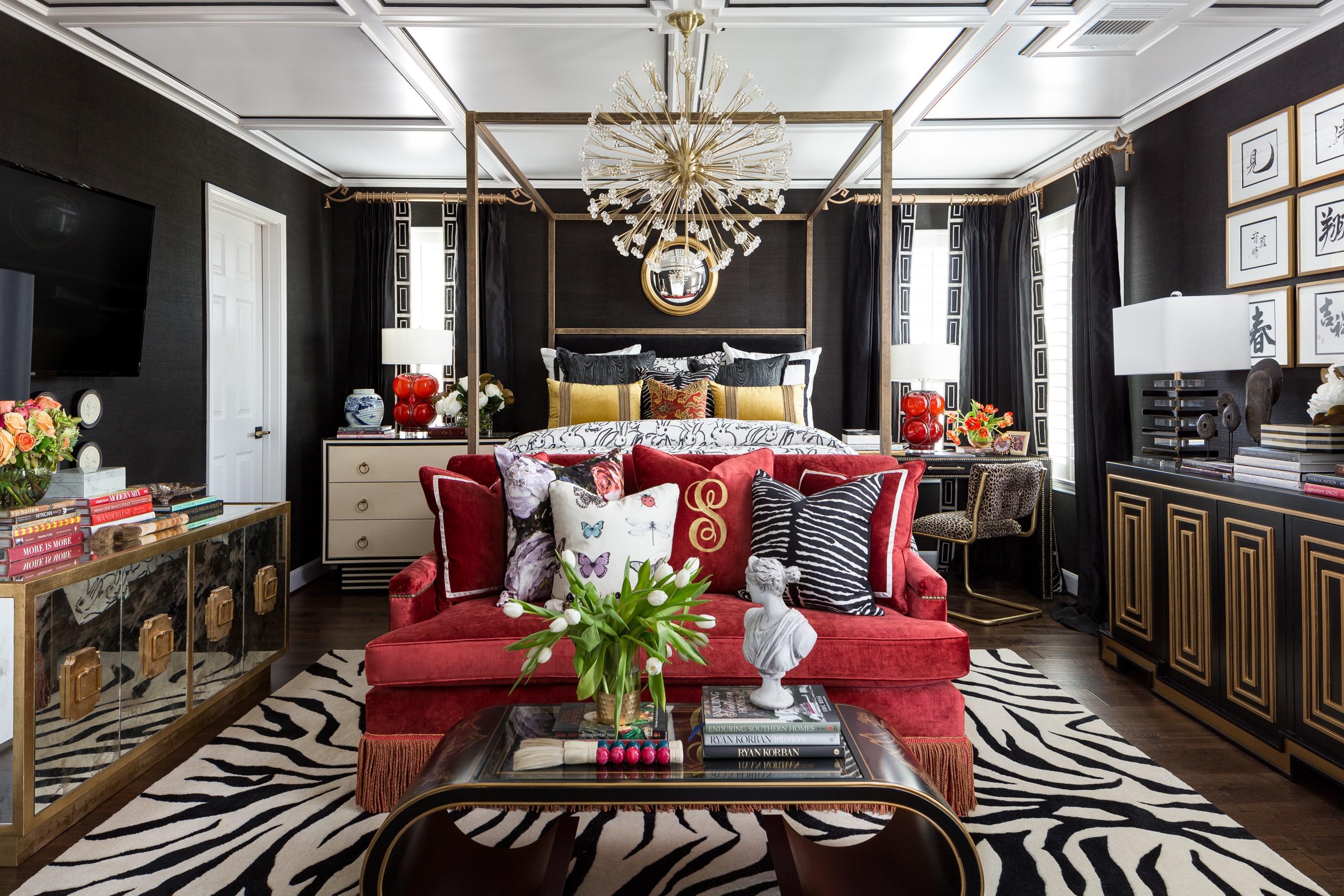
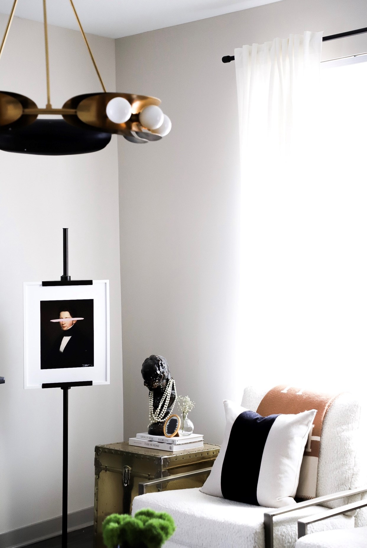
A dark bust draped in jewelry and an irreverently paint-slashed portrait mixed with a dramatic modern chandelier make for big new classicist energy in this space by Sam Cram Design.

4. Millwork & moulding

Nothing says classical like moulding and millwork. Whether that's paneling on the walls, thick crown mouldings where they meet the ceiling, or medallions around the canopy of that interesting lighting choice you made, these strong traditional elements give a space an elevated classicist feeling. There are convincing faux-panels now, which will add texture and dimension to the space, as well as some approachable wooden options for the average homeowner. When any of this sort of millwork is adjacent to your "classicist moment," the impression will be that much stronger.  


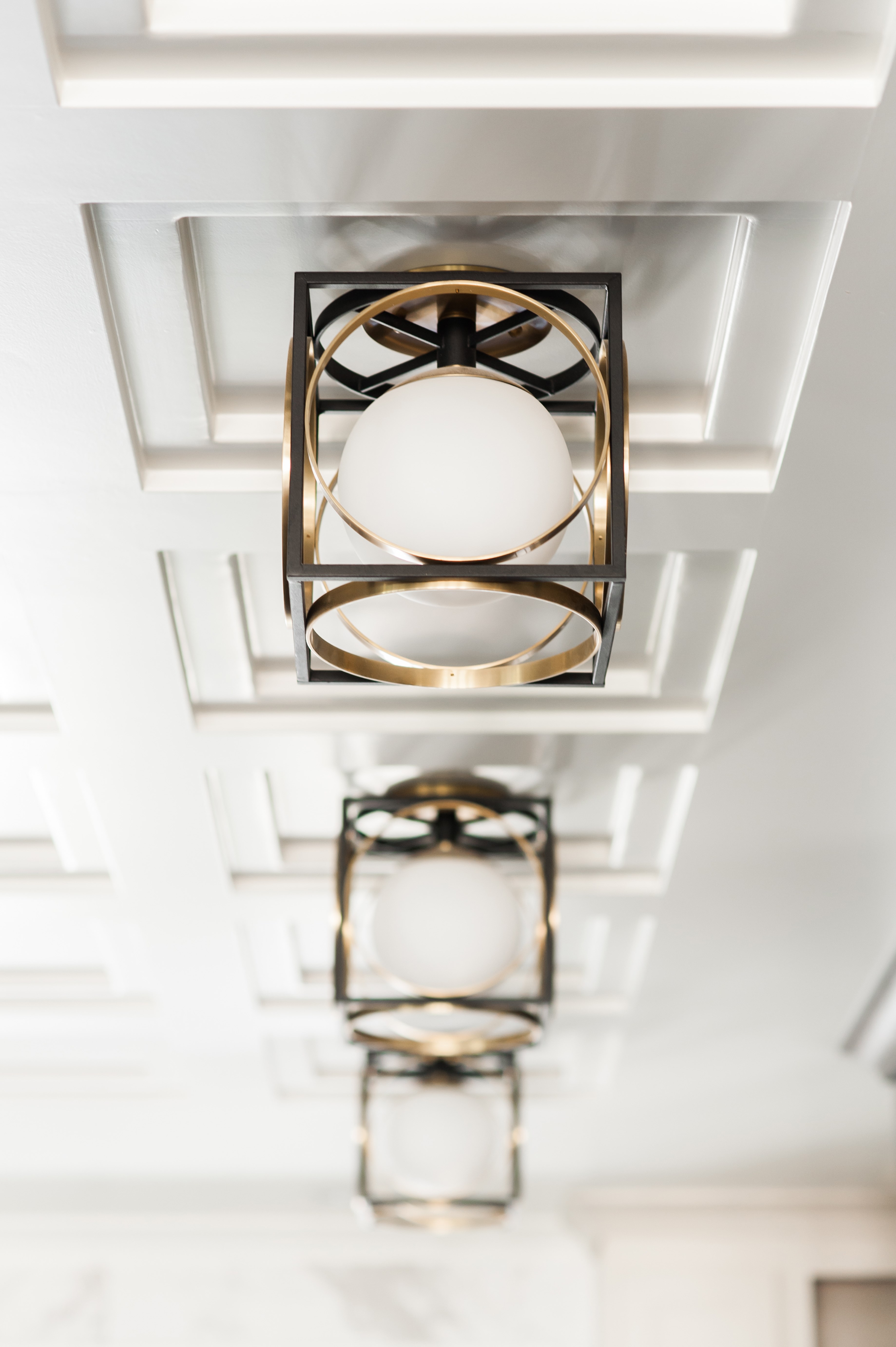
Design: Brandalyn Designs | Light: Wadsworth | Millwork mixed with unconventional lighting creates a sophisticated classicist look.

5. Don't forget the flowers

Nothing freshens up a space like fresh flowers. Look at any pictures of interiors online giving you life and chances are there are flowers in them. This natural element helps you create dimension in the different heights of objects in an arrangement—a key aspect to a winning vignette. (As discussed in this tablesetting post.) Walk into a space with your classicist moment, complete with a recent floral bouquet, and you'll feel like you're treating yourself.

It's the final touch that pulls it together.


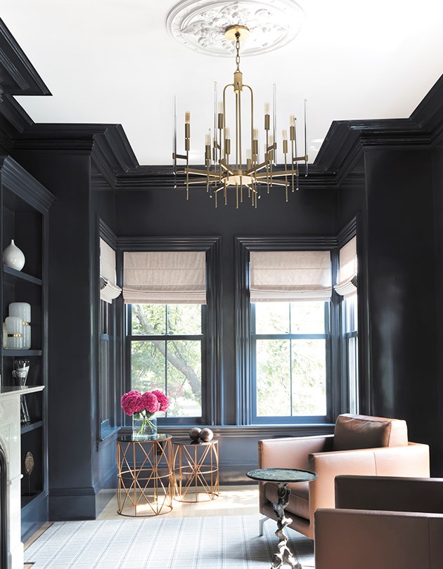
Fresh pink flowers beautifully contrast the moody blue hue in this amazing space with classicist bones and modern sensibility by Cecilia Walker.

Pictured at top: Troy Viola in Distressed Gold Leaf