Something about January gets everybody’s prediction juices going. People are eager to predict what will be in and what will be out—where cool is taking us. Others relish the chance to be in-the-know of very new information. It is commonly held that the month January gets its name from Janus, a two-faced Roman god who looks both forward and backward at the same time. The Wikipedia entry for Janus states that he “is the god of beginnings and transitions, and thereby of gates, doors, doorways, passages and endings. He is usually depicted as having two faces, since he looks to the future and to the past.” We’re all a little Janus when January rolls back around: still processing the year that just ended, while also excited about the possibilities of the one just ahead.
Here at Hudson Valley Lighting, we have been scouring the internet to find out what tastemakers and color experts in home design and fashion are saying about the projected “colors of the year.” Our findings have been quite interesting and we are excited to share them with you.
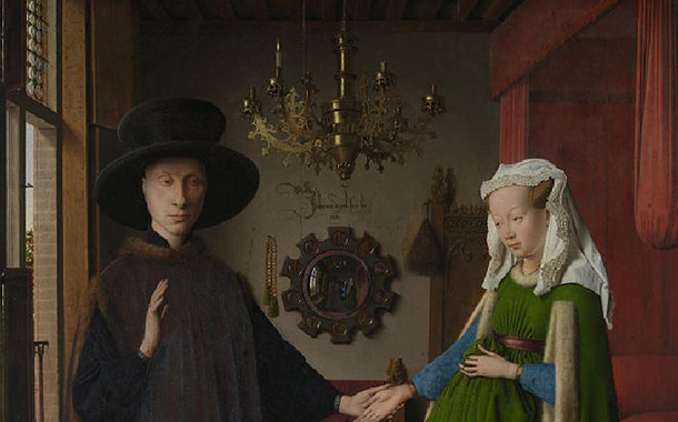
If there is one big surprise about the color predictions in total, it is that this deeply mysterious painting from 1434 by Dutch artist Jan van Eyck shows everything that we’ll be seeing in the new year.*

The Arnolfini Portrait, by Jan Van Eyck, 1434.
Brought to our attention by its placement in a slideshow about color trends for 2015 by House Beautiful.
The most important color prediction comes from Pantone, a company that coordinates color consistency across all levels of the design and fashion industries. Every year, after heated debate, Pantone announces a "color of the year." This is a color that experts in the field believe will most resonate with people's taste and concerns in the year ahead. The worlds of fashion and design listen. Within days of the announcement, the internet is abuzz with debate on the color and pictures of its application in clothes, furniture, makeup, and textile. For color of the year 2015, Pantone announced Marsala, a rich, dark red with brown hues in it.


Images from Pantone's Color of the Year 2015 Marsala Page
While Pantone's announcement is very important, other industries invested in color make their own forecasts. Not content with just one, Farrow & Ball, a British paint company highly respected by interior designers, announced four key colors and provided images displaying complementary options for each. These colors were chosen as ones that seem best suited to help people make their home a sanctuary where they can escape and recharge from their "nomadic working lives." As you can see in their beautiful set shots below, it is an earthy and soothing palette.


Photographs from Farrow & Ball, displaying their four key colors in action
Across the board, tastemakers and forecasters seem to be saying, "don't be afraid to go bold." Dark, nutritive colors are in. For the lighter side of the spectrum, the natural world is the touchstone. Their reasoning for this is that people are more burnt out from their work lives, which travel with them in the new world smart phones and tablets have ushered in. Consequently, people need a retreat at home that has the contemplative and revivifying qualities many find in the natural world. Leading color forecaster Leatrice Eiseman has been quoted as saying,“There is a growing movement to step out and create ‘quiet zones’ to disconnect from technology and unwind, giving ourselves time to stop and be still. Color choices follow the same minimalistic, ‘en plein air’ theme. . . Soft, cool hues blend with subtle warm tones to create a soothing escape from the everyday hustle and bustle.”
So how did these brands land on these colors as the ones that will resonate with people in the year ahead?
Welcome to the fascinating world of color forecasting.
For Pantone, each year, international color experts gather in a European capital and pitch colors based around a theme selected in advance (this year, it was "unity"). A moderator presides while they passionately argue for and against the colors under discussion in something that resembles a David Foster Wallace story. They attempt to tap into what people are gravitating to now and anticipate what color will most resonate with people.
With a color like Marsala, you might wonder, 'Am I seeing it everywhere because this color just feels so vital, fresh, and perfect for now or am I seeing it everywhere because fashion and interior designers listen closely to what this respected brand has to say?' Tom Vanderbilt, in an interesting and amusing essay for Slate, brings us into the room as they pick out color of the year and into conversation with Leatrice Eiseman, executive director at Pantone Color Institute:
“Pantone is in the business of selling fabric and paper samples—all their reports are done in order to sell more paper and color samples.” Who’s more accurate? It’s hard to say. There are no analytics measuring success of color forecasting—how would one even accurately measure such a thing? To play it safe most companies rely on a range of color forecasts. Eiseman says Pantone’s effort, and perhaps color forecasting in general, suffers from two misconceptions. The first is that there is some kind of “evil cabal” that “schemes to get the colors out there.” The second is “let’s just throw a dart and wherever it lands is what’s going to be the hot color for next year.”
In this fascinating clip, Eiseman gives more insight into why they chose Marsala for 2015.
We really like the part where Eiseman says, “I love to to see it as a layered color…Layering it as far as a paint color is concerned, or as far as any texture is concerned—layering it with other metallics, in particular, like the bronzey tones, the umber, anything that has that brown coppery feel is obviously going to be a natural.” We love the idea of an accent wall or a whole room in Marsala; with so many different kinds of brass and bronze finishes used on so many different styles of fixtures, there is a lot of room to play with, and one can even use several different styles in the same room, with the metallic tones being the common thread.

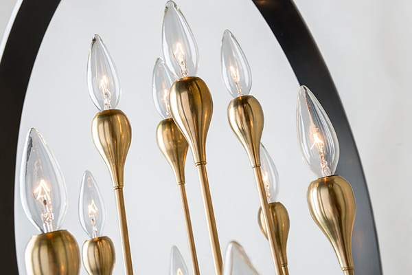
Hudson Valley Lighting Baldwin Chandelier in Old Bronze Finish
But companies such as Pantone and Farrow & Ball are not the only ones making color predictions. The design community, with its ear close to the ground and its finger ever on the pulse of now, also has valuable insight into what colors are being used recently and which ones may take off soon. As optimism and nature are driving the up-and-coming color choices, various shades of blue and green are being put to good use by interior designers. Mediterranean blue, boldly paired with a variety of greens, is a sumptuous, refreshing look appearing in several exemplary shots we came across researching this post. Various shades of green grow in our increasingly environmentally aware culture—the color of hope. Capella Kincheloe tells House Beautiful, "Olive greens will be popular in 2015...The shade is warm, organic, and neutral for almost any other color you pair with it," while Anne Maxwell Foster and Suysell dePedro Cunningham of Tilton Fenwick tell them,"We thought a lot about color trends as we were designing our Duralee fabric line and we love a little sour green mixed in with anything."

"Here, vibrant versions of classic blue and green have a fresh, bold look."
From Tillton Fenwick's Duralee line.
If you look again at the Van Eyck painting, everything trending and forecasted for this year in color is there. A soothing brown tone makes up the walls; the bed and other furniture are draped in a Marsala-like color. The woman's clothing is an energizing contrast of Mediterranean blue and olive green. The man wears a sumptuous combination of rich, dusky purple-infused colors with browns and blacks worn at the same time. He even sports a wide-brimmed hat, which has been making a comeback!
What do you think of the colors of the year? Do you think they will take? Will you be redoing a room or working it into your wardrobe? Check out our collection of images on Pinterest for additional inspiration and let us know on Facebook at LargerThanLight.
*While this may be surprising, Anita Albus, in her book The Art of Arts (Knopf: 2000), pointed out that van Eyck painted the future into the portrait: “In the interior seen in the Arnolfini Betrothal, the same type of convex mirror [as used in a lost painting depicting women bathing, recorded by Fazio] also allows the depiction of the room, with everything that is in it, from a hidden side. The mirror dissolves the boundaries of pictorial space like a real mirror, and the boundaries of time like a magical one. The presence of the painter and another witness at the wedding is reflected as if they were on this side of the painting; they are seen entering through the door. The viewer is thus virtually reflected within the painting itself—although he may not recognize himself in the figures of the anteroom. On the frame of the mirror, ten colored miniatures under convex glass recall the Passion of Christ. In a reflecting eye set in a frame, the artist has thus summed up the past, the present, and the future. His paintings show the world as if seen through beryl—the eyeglass described by old Nicholas de Cusa, polished into a simultaneously concave and convex form, a gleaming white, clear crystal through which one sees that the largest things coincide with the smallest.”


