
Each year, the South Florida chapter of American Red Cross puts together a designer showcase house to raise funds for their much-needed emergency relief. An expected 4,000+ show up, paying admission to walk the breathtaking space. This year, the highly talented and skilled Forte Interiors joined the team of designers taking on the house. Andrew Mormile and Nicholas Skidmore worked on the 2nd floor master bathroom. They contacted us to see if we would donate some lights of their choice for their makeover of the room. We were more than happy to oblige. The results, as you will see below, are stunning. Forte did an amazing job. In the journal Red Cross distributed to those who visited the house to tour it, they wrote:
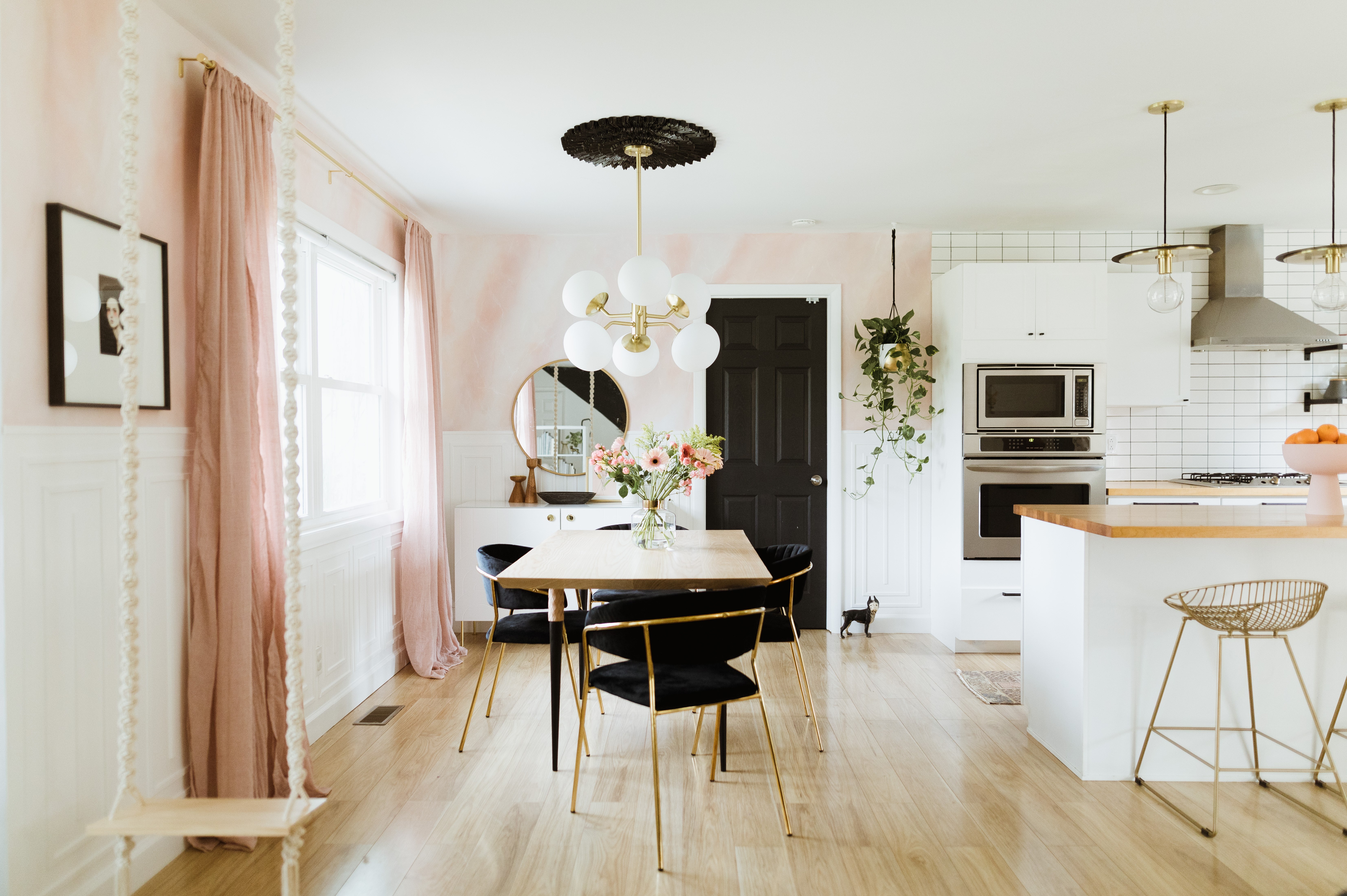
“Unexpected drama pervades this former master retreat with its rich color palette of navy, gold, and stained burled Madrone. Both vintage and contemporary styles captivate and rejuvenate the space. Stylish furnishings consisting of a boldly painted custom vanity and stained dressing table feel and look like furniture as they easily become focal points, complementing one another. Brass plumbing fixtures offer a modern, minimalist design while still maintaining warmth and sophistication. Classic lighting sconces and a striking pendant add panache to this royal remodel.”
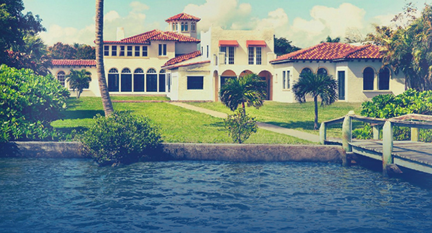
Their challenge: La Florentia, also known as The Birthday Cake Castle, a sprawling majestic Mediterranean 1925 house on intracoastal waters.

The gentlemen agreed to allow us to interview them. Read on for the whole exchange and enjoy the gorgeous photographs, courtesy of Nickolas Sargent.

Hudson Valley Lighting: One of the immediately striking things about the room is the controlled color combination. There seems to be a limited palette that serves to strengthen the design. Particularly striking is that wonderful shade of navy blue on the vanity, which is echoed in the marine imagery in the art. Was the house’s waterside location a prompt for this? Andrew and Bob at Forte Interiors have some background in yacht interiors, as well. Does that continue to serve as an inspiration?
Forte Interiors: This year's Designer Show House was built by Addison Mizner's protégé Sherman Childs in the 1920's. In terms of a color palette, we wanted to pay homage to the historic Mediterranean-style and went bold with blue. The home has a lovely setting on the intracoastal and the water views further reflect our color selection. Unexpectedly, we infused the color on the vanity, bench and millwork, rather than placing it on the walls. Hints of the rich navy are seen elsewhere in the room, such as in the artwork and window treatments. Together, there is plenty of contrast without being overwhelming or heavy, as Mediterranean designs can sometimes depict.

HVL: Looking closer at the details, there is that lovely banner relief in the shower marble, which seems more connected to your incredible worldwide background, especially your study in Italy. Can you tell us a bit about the way you and Andrew bring your wealth of experiences and different backgrounds to bear on a design project like this?
FI: When we began developing the space, we weren't exactly certain how far the limited budget would go. The tile on the floors (which we had the grout painted) and the shower tile surround, remained due in part to budgetary constraints. Thankfully, we had a neutral palette to work with and there were a few details we didn't mind, such as the scroll work on the shower banner tile. It is more subtle than what we proposed, as a blue marble accent would have been our first choice, as seen in our inspiration board [below]. Both of us have traveled extensively and studied overseas. We often find our rooms being an eclectic blend of styles, enhanced by experiences—whether it be through art, materiality, or proportions. As designers, we always take the opportunity to draw inspiration from architecture, fashion, and art. Something as simple as a fabric pattern or a molding profile on an Italian palazzo can provide insight for our next project.

HVL: Nick, in the Team section on the Forte Interiors website, it says your design approach is innovative yet attainable, and that you strive to be current, yet enduring. Our guiding philosophy at Hudson Valley Lighting is very similar. What lead you to choose us to partner on this project? It feels like a perfect match.
FI: As a firm, we strive to be innovative and utilize new and interesting materials in different ways. However, at the end of the day we want to be distinctive, but equally as important our room designs should be timeless. We feel that Hudson Valley Lighting has a similar design aesthetic and that combined with exceptional quality is the perfect combination to partner with on a project such as this. The Glendale, for example, is a more traditional interpretation of the classic sputnik. The dark metal open frame, in contrast to the brass is elegant and unexpected, two qualities we often attempt to transcend through our designs.

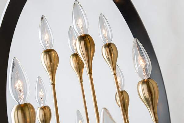
HVL: When we write product descriptions, we try to give a feel for a piece’s design context and we try to avoid leading people to thinking narrowly about how or where to place one of our lights. While they may be ideal for a certain kind of use, there are a lot of possibilities. That said, we loved your bold, unexpected use of our Merrick fixtures, which were designed as picture lights but you use here as bath and vanity sconces. Can you tell us about the thought process that went into that? From what I understand, it was quite a hit, and those lucky enough to tour the house commented on it a lot.
FI: Our design philosophy for this space, and for most bathrooms we design, is to treat them like a comfortable living space. For example, we are creative with lighting selections, rugs, and even upholstered pieces in unpredictable places. We knew a standard vanity light wasn't going to add the distinction we desired. The space has a level of sophistication and the unexpected use of the Merrick provided the traditional shape and proportions we wanted to directly contrast the modern faucets and under-lit glass countertops. This adds interest and hopefully inspires others to think outside the norm when selecting pieces for their home.

HVL: Your assignment was the 2nd floor master bathroom. Now, the house is from the 1920s and there were some stipulations you had to adhere to, in terms of what had to stay and where things could go. Looking at your original mood board below, we see the basic concept was carried through, but with several changes along the way. One might even argue limitations and challenges that came up had unexpected benefits, though they may have been frustrating at the time. How was the experience working in a house nearly a century old like this one different from working on a new building? How did this house’s history affect your design vision?
FI: Working in a historic home, on a limited budget, in a very short period of time certainly had its design challenges. Decisions to leave the existing tile floor was probably our biggest challenge. We wanted to add a makeup vanity, but opted for a bench when we realized the floor didn't run underneath the previous vanity that was removed. The bench design was an unexpected benefit, as it allowed for additional towel storage, as well as a full length mirror. Of course the existing walls also became our nemesis. Most of the budget went towards smoothing out the walls and ceiling, which were a heavy plaster with a lot of texture. Others may differ , as we allotted a significant portion of the budget towards this, but we realized the detailing in our crown moulding and cabinetry would be overshadowed if we kept the shell as is. Additionally, two of the walls are exterior and plaster was literally placed over terra cotta. We had to chisel the walls to allow for junction boxes to be installed for the sconces.

HVL: We did a post earlier this year about the comeback of brass. Anyone who was still in doubt can’t be, after looking at this bathroom. Have you always been a lover of brass or are you newly converted by its renaissance? Going back to that first question about the controlled palette, was the inclusion of aged brass one of the first things that came to mind for this room?
FI: Both of us like different metal finishes and are definitely not timid about mixing them. In this particular space, the bold navy blue was selected and we immediately wanted to introduce a superior finish such as brass. It provides the warmth, elegance and contrast we were looking for. The Glendale tied everything together in this space, as it had the brushed brass, as well as a color tone similar to that of oil rubbed bronze, which is the hardware we used on the frameless shower enclosure. Many people are hesitant to use brass, as they are reminded of the polished brass of the early nineties. The critical element to any metal is the finish. We will continue to use brass and we actually just designed a coffee table for a client that has an aged brass finish and it works perfectly in a space with other metals.

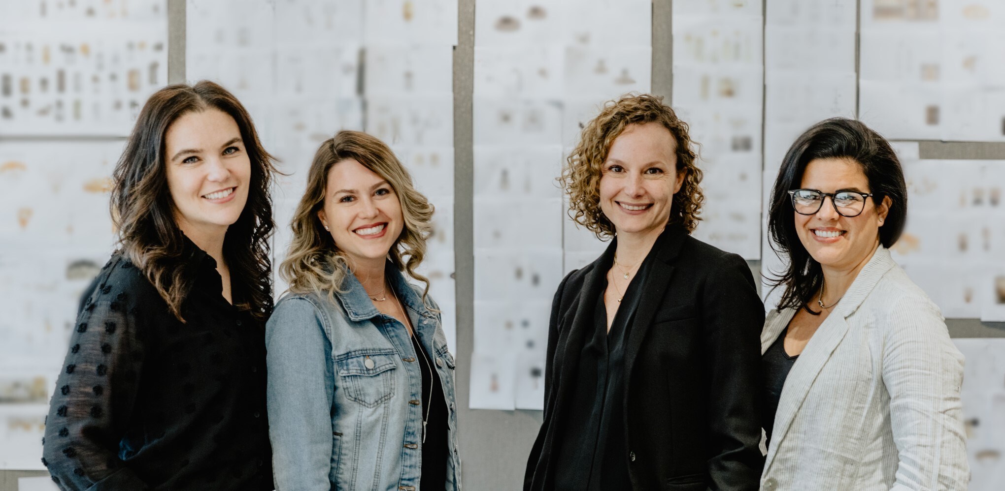
Forte Interiors, Left to Right: Bob Mormile, Andrew Mormile, Nicholas Skidmore
HVL: It feels so good to be involved in a project like this, for the American Red Cross, who do so much good and important work, and we truly thank you for including us. Did Red Cross approach you? How does something like this come about? What were the most rewarding aspects for you?
FI: Working with everyone from the Red Cross has been an absolute pleasure from day one. The amount of work and detail that goes into the show house is inconceivable. The American Red Cross Designers’ Show House continues to be a unique fundraiser for our area year after year. So many people look forward to it, as it provides an exceptional opportunity for all to experience outstanding home design.
With this being our first year involved, we undeniably learned a lot about the process, and would do it again in a second. To be selected, we had to submit a portfolio, as well as list the top three rooms we would like to design and include a schematic design proposal for each. The selection committee then worked with the homeowners and decided which designers would be involved and their newly acquired spaces. Understanding this is an incredible fundraiser for the Red Cross, we are very supportive and our involvement makes it that much more worthwhile. We met so many incredible people throughout the process and having others appreciate and see our hard work is truly gratifying and humbling.
HVL: Thank you so much for your time, your words, and your great work!

The whole crew of designers before La Florentia, with Andrew and Nick front and center.
It was an honor and a privilege working with such talented and thoughtful designers, bringing such a wonderful project to fruition.
What do you think of the bathroom? We would love to hear your comments below!