
Woman in Blue Reading a Letter, Johannes Vermeer
Johannes Vermeer, like so many genius artists of the past few centuries, died in debt and squalor, probably thinking his life’s work was in vain. It is difficult to imagine he would have an inkling how much his paintings of contemporaneous Dutch life in the 17th century would go on to move, inspire, and impress people the world over, centuries later. Vermeer’s paintings are adored and pored over due to a few factors: the quality of light he created, usually slanting into a domestic space from a window on the left; a great sense of composition and allegory, captured in vibrant hues; and an enduring aura of mystery that draws one into the paintings. Vermeer himself is a mystery: little is known about him. What we do know is that, unlike virtually every other painter of his era, he painted with copious amounts of ultramarine, a paint that, due to the difficulty, ingredients, and travel inherent in making it, was obtained only at exorbitant cost.
Ultramarine. The pigment par excellence. The name “ultramarine” means “beyond the sea,” but it could just as well mean “beyond.” The sea, already a symbol of transcendence, limitlessness, and the infinite, is topped by this hue. When House Beautiful ran a fun little feature on it in their current summer issue, we thought, "Holy luxury!" We didn't realize the color was so luxurious it was literally reserved only for holy people! It turns out the color has a long and interesting history of prestigious and exclusive application, from make-up to home decor, from Ancient Egypt to Renaissance Europe to Contemporary America.
In painting, ultramarine was reserved for religious subjects.The Virgin Mary. Her Son. That sort of thing.

The Virgin in Prayer, Sassafero.
But Vermeer, unlike his predecessors, decided to weave it into everything in his paintings of everyday life. From rich uses of it for the fabrics and textiles in the rooms and clothes of his subjects to slight traces of it in their skin, and even tiles on the floor and frames in the window, it is like he was making a point about a mystic vision of reality, in which everything was alive and numinous—that famous slant of light of his playing no small part.
Usually only featured in the vestments of sacred women, he used ultramarine to render the everyday woman divine. The headcovering on the young lady staring out at us with endless mystery from Girl with a Pearl Earring is imbued with this rare color. The painting has traversed both seas and centuries; beyond temporal bounds, the color helped her transcend time.

Girl With a Pearl Earring, Johannes Vermeer
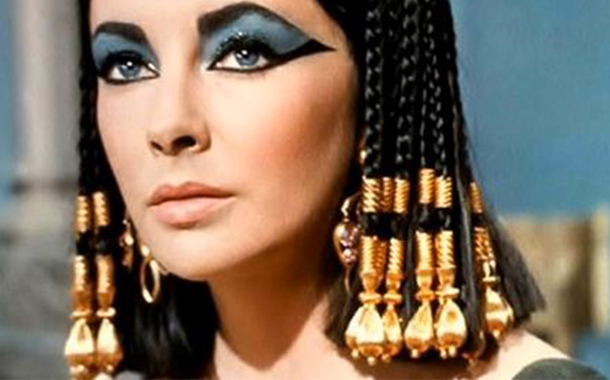
Why was it so expensive? It was originally made by crushing lapis lazuli into dust and carefully applying some other elements. It was difficult to pull off and the paint itself was not easy to apply. Lapis lazuli was a rock found only in the steep Hindu Kush mountain range in north-east Afghanistan (though later it has been discovered in other places, often in less quantity and of inferior quality). It found its way to Europe in the Middle Ages and Renaissance via Venice. The earthly Venus herself—Cleopatra—is rumoured to have worn the dust of lapis lazuli as eyeshadow. It has been found in sacred and ceremonial usages going back to antiquity in the Mediterranean world.
So ultramarine and luxury go hand in hand.

Elizabeth Taylor, Cleopatra (1963).
Enter House Beautiful. In their current issue, they kick off their Color section with a “color crush” on ultramarine. “We love our blues!” they enthuse. “And this one seriously cranks up the volume. It plays wonderfully well with other colors and has an unstoppable fierceness we just can’t resist.” The mood board they assembled on the other side of the page is fun and piqued our interest.
After spending some time with ultramarine, we couldn’t agree more. What a wonderful intensity to surrender to! Earlier this year, we did a post on the year’s color predictions, with an emphasis on Pantone’s color of the year. In that post, we noted that Mediterranean blues, especially paired with olive greens, would be on the rise. It seems it has come to fruition.
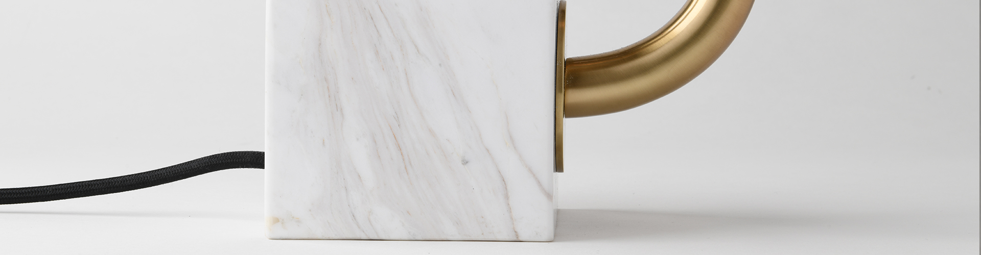
Due to the pyrite flecks in lapis lazuli perhaps, brass pairs well with this bold color. Its associations with antiquity also make bronze a welcome contrast. Its cool tone allows for silvery complements, as well. Ultramarine’s adaptability makes choosing fixtures to go with it a pleasure.
%202.jpg)

Image: Kate French @ Sarah Kaye Representation Image: Bumper France & Elements of Kiel, Liaigre
Ultramarine is no longer made by some arcane practice. No lapis lazuli, no Afghanistan, no Venice. We can weave it into our lives like Vermeer did into his paintings, without the great cost yet with no luxury lost. Just as he foregrounds the composition of A Young Woman Standing at a Virginal with a chair upholstered in an eye-popping, vivid ultramarine, we can use it on a chair or ottoman close to the entrypoint to a room, a table or wallcovering in the background. Or, if you're up for the plunge, painting walls and moldings (even some of the furniture?) a deep, shiny coat of the legendary color. So doing, we infuse our quotidian existence with a touch of the ecstatic.

A Young Woman Standing at a Virginal, Johannes Vermeer. Used here through The National Gallery's generosity.
A couple of notes: it is often the case that you will get more out of our posts if you click on the links (in black text, as opposed to grey, and most of the pictures we use) and visit the Pinterest boards we curate to complement them. This is especially true in the present instance. If you have the time, please visit our gorgeous Pinterest board dedicated to ultramarine and let us know what you think of the color in the comments below. Where would you use it in your home? How much of it would you use? Do you have a favorite Vermeer painting? A good technique for applying ultramarine eyeshadow? We would love to hear from you!