A couple posts ago, we discussed clearing out the clutter and making of your space a clean canvas with which to allow for new possibilities. One of the advantages of doing this is the way it sets you up to choose your own favorite “pop” color—in a room that is monochromatically designed, a few well-chosen and carefully placed objects in a boldly contrasting color can make a thrilling visual impact. Angela Wright, pioneering British color scientist and author of The Beginner’s Guide to Colour Psychology, points out that “it is the combination of colours that triggers the response… we do not respond to just one colour, but to colours in combination.” Pantone, leading experts on color, say “Color is the catalyst that can spark the sale, define the space and create the magic and the mood.” We couldn’t agree more and that is why we are in love with YELLOW. (It is so bold and beautiful, it deserves the all caps.)

From the happy yolk of an egg to the sun smiling down from the sky to a lemon wedge in your cocktail, yellow makes us feel good. Of course, not everyone feels that way. Reactions to the color are as extreme and varied as they are to the Coldplay song of the same name. Charlotte Perkin Gilman’s famous feminist story from 1892 about a woman losing her mind due to “The Yellow Wallpaper” she was confined with in her bedroom is testament to that fact. But one need look no further than our Pinterest inspiration board for this post to see that yellow is zest, is innocence, is adventure. Yellow is yes.

We might have a little extra love for yellow as pop color extraordinaire because we are passionate about lighting and yellow has a special relationship with light. Yellow reflects a lot of light—in fact more than any other color. It has been listed as the most attention-getting color. It is best used in concentrated doses, like a pillow, chair, bar tray, the inside of a bookshelf or kitchen cabinet, or one wall in a room. Used to paint a whole room or as the dominant color, it can cause fatigue. It's intense like that.

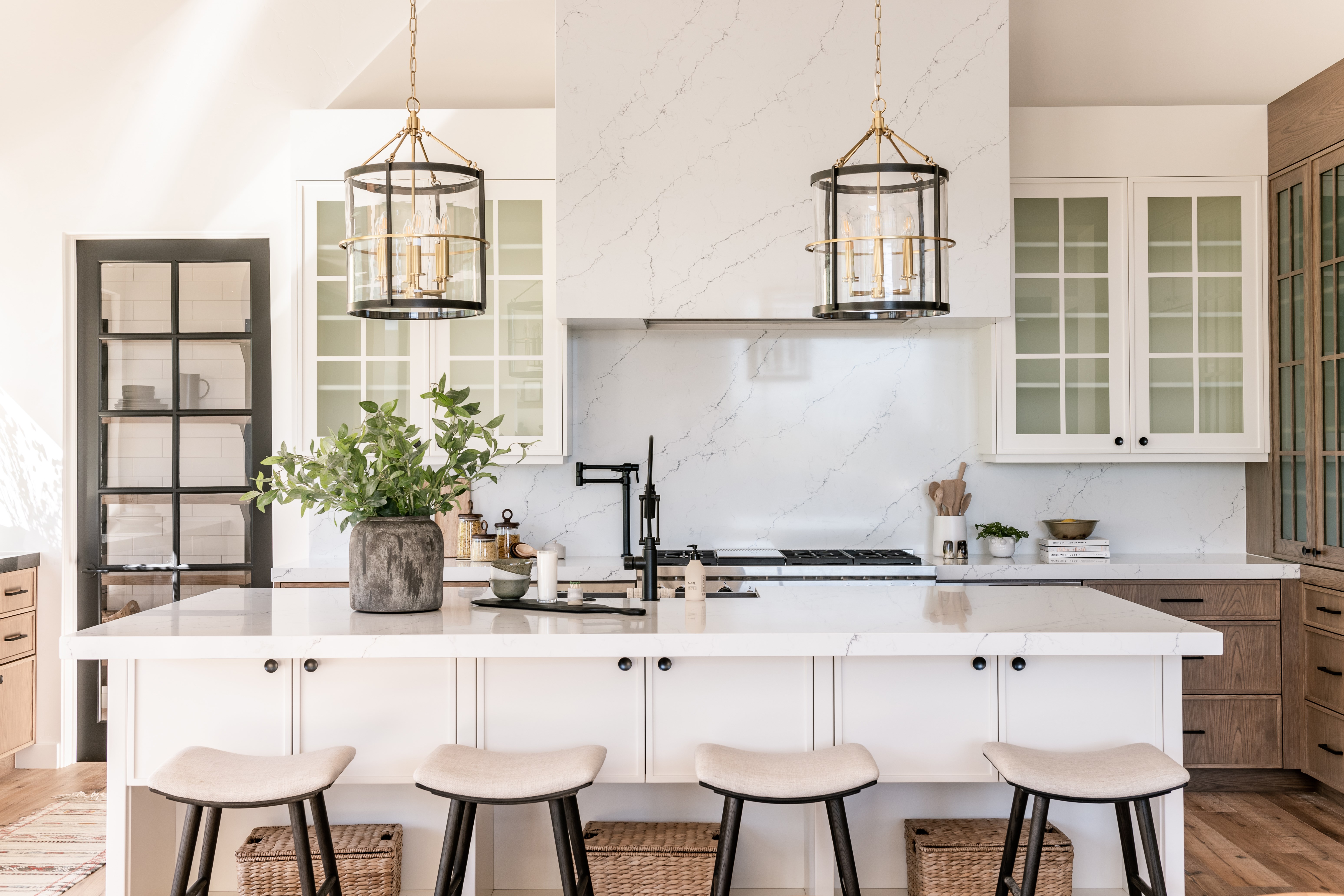
However, in home lighting, it has the opposite effect. The quality of home lighting runs a spectrum arcing from a cool white to a warm inviting yellow. This spectrum is described in terms of “color temperature,” measured in Kelvins, with yellow occupying the warm end, white in the middle, and blue on the cool end. It is that warm, yellow light that is more desirable for one’s home space, creating a sanctuary from the world. One might also consider the finish of a metal light fixture. Yellow presents itself in a mellowed way in aged brass finishes. While less of a "pop," it does add to that inviting sense of warmth.

Hudson Valley Lighting Alpine
Source: Luxe Design / Build
With a lot of winter road ahead, we encourage you to find the pop color that works for you and get creative with it. It might bring you the smile and warmth you need so that when you close the door behind you returning home, your deep breath turns to a yes.