BRANDS
  • View All
BRANDS
  • View All
BRANDS
  • View All
FIND A SHOWROOM
BUY ONLINE
INSPIRATION
Products
Brands
Where to Buy
Search
Morgan's Many Moods

Striking Geometry and Simplicity

There's Trends and Then There's Troy

Artful Approaches to Lighting

Interiors Enhanced by Art

April 05, 2018
img

Artful Approaches to Lighting

Interiors Enhanced by Art

April 05, 2018

A room is a conversation. The different elements placed in a room talk to one another. Like a host with a genius for getting the right invitation list together for a party, when you select what will make up a given space, you're selecting elements that have enough in common but are also sufficiently different that the conversation will sizzle and sparkle.

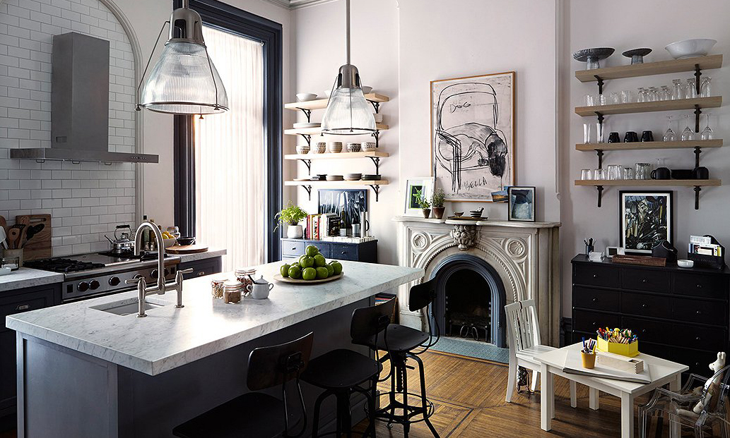
Setting up the conversation between art and lighting is one of the most important choices you may face from a decorative standpoint. By selecting artistic fixtures that tie into a nearby painting and its frame or sculpture in some way, you create a natural conversation that is always going on. 

Art is an essential part of any interior space. When it comes to interior décor, art is not just something you hang on your walls. Art is an approach; it’s a sensibility you bring to the space. Each room is a composition where aesthetics guide decisions, questions of proportion and emphasis carefully considered. 

Décor trends may nudge some of these decisions one way or the other, while abiding principles of artistic interior design dictate the larger picture. Trends are temporary while art is timeless. Yet the two often intersect. Current and emerging décor trends value layers, textures, the organic, and the handmade.

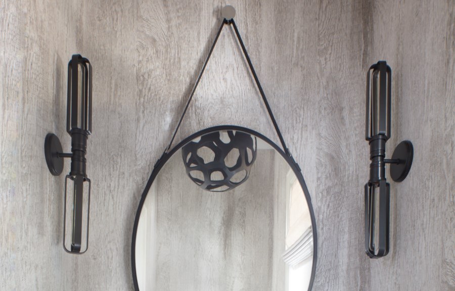
In this context, the right sort of lighting fixture may assume an aura of art. Depending on where it falls in the composition of a space, a Corbett fixture functions as a piece of art that happens to light things.

Our Pulse pendant's gold leaf curves tie into the ornate mirror frame nearby while also playing off the sense of style exuding from the portrait.

A sense of artfulness imbues the work we do at Corbett. It’s a sense—a conviction, really—that lighting fixtures can be so much more than mere props that light the room. That they might be aesthetically gorgeous and stimulating in their own right.

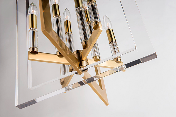
Toward this end, we carry a few guiding principles into each new work we fashion. We design from base to canopy, giving consideration to how a chandelier, for example, will look from below. Thought about where it will be placed, such as in the entryway or above a dining room table, informs decisions about its design. 

In addition, we consider the materials which we'll use. How we might create a visually engaging sense of layering and textural contrast while also fulfilling our creations' number one purpose: lighting efficiently. 

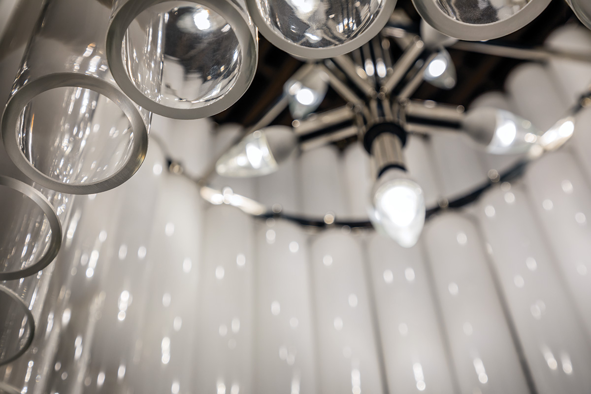
Taking these two together, we end up with something like our Dolcetti. Featuring myriad pieces in a mosaic-like setting that includes nacre, or mother-of-pearl, Dolcetti achieves a sense of unity by carrying this unusual material like a through-thread from the rims of each separate tier up to the canopy on the ceiling. To look up into the mosaic light is to swim in nacreous delight. 


Lastly, there are finishes. And true to this word—"finish"—it might be said we've saved the best for last. 

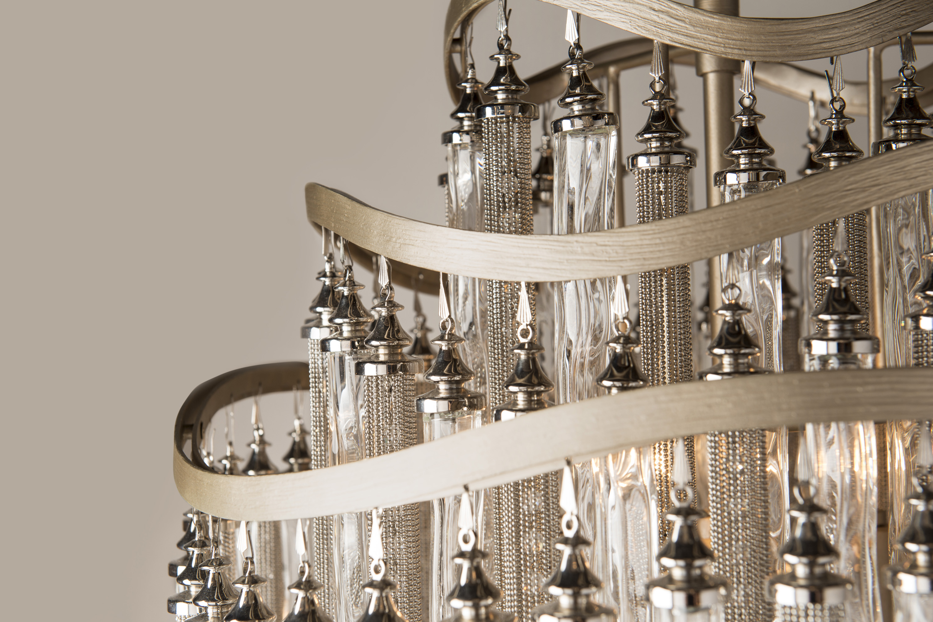
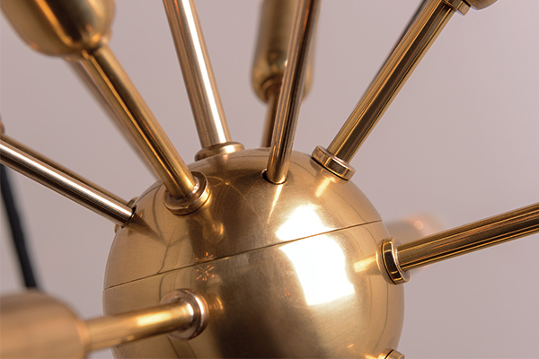
A finish is a process by which a piece of metal is given its final and often fixed appearance—clothed, as it were, in other metals. Derivatives and alloys, layered and lacquered. Many of our finishes involve some form of gold or silver leaf (or both). These leaf finishes are the result of a multi-step process done by hand, which is evident in a painterly way when you take a close look at them. The so-called "leaf" is actually made of the desirable gold or silver, in very thin sheets and squares, that are attached to brush-applied adhesive and worked on before excess is removed. These brush strokes remain visible through the gorgeous luster of these silver and gold finishes.  


One of our artisans applies gold leaf to the inside of the large iron bands of our Vertigo.

These detail shots of our new fixture, Libra, show the visible brush work in our Antique Silver Leaf finish. Layers and textural contrast stand out as key design elements in this harmonious piece. Like the scales of its astrological namesake, it has a sense of balance, even while branching out into a purposefully asymmetrical form. It is at once a wonderful complement to artworks within the same space it illuminates and a work of art in itself.

In parting, here are Vertigo and Tiara and Haiku. In person, their sense of scale, their finishes and materials, their thought-out design are all impactful. These are pieces that demand attention, that pack serious drama, and that both define a space and enhance a room, depending on their conversational companions.