BRANDS
  • View All
BRANDS
  • View All
BRANDS
  • View All
FIND A SHOWROOM
BUY ONLINE
INSPIRATION
Products
Brands
Where to Buy
Search
High Point Fall Market 2018

A Recap in Case You Missed It

Martyn Lawrence Bullard for Corbett Lighting

A Cosmopolitan Collection, A Fantasy of Light

Lighting Tips from Troy

Aesthetic and Pragmatic Considerations for Your Lighting Plan

November 08, 2018
img

Lighting Tips from Troy

Aesthetic and Pragmatic Considerations for Your Lighting Plan

November 08, 2018

Lighting plays a vital and enlivening role around the home. We don't always notice it. Beyond its utilitarian purpose and its decorative impact, lighting creates opportunities: opportunities for rest; opportunities for creativity; opportunities for connection.

Designers worth their salt know that the lighting plan is key to a harmonious feeling at home and that fixtures with decorative value and thoughtful design go a long way toward a space's aesthetic impact. Understanding the layers of light is the first step, so if you haven't read our post on the different roles ambient, task, and accent lighting serve, you should do that now.

Read on for a few tips on practical and decorative aspects of lighting as we discuss a few different spaces and lighting categories.


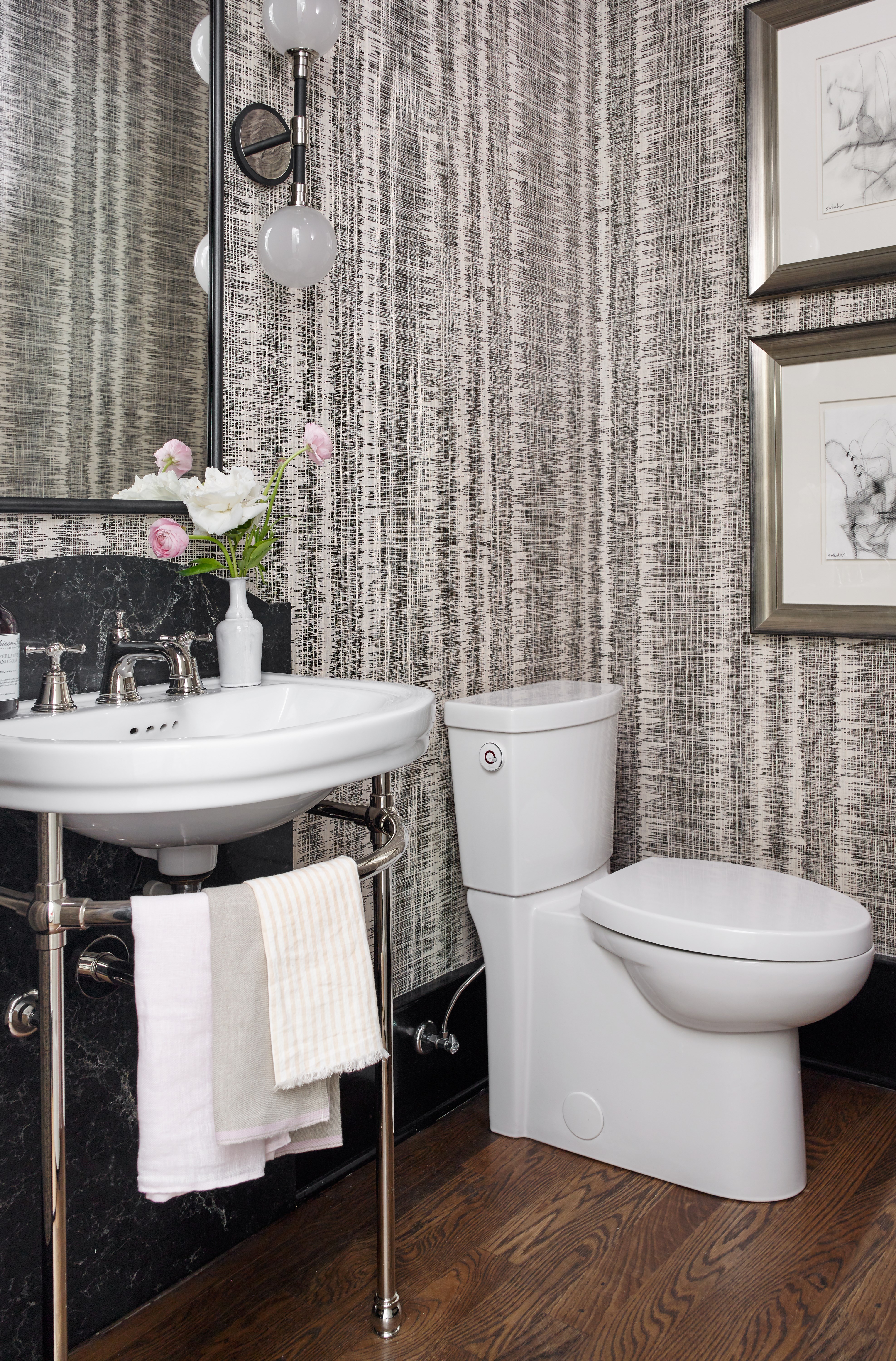
House Beautiful Kitchen of the Year 2016 | Design by Matthew Quinn | Andromeda wall sconce by Troy Lighting

With a powder room or bathroom, use lighting to add contrast and surprise. Traditionally the province of flush mounts and bath & vanity bars, wall sconces and pendants possess the potential to bring these important spaces to another level. Powder rooms have become places to take risks and go for whimsy and fantasy. The bathroom—especially the master bath—has shifted from a purely functional get-in, get-out space to a center of sensuous self-care in the age of information overload, becoming a room in which to invest more energy and expenditure.

The powder room above, a couple years old now, uses the ahead-of-trend Carbide Black & Polished Nickel contrast in the Andromeda sconces. It's a good idea to opt for a fixture that has diffusers like the Andromeda; opaque, opal-etched glass shades or clear ones pressed with a prismatic surface spread light evenly while preserving its intensity. Side-lighting a mirror like this helps to avoid shadows and glare, putting you or your guests in the best light possible.


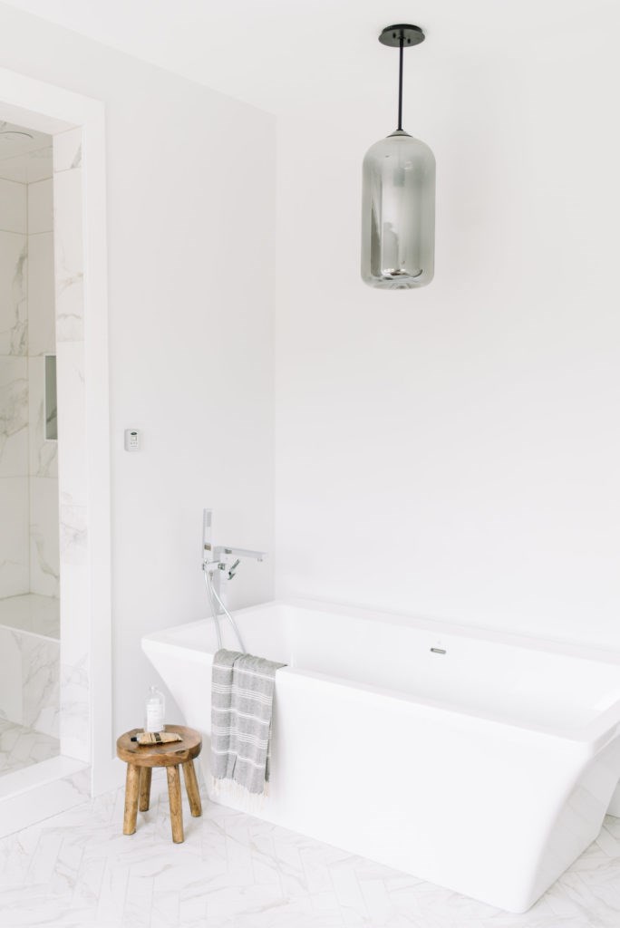
Design Kristina Lynne | Photo by Tracey Jazmin | District pendant by Troy Lighting

This bath space is a beautiful example of the light/white/bright style in favor today. The smoke-glass diffuser and tubular exposed-filament of the District pendant have enough warmth, authenticity, and darkness to give the space that needed bit of contrast, while its simple lines fit in effortlessly with the contemporary scheme. In this context, the shape of its shade resembles a bottle of luxurious bubble-bath oil. Asked about this space in a MyDomaine piece highlighting several rooms with choice HVLG fixtures, the designer Kristina Lynne said, "I chose the District pendant from Troy Lighting for this bathroom because it was sleek and sexy. With the majority of the space being light and bright, I wanted something that would contrast well and grab people's attention. I love this pendant because it is simple and clean in design but the glass shade sets it apart."

Using a sophisticated pendant with a surprising sense of scale or interesting texture elevates the bath space. While bright light may be desired for hygiene, grooming, and other self-care, it's also entirely likely low lighting will be needed for a long relaxing soak in the tub. Never underestimate the power of installing all light fixtures on a dimmer. Even in a powder room, getting the right sense of warmth and intimacy is important.


Designer: Studio James Interiors | Odyssey pendants by Troy Lighting

Another place where lighting is important is in areas where guests might mingle. It's a subtle art to make people feel comfortable. There are things you can do with lighting to bring about conversations. To emphasize what we just stated, wiring all lighting to a dimmer switch is probably the single most important thing you can do. When lights are on full blast, their bright harsh glare blares at people, making them feel overexposed. Better to have an adjustable lighting source set at a height that gives consideration to this factor, creating an alluring sense of mystery. 

This is partly what makes pendants so great for over the kitchen island. Prepping meals, they serve as important task lights. But when company naturally congregates around this space, it's the right amount of illumination for conversation. Shades and diffusers sculpt the light to the task below and soften its impact on the people gathered near it. So in a kitchen with can lights in the ceiling serving as ambient light, versatile pendants above the island and other nearby surfaces, such as the breakfast nook or over the sink, shift between accent and task roles.

To figure out how much light you need, multiply the square footage of the countertop area by 2.5. This is the number of watts you'll need in traditional incandescent terms. Convert watts to lumens if needed. Then select pendants with sufficient output to accomplish your goal. Remember to leave 30" between the fixture base and the counter surface. 


Library pendant by Troy Lighting

In a living room, using a low-hanging pendant over a coffee table where furniture has been arranged to encourage conversation is a good strategy. In a thoughtfully put-together post on his blog BorealAbode, Juan SanDiego talks about how TVs have a tendency to make demands on furniture placement and decor; he suggests replacing its role as a focal point with a pendant in this way. Quoting Joey from an episode of Friends ("You don't have a TV?! What do you point all your furniture towards?"), Juan argues that TVs too often become the focal point of a room, especially living rooms.  For homes where TV isn't on every night, maybe these spaces should instead be set up in a way to subtly promote conversation when guests are over.

Juan suggests careful placement: "Too high and everything will be flooded with light. Too low and it will make your tea boil again. The sweet spot is 90 cm (35 in) above the coffee table."

He also carefully adds that "it’s not about getting rid of it. The key is to shift the focus of the room."


Design and Photo: Erin Conway of Kismet House | Bennington flush mounts by Troy Lighting

Which is exactly what Erin Conway of Kismet house did here with her own place. She has another hang-out space right around the corner from here, but in this space, you can see how the TV is there if desired, but behind chairs facing other furniture, and with a wall of art surrounding it. 

Flush mounts are not just for hallways, bathrooms, and backdoor/sidedoor entrances. Here, Conway took on the interesting planes of her home to get a versatile, engaging space. Her seventies-style beach house has some... let's say challenging... architecture. Her motto was to "embrace the quirk." And KA-POW!  In so doing, she made an inviting space, suited to a variety of moods and relaxation, from conversing with visiting family & friends to taking in a movie. You can see the "before" lighting fixtures she had in this space from her domino takeover

From electrical wiring capabilities to budgetary constraints, projects have limitations that may guide lighting choices. While she may or may not have been able to use a pendant with a hang-straight canopy along the vaulted ceiling to light the space or add another layer of light, she opted for three flush mounts along the part of the ceiling that runs parallel to the floor. These Bennington fixtures add texture to the space with their layers and intriguing glass, while their Forged Bronze finish complements the dark moody green of the accent wall. They also serve as a kind of runway to her workspace, from which one might presume she runs her Kismet House empire. 

Flush mounts may serve as a primary ambient source of light or an accent, depending on what other layers are present. In spaces like this where there are different ceiling heights, use flush and semi-flush mounts to provide another lighting option, save space, and add textural diversity and stylistic complements. From a decorative standpoint, this lifts the design to the ceiling, brings the eye up, and makes for a more complete, unified space. 

When installing flush mounts along a ceiling, whether in a hallway, or a space like this, leave about 10 feet of space between flush mounts. 


Design and Photo: Erin Conway of Kismet House

Thanks for reading! We hope these tips have been helpful or inspiring to you!