BRANDS
  • View All
BRANDS
  • View All
BRANDS
  • View All
FIND A SHOWROOM
BUY ONLINE
INSPIRATION
Products
Brands
Where to Buy
Search
Five Questions with Carrie Shay

A Welcoming Space With Shabby-Chic-Meets-Farmhouse-Style Vibes

Midcentury Mitzi

The MCM Theme in Mitzi's Latest

One Room Challenge Revelations

Big Reveals From HVLG-ORC Partners

May 16, 2019
img

One Room Challenge Revelations

Big Reveals From HVLG-ORC Partners

May 16, 2019

It's always easier to do hard work when you're lifted up by community. And renovating a room is very hard work. Thinking along these lines, the One Room Challenge was born. 

Now in its eighth year, the One Room Challenge promotes the work of twenty vetted/selected Featured Designers and a vast number of Guest Participants as they transform one room over a six-week period. Those performing the tranformations regularly blog and post once a week about the progress and the choices involved, while an enthusiastic online community sends moral support through likes and comments on blog and Instagram posts.  

No stranger to being featured in these stunning spaces, we're thrilled and humbled to have fixtures from all four Hudson Valley Lighting Group brands Troy, Corbett, Mitzi, and Hudson Valley Lighting in many of the rooms by Featured Designers and Guest Participants this year. A great new lighting fixture is an essential part of any transformation. To really appreciate how stunning these transformations are—and to understand the challenges presented by these single rooms—check out the blog posts by the designers and bloggers for each space by clicking the links on their names when they're introduced as well as following the embedded Instagram posts to explore their IG accounts.

Whether you love a calm neutral or white minimal space, or you're crazy for color and pattern, there's a lot here to love and get inspired by. Six weeks on from the April 3rd launch date for the Spring 2019 ORC, the reveals are live, and with that, let's dig into these dreamy, delicious spaces!


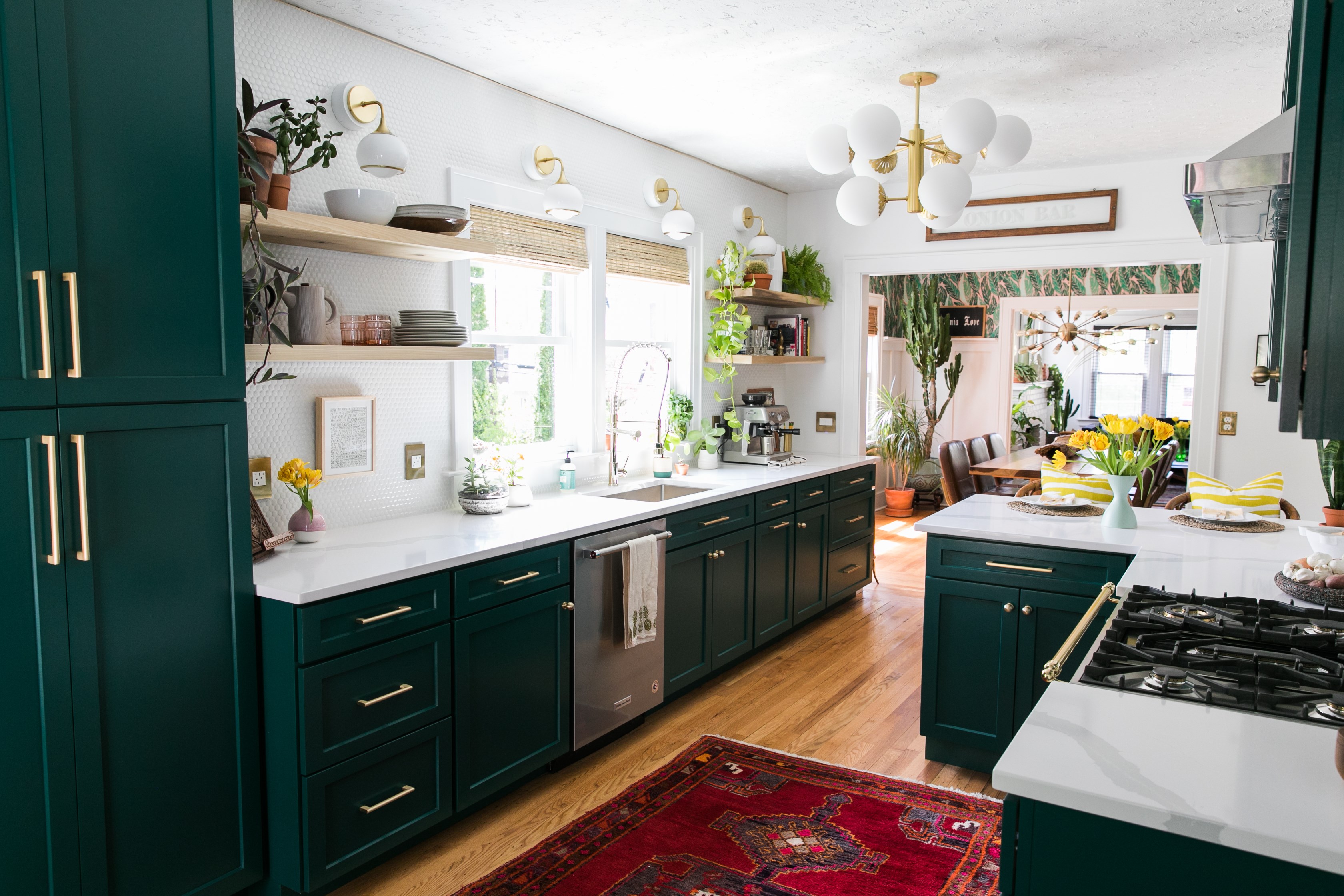
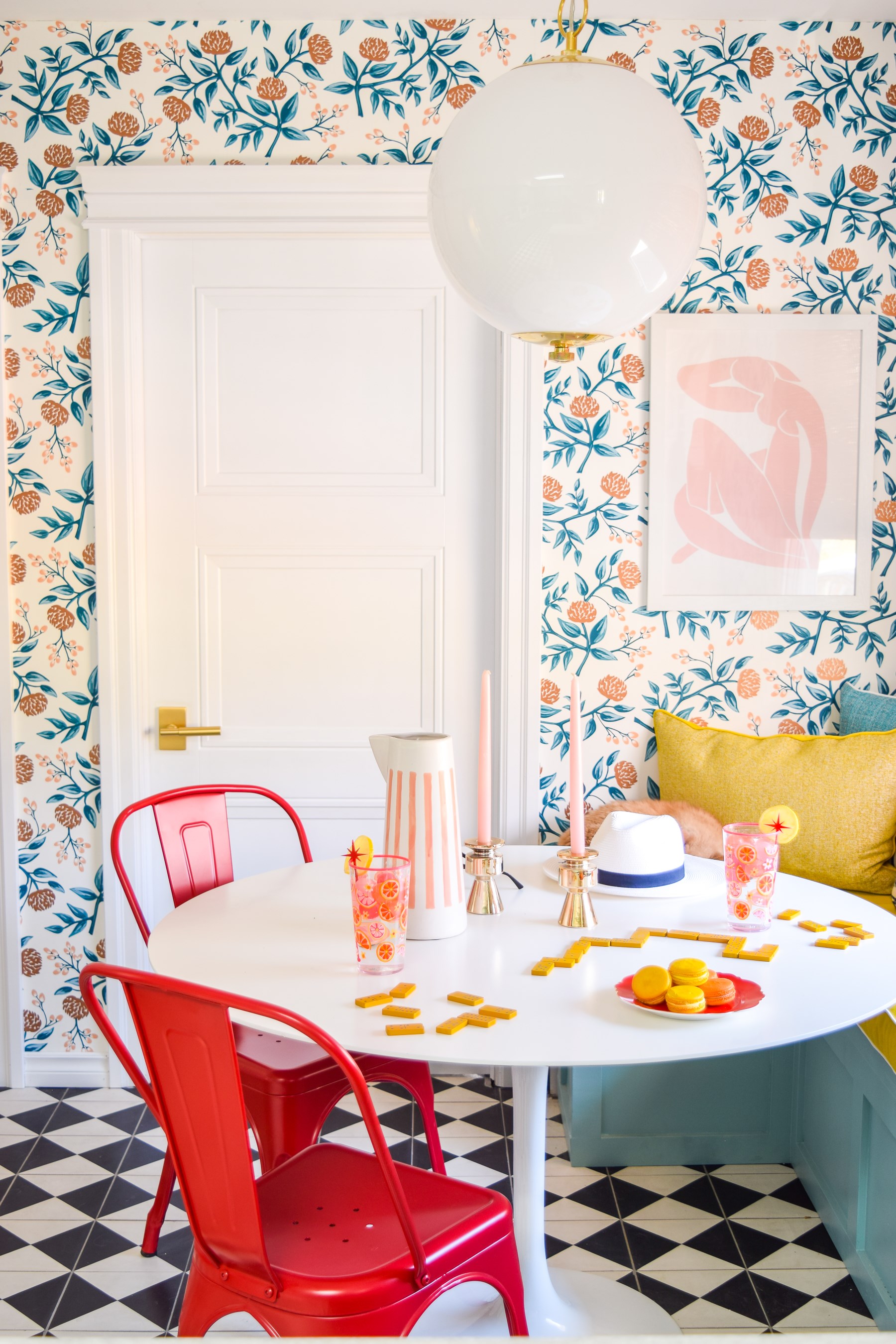
Designer & Homeowner: Ariel Garneau of PMQ for Two | Light: Sphere No. 1 by Mark D. Sikes for Hudson Valley Lighting

House of Jade Interiors took on the kitchen. The catalyzing force for this transformation was The Big Chill—the awesome appliance company, not the quintessential film about boomers. Once you raise the game that much in a room, you got to move everything up to meet it. House of Jade used the The Big Chill's Classic Stove, and needed something equally classic in the same sightline.

If you're looking for something classic, where better to start than our debut collection with Mark D. Sikes, CLASSICS? That's just what House of Jade did here, bringing some Metal No. 1 into the mix. Nearby Hudson Valley staples Pelham and Gaines provided some beautiful task and accent light with our distinctive Aged Brass finish and updating of industrial forms, which is always a good look to bring into play with farmhouse style.  

Upstate New York represent!  The Farmhouse Project took on one of five (5!) bedrooms as part of their ongoing reclamation of an upstate New York farmhouse. These gents, Shawn and Kris, made an amazing space with a lot of character and charm. Every room has its genesis point, and for these fellas, it was this lush chinoiserie pattern wallpaper, Tori, in teal, from Graham & Brown.

Shawn and Kris are not just a couple of talented gentlemen who love fine things, they are a true lifestyle brand, trying to bring the upstate shop-local-think-global ethos to life in all they do. This space wonderfully incorporates both vintage antique items and brand new pretty things. One of the brand new pretty things is our Brasher chandelier, from nearby Hudson Valley Lighting, with its hooked and handpoured panels of textural glass. We love the way it plays against the chinoiserie wallpaper and the more historic elements in the space. And the medallion around the canopy, in the same dark, enveloping hue as the rest of the ceiling? Soooo good. We're ready to spend the night—or maybe the whole weekend.  

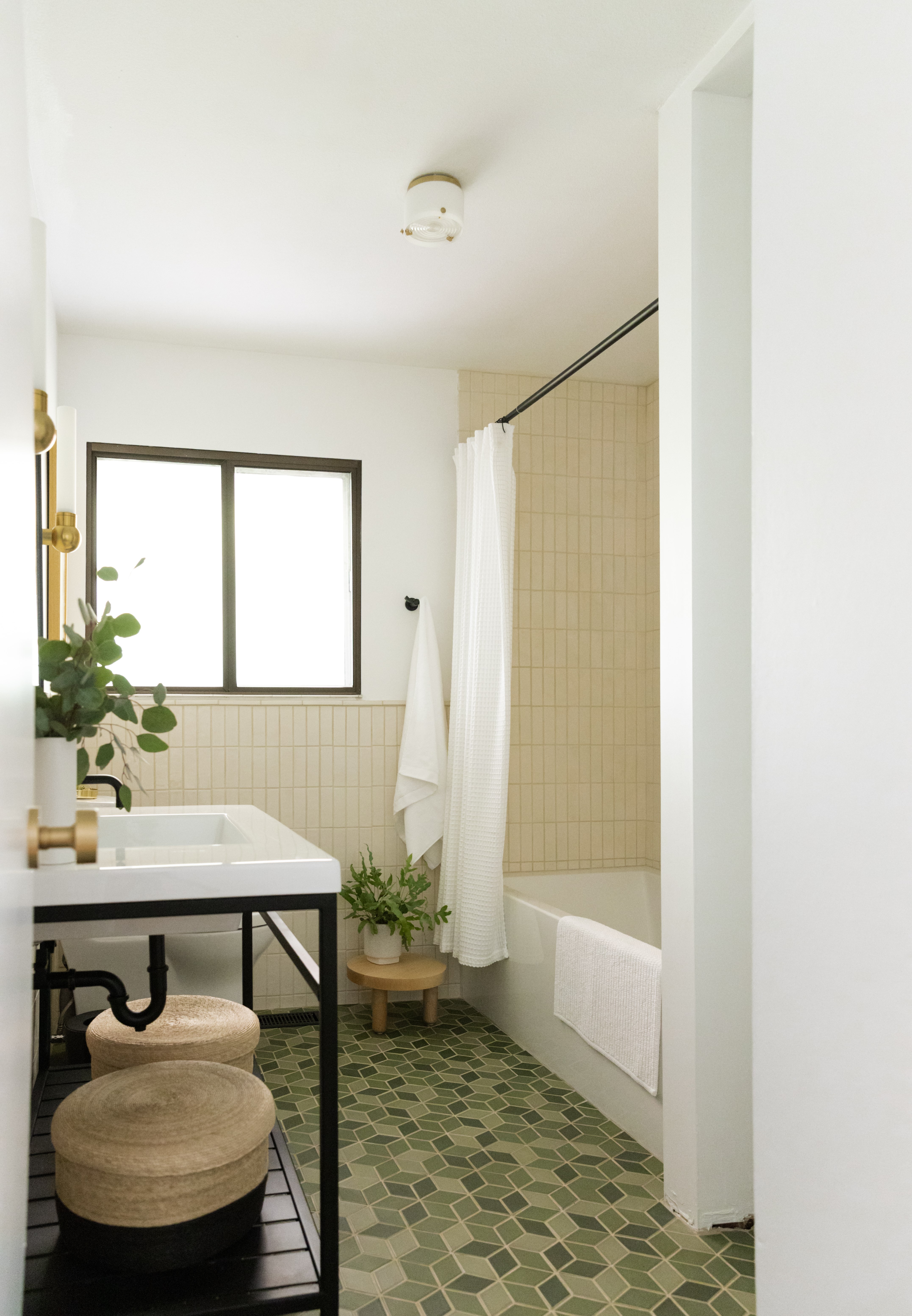
Casey Keasler of Casework put on her Carhardts and went to work. In 2017, she bought a 1966 ranch-meets-bungalow-style home, which she has dubbed "the ranchalow," and has been redoing one room at a time while running an interior design + architecture business in Portland, Oregon. She took the hammer to her one-and-only bathroom for the One Room Challenge, fast-tracking a project she usually allots double-to-triple the time for when dealing with clients. Talk about a leap of faith! 

View this post on Instagram

BEFORE & AFTER TIME! Thanks to the @oneroomchallenge the #ckranchalow got a major refresh. The past month I’ve been busy transforming my dated and worn bathroom to something that feels more current. Swipe to see the before! ——> Lighting plays a huge role in a remodel and the right placement is key. I switched the single overhead sconce to two @hudsonvalleylighting sconces on each side of the mirror at eye level. This provides more even and consistent light instead of overhead shadows. Head to the link in my profile and check out Week 3 to find the ideal placement (including dimensions) for bathroom sconces. And be sure to check out the hard work by the other ORC designers, they are impressive! • • • • • • • @athomewithashley @casavilora @thefarmhouseproject @homemadebycarmona @houseoffunkdesign @houseofjadeinteriors @housesevendesign @houselarsbuilt @imjessicabrigham @inspiredbycharm @janabekdesign @kellygolightly @murphydeesign @thepinkpagoda @sarahgunnstyle @sarahmdorseydesigns @sherryhdesigns @sugarandcloth @vintagerevivals @betterhomesandgardens @oneroomchallenge #oneroomchallenge #BHGORC • • • • • • • #CASEWORKIT #interior #interiors #interiordesign #interiorarchitecture #homedecor #decor #homedesign #remodel #interiorlovers #neutralhome #tile #prattandlarson #hudsonvalleylighting #bathroom #bathroomdesign #bath #bathroomremodel #sink #tile #banheiro #banyo #shower #tiles #renovation

A post shared by Casey Keasler (@casework.it) on

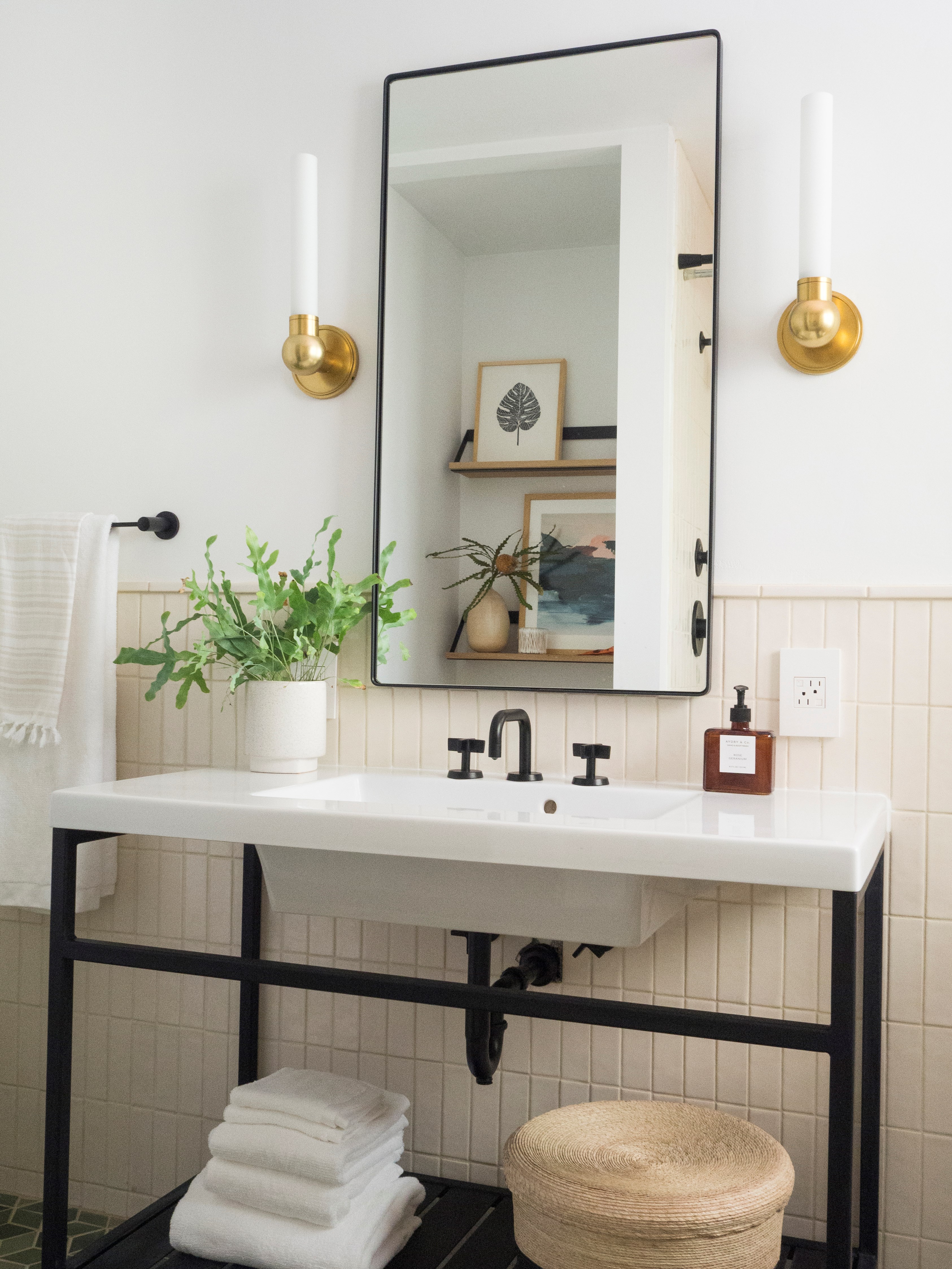
As one of the 20 Featured Designers of this spring's ORC and a consummate professional, Casey also took time to answer questions on her IG and write some of the most useful, thoughtful, and thorough blog posts on what she was doing, like this invaluable one from week 3 on how to plan a vanity. She narrowed down all of our sconces to 13 to choose from before picking our Cornwall as her new bath and vanity fixture:

"Because my space is small and the profile of the sconce is as important as seeing it from the front, the Cornwall won! I love the brass finish and classic details that take inspiration from a 20th-century apothecary sink with the pipe and ball metalwork. It’s timeless and modern at the same time!"   

Be sure to check out her blog for the full story and the amazing before-and-afters. (You can also get a quick breakdown of the whole process in Instagram Story form at Casey's archived ORC Story here. It's pretty amazing.)


Design: Casey Keasler of Casework Interior Design | Blackwell Flush Mount by Hudson Valley Lighting


Design: Casey Keasler of Casework Interior Design | Light: Cornwall by Hudson Valley Lighting

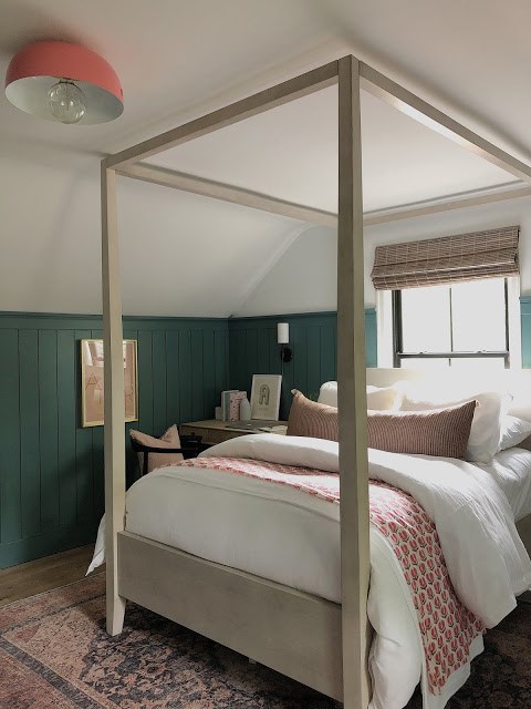
Anissa of House Seven took on her teenage daughter's space. Given the instruction by her daughter to make the space a bit more grown-up, Anissa made a beautiful, functional room that takes into consideration what an important space your bedroom is to you and when you're a teenage girl. The beautiful hue of the walls, made by doing a color match with the darkest part of the wallpaper but made 10% darker, sets the tone, and a fourposter bed with a serious pillow game helps the room grow up a little bit. Work and rest are both accomodated with a window alcove with swinging chair and a great desk space for homework and art. Olivia sconces and an Avery flush mount in Old Bronze and Pink courtesy of Mitzi by HVL feel like the perfect fit for this space and its young occupant.


House Seven Design | Avery Semi-flush Mount by Mitzi


House Seven Design | Olivia Sconce by Mitzi

Sandra of House of Funk Design also took on her daughter's room. Her daughter wanted a tent-like bed situation to retreat to and a good set-up for reading. Sandra totally nailed it in a stunning transformation: Troy's Hideaway pendant makes this the ideal "hygge hideaway" and the adjustable Roslyn wall sconce and Girard floor lamp by Hudson Valley Lighting are perfect for hours of reading, whether it's in a big cozy chair or the tent-like retreat of bed. Most importantly, it expresses her daughter's personality! Check out the before and afters. 

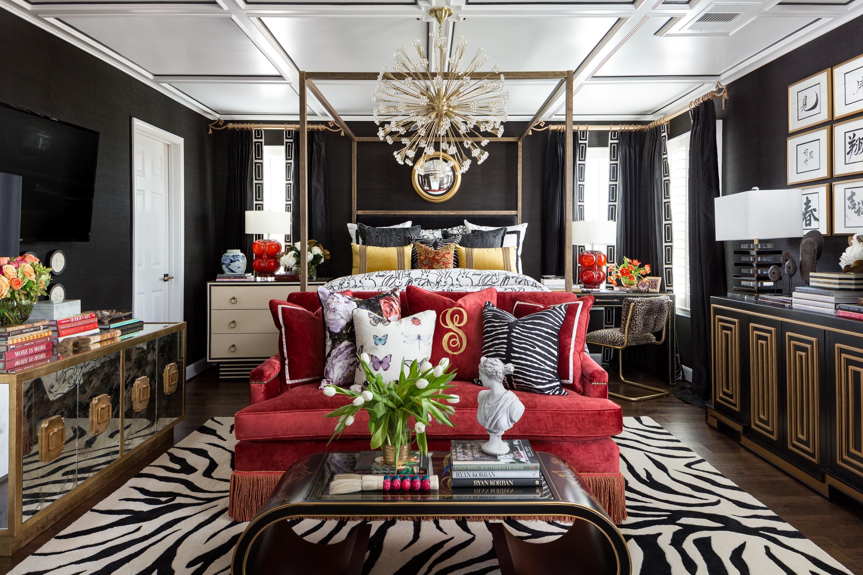
Veronica Solomon of Casa Vilora gave her bedroom the moody maximalist makeover she's been waiting for, transforming it into a space that feels totally her. Click the link on her name to get the full reveal and see the before and afters, because it's incredible. One of the ORC's 20 Featured Designers as well as one of Dwell's recent "9 Brilliant Black Designers and Architects You Should Know," Veronica brought the glamour and the drama  to the max with our Dunkirk chandelier by Hudson Valley Lighting. But that was really just the icing on the cake. Black grass-cloth wallpaper, black silk window treatments, a canopy bed SHE designed and had custom-made by S&L Designs—the layers and textures and details in this room just boggle the mind. Veronica gives a shout out to Miles Redd as an influence and you can see it here in all the best ways. Sometimes more really is more, and who doesn't want more in this space? 


Homeowner: Veronica Solomon of Casa Vilora Interiors | Photo: Colleen Scott | Light: Dunkirk by HVL

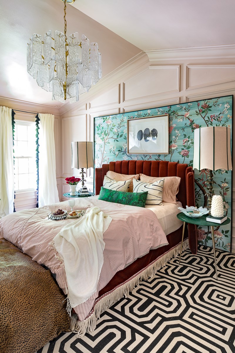
Jewel of Jeweled Interiors also sought to make the bedroom of her dreams come to life. Like Veronica, she layered textures, going for an idiosyncratic maximalism. We love her bold use of color and pattern, often in layers of contrasting texture. How about you?

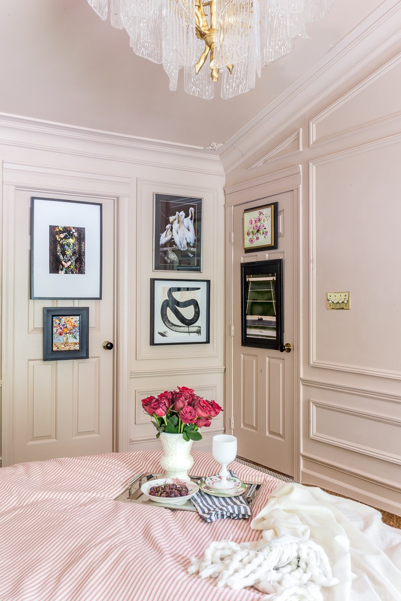
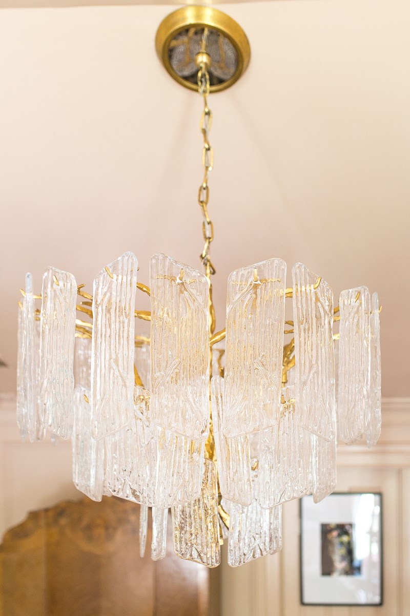
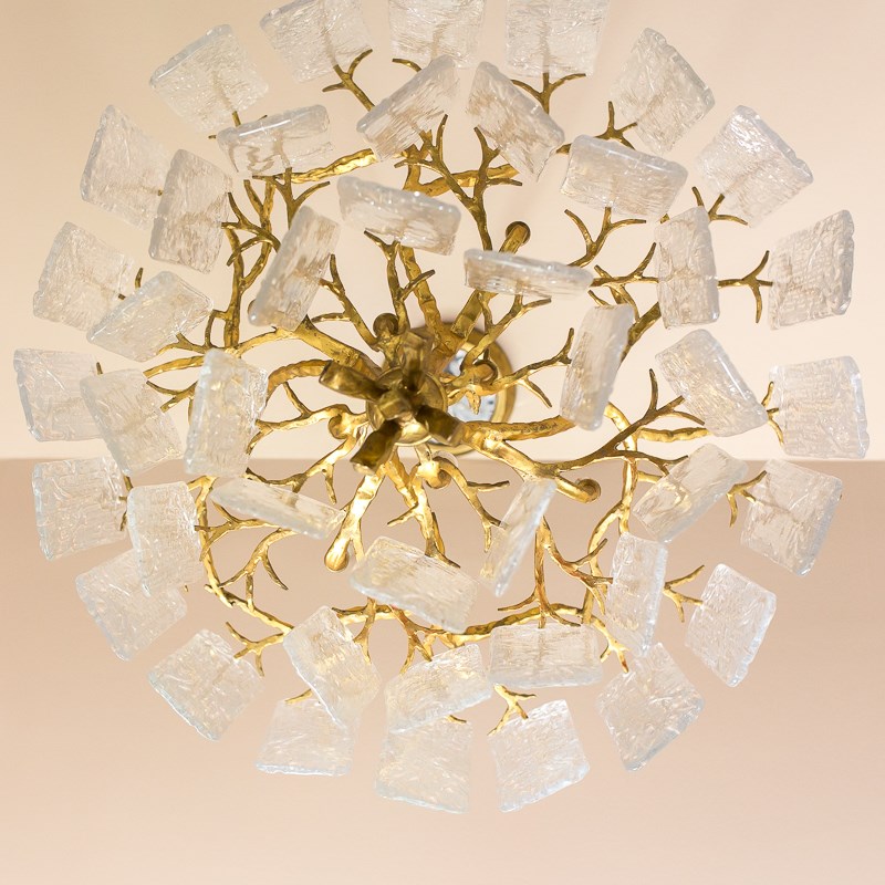
She also wanted something dramatic for the lighting, but without traditional crystals, and she was hoping for a little Art Deco in there. Jewel decided to use the Piemonte chandelier by Corbett Lighting. A crucial part of any room transformation is new lighting, but there may never have been an upgrade as enormous as Jewel's vaulting jump from the space's existing ceiling fan with lights to the handmade artisanal Piemonte chandelier in Royal Gold with individually crafted panels of textured glass.


Design & Home: Jewel of Jewel Interiors | Chandelier: Piemonte by Corbett Lighting

An interesting challenge was that she needed to be able to suspend this beauty from a cathedral ceiling with a slight gradient. At Corbett, we pride ourselves on designing from base to canopy; Piemonte has a hang-straight canopy that ties into the rest of the design beautifully for a harmonious sense of unity. 

Ursula Carmona of Home Made by Carmona, one of this spring's 20 Featured Designers in the ORC, was looking to transform her living room. Ursula's waylaid renovation plans put the "challenge" in One Room Challenge, but she still made a lot of creative, bright, and beautiful changes to her space. Her ultimate vision requires some work that falls outside the six weeks of the challenge. Rather than compromise, she'll make them down the line. In the meanwhile, the room got a deep refresh. Garden City adjustable wall sconces in Aged Brass added a lot to the space and Margot semi-flush mounts were a great way to satisfy the spatial demands of the room without sacrificing looks or quality along the way. 


Homeowner: Ursula Carmona of Home Made by Carmona


Homeowner: Ursula Carmona of Home Made by Carmona

Now let's get into some glamorous kitchen renovations, shall we? The before-and-afters on these are incredible. Like, seriously jawdropping. Bless whoever invented the swipe feature on Instagram. 

First up, here's  Dee Murphy of Murphy Deesign. It's hard to overstate what a beautiful, unexpected element that reclaimed wood ceiling of unfinished oak is, and how much it changes the space. Wow! Many other awesome choices here from stove to rug to stool. We love how our adustable Hillsdale sconce illuminates the sink situation. It's customary to keep the dishes with the linen, so its shade of linen is in the right spot to make washing them a more enjoyable experience. Dee says: "Making quite a statement of her own is the Hudson Valley Lighting Hillsdale Wall Sconce. You will see more photos from the side, showing her perfect angles and drama. I just love me some traditional vs. modern tango, don’t you?"


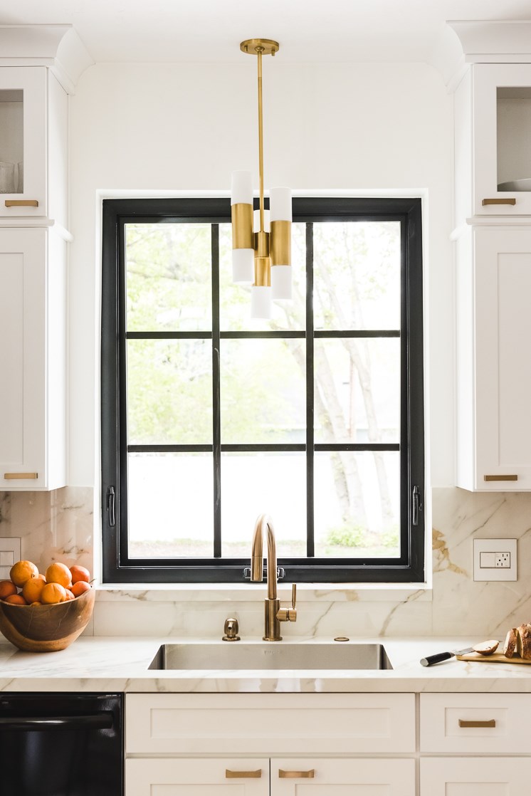
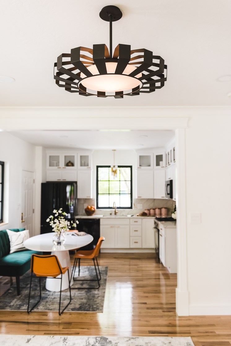
True to her company name, Kathy of Up to Date Interiors brought her open kitchen dining space up-to-date with the timeless elegance and modern lines of our Dillon chandelier. As part of a military family who has to move fairly often, Kathy has developed all kinds of crafty ways to personalize a space and make it home, however temporary. She applied some of her customary magic here.

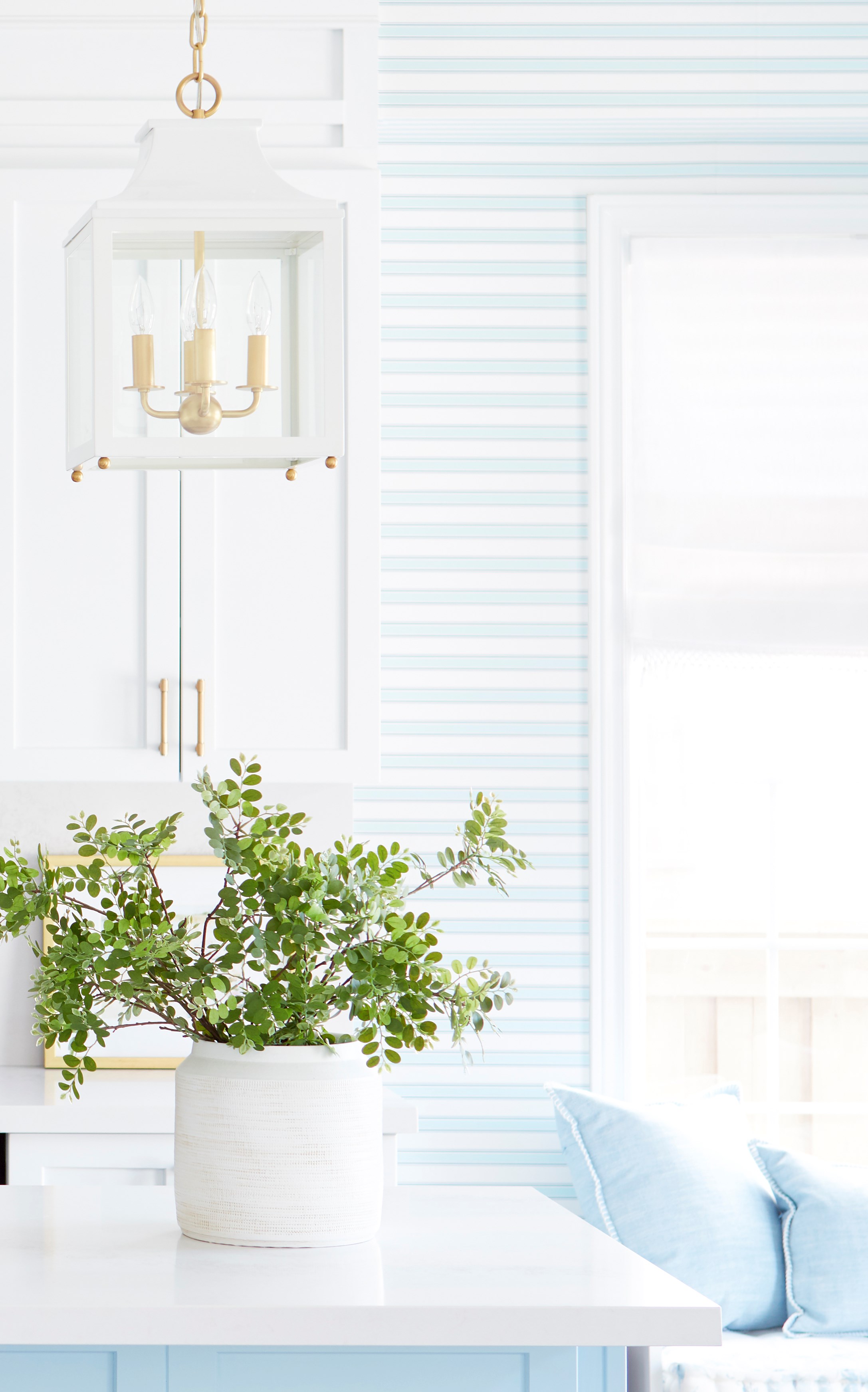
Sarah Gunn also took on her kitchen and made it feel like her. Self-described as a "lover of all things pastel and pretty," Sarah took her kitchen out of the dark ages (or at least a dark phase), putting a pretty pastel blue to use along with plenty of white and brass. The white-and-brass combo of Leigh lanterns by Mitzi over the island for task lighting and a Geneva flush mount by Hudson Valley Lighting for the ambient layer are the perfect fit for this space, and help toward that goal of being pretty, pretty, pretty.


Designer & Homeowner: Sarah Gunn | Leigh lantern by Mitzi

Brittany & Co. at The House That Lars Built took on their business director, Mary's kitchen. Go ahead: Stop drooling and swipe that Before & After below. We dare you. Add that six-week timeline again and this is the stuff that kitchen reno dreams (and nightmares) are made of. Obviously, there's a lot here so we urge you to click on the link above to get the full story, the useful insider tips, and all the glorious pictures. But we're happy our Lola pendant by Mitzi and Impulse pendant by Troy were able to be a part of such a gorgeous kitchen, HVL Martini forthcoming (shaken, not stirred).


Photo & Design by Brittany Watson Jepsen of The House That Lars Built | Lola pendant by Mitzi


Design & Photo by Brittany Watson Jepsen of The House that Lars Built | Impulse pendant by Troy

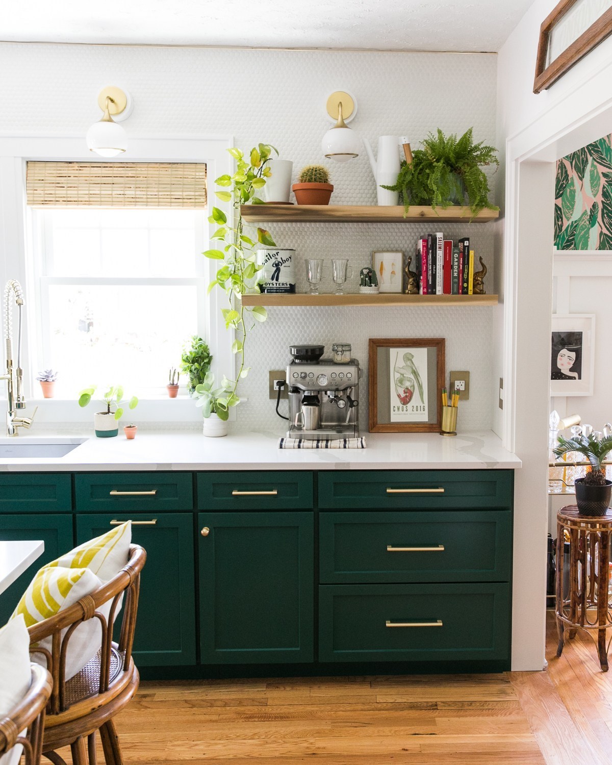
And hey, while we're looking at beautiful kitchens, ARE YOU READY TO GO GLAM? Are you ready to be GREEN with envy? Because up next is the GREEN GLAMAZON kitchen remodel by Jessica Brigham.

View this post on Instagram

Holy biscuits and gravy ... Are you ready for THIS?!!!! 🤩🤩🤩 I sure as 💩 am! PINCH ME PLZZZZ to prove this green kitchen glamazon ain't a dream!! 🦀 Hubby surprised this recovering renovator with dry-aged steaks to break in the new digs yestereve. And I'll say; some damn good digs, indeed!!! 🥩🍳🥙 ⠀⠀ ⠀⠀ This kitchen renovation (let's be realsies—restoration) is, hands down, beyond my wildest dreams 🤯 BUT THOSE ORIGINAL RED OAK FLOORS THO!! This 1934 Craftsman Bungalow is glllleaming with good vibes. ✨⠀⠀ ⠀⠀ GIRL, you just ain't seen nuthin' yet!! I won't give up another lick 😚 so I suggest you find yo'self over to the blog in two shakes of a lambs tail for the whole SHEBANG!!! 💥💥💥 ⠀⠀ ⠀⠀ www.jessicabrigham.com⠀⠀ ⠀⠀ ❌⭕️,⠀⠀ Jessica⠀⠀ ⠀⠀ ⠀⠀ CHECK OUT THE REVEALS!! 🍊⠀⠀ ⁣@athomewithashley⁣⠀⁣⠀⁣⠀⠀ @casavilora⁣⠀⁣⠀⁣⠀⠀ @casework.it⁣⠀⁣⠀⁣⠀⠀ @thefarmhouseproject⁣⠀⁣⠀⁣⠀⠀ @homemadebycarmona⁣⠀⁣⠀⁣⠀⠀ @houseoffunkdesign⁣⠀⁣⠀⁣⠀⠀ @houseofjadeinteriors⁣⠀⁣⠀⁣⠀⠀ @housesevendesign⁣⠀⁣⠀⁣⠀⠀ @houselarsbuilt⁣⠀⁣⠀⁣⠀⠀ @imjessicabrigham⁣⠀⁣⠀⁣⠀⠀ @inspiredbycharm⁣⠀⁣⠀⁣⠀⠀ @janabekdesign⁣⠀⁣⠀⁣⠀⠀ @kellygolightly⁣⠀⁣⠀⁣⠀⠀ @murphydeesign⁣⠀⁣⠀⁣⠀⠀ @thepinkpagoda⁣⠀⁣⠀⁣⠀⠀ @sarahgunnstyle⁣⠀⁣⠀⁣⠀⠀ @sarahmdorseydesigns⁣⠀⁣⠀⁣⠀⠀ @sherryhdesigns⁣⠀⁣⠀⁣⠀⠀ @sugarandcloth⁣⠀⁣⠀⁣⠀⠀ @vintagerevivals⁣⠀⁣⠀⁣⠀⠀ @betterhomesandgardens⁣⠀⁣⠀⁣⠀⠀ @oneroomchallenge⁣⠀⁣⠀⁣⠀⠀ #oneroomchallenge⁣⠀⁣⠀⁣⠀⠀ #BHGORC⁣⠀⁣⠀⁣⠀⠀ ⠀⠀ ⠀⠀ #myboldhues #designmilk #greenkitchen #architecturephotography #mytradhome #interiorfinishing #moreismoredecor #foundandforaged #finditstyleit #houseandgarden #vogueliving #frenchapartment #elledecor #purple #traditionalhome #architectualdigest #interieur #interiores #chicdecor #stripes #eclecticdecor #stellarspaces #heyhomehey #brightboldhome #pocketofmyhome #bhgstylemaker #homelove

A post shared by Jessica Brigham | MRFL (@imjessicabrigham) on

Jessica has a 1934 Craftsman Bungalow. She wanted to restore this kitchen to its former glory while making it green, glamorous, and one heck of a space to cook, eat, and drink. Check out her page for the ins and outs, as there's a lot to love here. She also explains why she chose Mitzi and what she loves about her choices: the Paige chandelier and Reese sconces you see below.


Image, Home, Design: Jessica Brigham | Lights by Mitzi

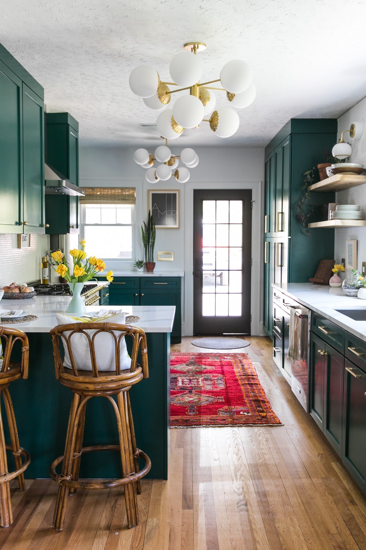
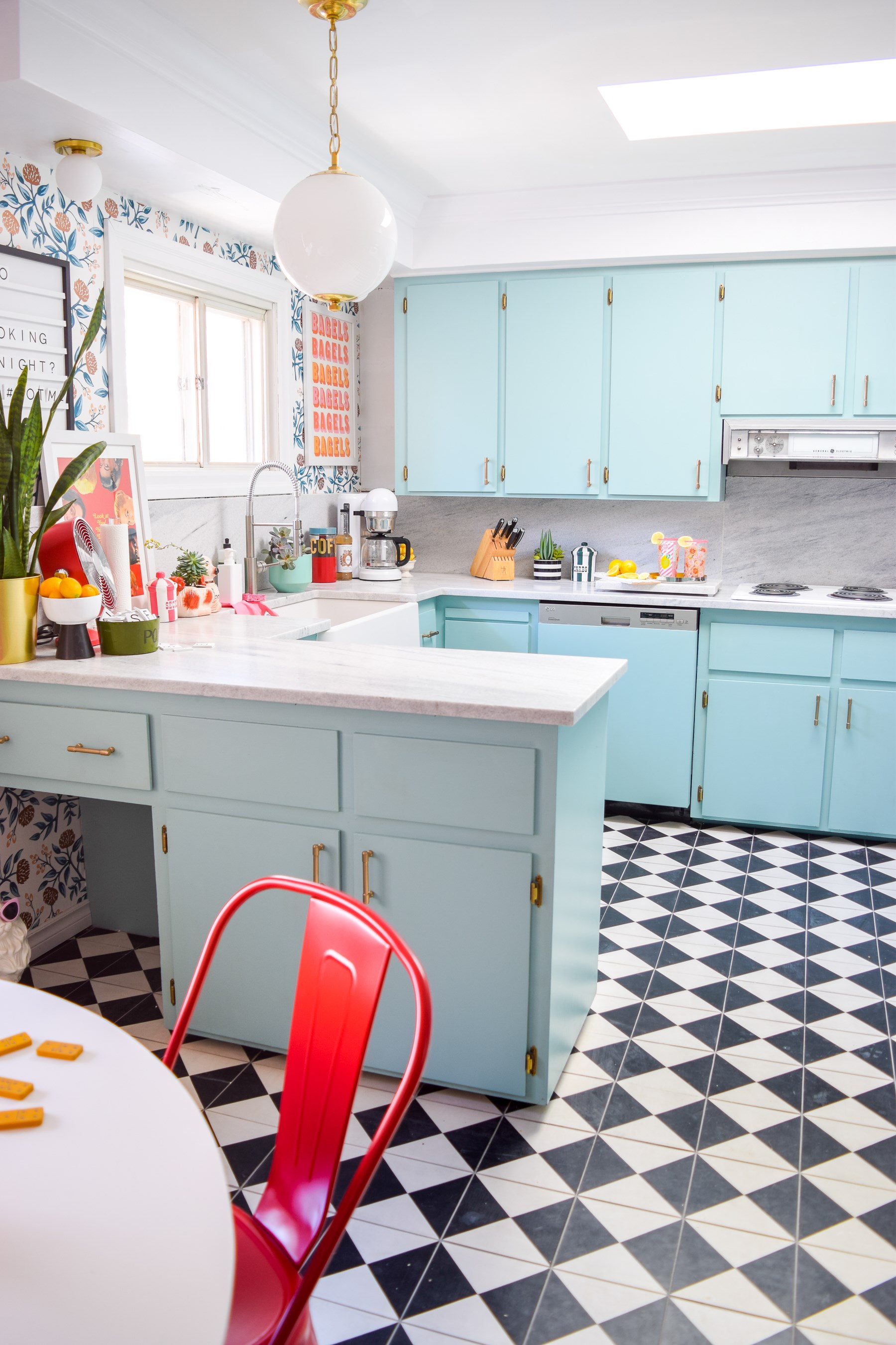
Not that Jessica is the only one who did a bold, colorful kitchen with some glamour. We're swooning over the one Ariel cooked up with her husband Dan in Canada in their PMQ for Two (soon to be three!). 

Ariel wanted to redo their kitchen in a way that was both retro and glam, mid-century modern seen through a contemporary kaleidoscope. It took vision, guts, and hard work, but wow, look at those results!


Homeowner & Designer: Ariel Garneau of PMQ for Two | Lights: Sphere No. 1 and Baird

Ariel and Dan put the Sphere No.1 collection from our Mark D. Sikes for Hudson Valley Lighting CLASSICS line to good use, hanging two in different sizes—one above the table and one above the counter. They wind up feeling so approachable in the space. Their spherical diffusers are echoed by Hudson Valley Lighting's Baird 9081-AGB, which can be installed as a flush mount or a wall sconce. 

There's even more, if you can believe it, which we'll be sure to share later. We trust you may be as exhausted as us by now—the eye can only take so much gorgeous before it needs to rest. 

Thanks for reading and check back soon for more One Room wonders from this spring's wonderful Challenge.