From the most delicate petal of a garden-fence rose to the inner-ear swirl of a sea-tossed conch, Nature paints in pinks so subtle and intimate, the best word we have for them is "blush."
While it may be easy to find in the outdoors, blush hasn't been popular in a long time indoors. This year, it's made a terrific comeback, working in a number of styles and settings. Blush as a cool color for interiors was probably last seen in the eighties. Now, a variety of interiors enchant with some shade of blush, whether in the walls' paint color, the furniture, or some other feature.
![]()
Blush pairs with ornate, heavy molding and with bold textures or patterns, providing rich contrast with its delicate air.

Photograph by Brittany Ambridge | Via Domino
Shades of blush are equally at home in traditional settings or contemporary contexts. When a shade of blush coats the walls (say Farrow & Ball's Pink Ground, for example), it creates the context. How does a certain lamp, or chaise, or mirror come across in a room that is a gentle shade of blush? How might these very same items register differently in a room that is white or Mediterranean blue, or features emerald or olive green? Or dark grey, for that matter?

Speaking of which, blush and grey work beautifully together, creating an even, muted backdrop, which brass and gold elevate. They also allow the choices of import to emerge in the textures and details. With no colors shouting for your attention, the eye lands on the fuzziness of a throw, the gleam of a mirror, the metals and materials chosen, the pattern of the floorboards or the texture of the area rug.
These two pictures illustrate this perfectly. Also evident is the versatility of style to which blush & grey adapt.


Image via Kate Forman, showcasing their Charcoal Stripe upholstery
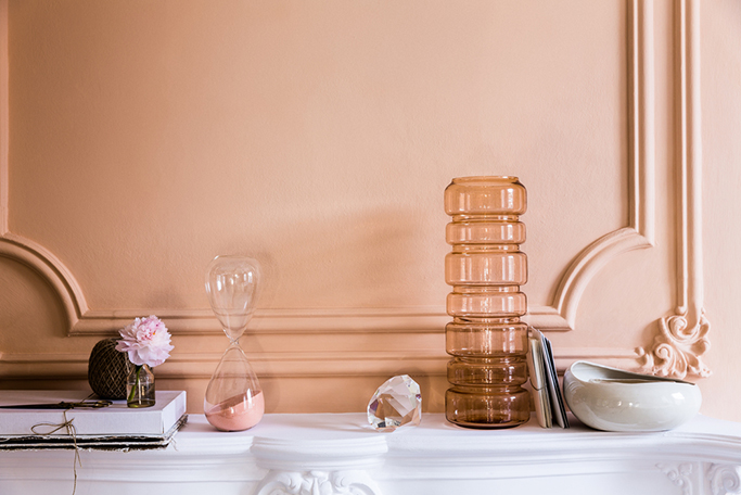
A floor-length mirror, a Louis's lines, a gold-painted timeworn frame, and an antiqued pane all add a delicious touch to the blush-based room. Elements like marble & stone, fresh flowers & candles all spruce up the room's vibe, working with blush's innate tranquility to create a sense of calm and poise.

Pale Pink Satin by Benjamin Moore
But blush doesn't need to be put to work with white and light interiors to leverage its charms. Its smart, arty side invites one to contemplate in a dark setting, as seen here:

When Dulux announced Copper Blush as its color of the year for 2015, they showcased how complementary it is with copper and organic, wooden forms. Their images below (and above as the featured image for this post) showcase this quality.


If painting a room blush feels like too much of a commitment, pop it in with the furniture.

Photograph by Jeremy Harwell of his own home | Via Decor8
Or, set a defined section for it. Blush adds a lot to a space when used in an unexpected spot, such as the inside-facing expanse of a door, or as backsplash tile in a kitchen. In the picture below, the point is made clear again: something about thick molding and blush just works.


Design by Fiona Lynch
Since blush as we understand it today has at least some of its provenance in the world of makeup, it should come as no surprise it makes for a lovely mood in a bath setting and adjoining powder room. The Dulux Copper Blush shoot provides more inspiration:

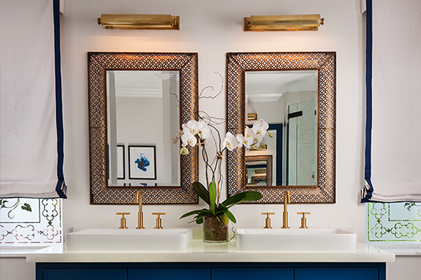
In the below image, chevron-tile floors, an acrylic chair, plenty of brass, and our Essex sconces come together with a blush-like lavender-pink for a completely on-trend powder room vanity setting.

You can mix pieces from very different epochs in a space using a restrained and gentle blush palette. Similarly, fixtures from across the style spectrum work in a subdued blush-toned space. If you seek out blush interior images online, you may notice that chandeliers, lamps, and sconces play a pivotal role in interacting with the delicate hue to make a style statement.
Crystal pieces, with strings of faceted beadwork, partner with blush accents or walls for immediate impact. A world of luxury and relaxation is suggested. Rooms reaching in other directions may find glass pieces with interesting shapes or acrylic pieces with brass joinery essential to their effect. Something like our Knox nudges the room in a mid-century modern direction, while our Crawford lends an old world elegance.

So smitten with blush were we that it wasn't enough to complement it, we made two of our recent fixtures, Pomfret and Rousseau, available with a blushy pink glass diffuser.

Left, Pomfret in Aged Brass | Right, Rousseau in Polished Chrome
Whatever your taste leans toward, suspending a chandelier or pendant in the right style for the space and complementing it with a table or floor lamp contribute to that special feeling—as if, upon entering the room, you're recalibrated, set at ease, and lifted ever so slightly.

Have you used blush in a room? Tell us all about it in the comments below.