.png)
Earlier this year, the color geniuses at Pantone compiled the Fall 2017 Pantone Fashion Color Report. Based on the runways from New York Fashion Week, the team predicted ten shades that would be huge in the autumn months. When asked about their predictions, Leatrice Eiseman, Executive Director of the Pantone Color Institute said:
“Bookended by a dynamic Grenadine red and a tawny Autumn Maple, the color palette for Fall 2017 leans more to warmth, “ says Eiseman. “While comforting, enveloping colors and ease are crucial to the seasonal feeling, standout shades include a pale pink Ballet Slipper, a refreshing Golden Lime, and a bright Marina blue. These hues add a striking touch when paired with the classic autumnal shades of Navy Peony, Neutral Gray, Butterrum and Tawny Port.”
The fashion and décor world always blend, especially when it comes to colors. With fall just around the corner, we selected our five favorite (and the most unexpected) shades and chose a few of our favorite rooms featuring them.
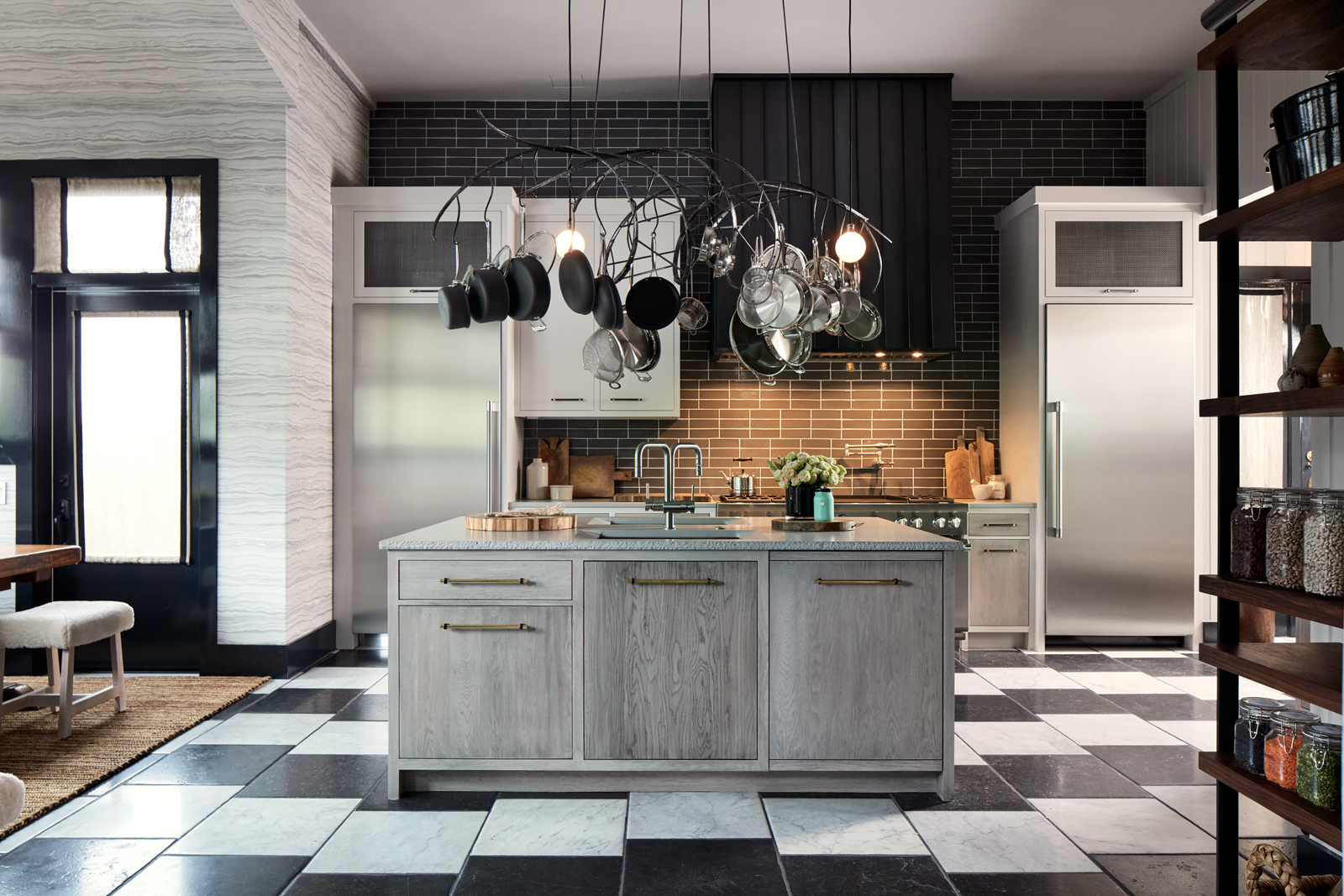
Neutral Gray

Swatch via Pantone | Photo: Salt Box Collective | Featured Fixture: Belmont Pendant
Greys are having their moment in décor, slowly becoming a favorite amongst paint colors. For people who are sick of white walls but don’t want to commit to a bold color choice, grey acts as a great in-between neutral. Elle Décor recently listed 20 Best Grey Paints and included grey walls on their list of 15 New Scandinavian Trends. Our friends at Salt Box Collective used grey alongside our Belmont pendants to create a beautifully clean and open kitchen.
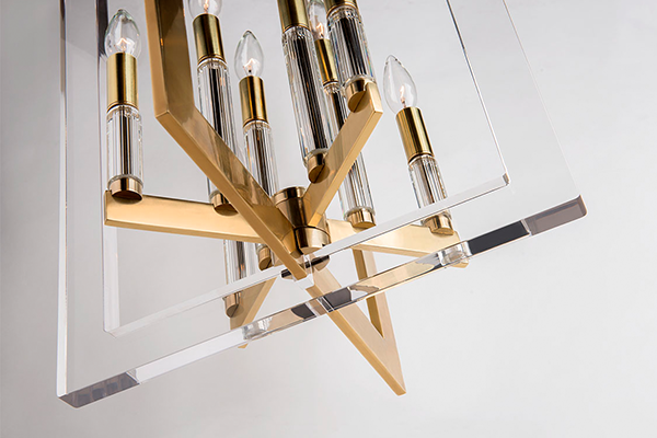
Shaded Spruce

Swatch via Pantone | Featured Fixture: Liberty Chandelier
Shaded Spruce is a beautiful dark teal-ish-green tone that exudes richness and decadence. While it is a bold choice, we think it pays off when it can be the star of the room, like the gorgeous chairs pictured above. Shaded Spruce might not be the best option for minimalists, but with the maximalist trend making a strong comeback, we think we’ll see a lot of this color.
Ballet Slippers

Swatch via Pantone | Photo: @goldalamode

Rousseau Pendant and Pomfret Pendant from Hudson Valley Lighting
Millennial pink, ballet slipper, blush—call them what you want, but pink shades are here to stay throughout all seasons. We love the pop of color dusty pink adds to blogger and stylist Cara Irwin’s front door. The shade is super versatile; it can work anywhere from your front door to lighting fixtures. The glow from our Rousseau and Pomfret pendants enhance the rose tone, especially when paired with shiny Aged Brass or Polished Chrome.
Golden Lime

Swatch via Patone | Featured Paint: Medieval Times by Benjamin Moore | Design: Corey Damen Jenkins for the DXV 2017 Design Panel | Featured Fixture: Marietta Pendant
One of our favorite designers Corey Damen Jenkins used a shade reminiscent of Golden Lime in his DXV 2017 Design showcase. Corey presented a glamorous bathroom adorned with our Marietta pendants and a beautiful bookcase. He used the tone—which some may consider out of the box—along with a funky toile wallpaper to redefine Classic Renaissance.
Marina

Swatch via Pantone | Photo: House Beautiful Kitchen of the Year 2016 | Design: Matthew Quinn | Photographer: Emily Followill | Featured Fixtures: Lewis Chandelier and Leyden Sconce
Definitely an unexpected color for the fall time, Marina is a crisp calming blue shade. The photo above of 2016’s House Beautiful Kitchen of the Year proves it contrasts well with brass tones and lovely whites. Pantone describes the tone as “cool with an enhanced vitality; Marina is the only truly cool color in the fall palette that brings with it freshness and brightness.”