BRANDS
  • View All
BRANDS
  • View All
BRANDS
  • View All
FIND A SHOWROOM
BUY ONLINE
INSPIRATION
Products
Brands
Where to Buy
Search
Southern Studio on Southern Style

A Ramble Through the Bramble

Kitchen Envy

These Spaces Have Us Green With It

House of Jade Takeover

A Classic Kitchen With an Airy Feel

September 24, 2019
img

House of Jade Takeover

A Classic Kitchen With an Airy Feel

September 24, 2019

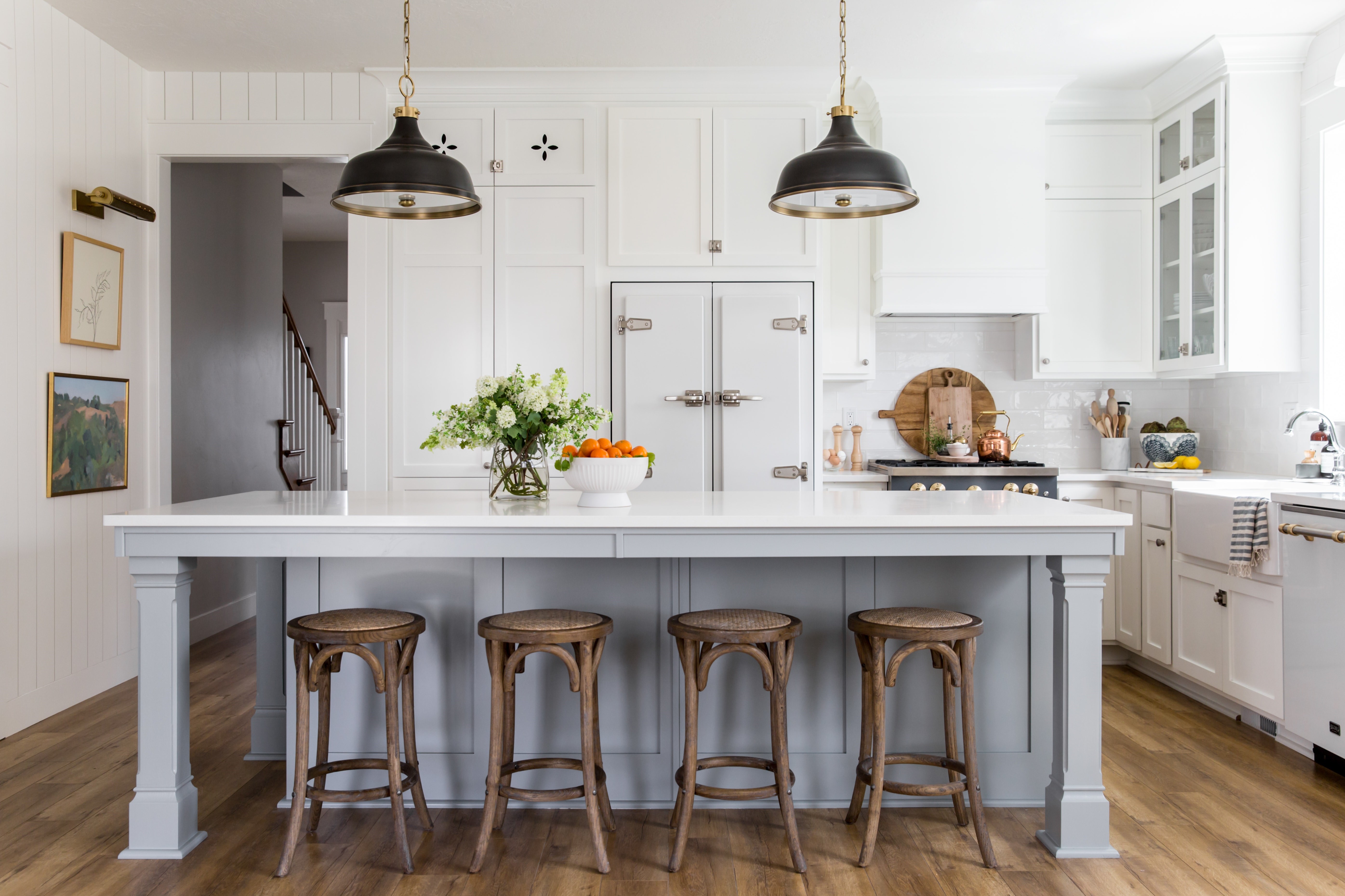
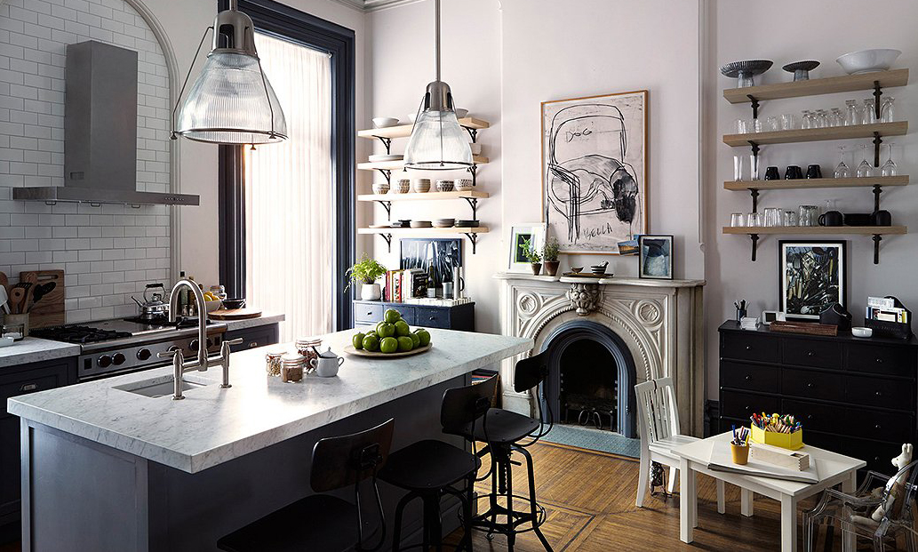
Earlier this year, the One Room Challenge gave rise to a plethora of stunning new spaces. Amongst these was this gorgeous, welcoming kitchen by House of Jade Interiors. 

Erin and Kirsten were going for a modern country farmhouse look that had all the good old vintage feels but with contemporary luxe: tactile warmth mixed with modern sheen. They had a very nice white-and-grey kitchen. The challenge was for this one room was to take it from being pleasant to beautiful.

It takes many factors to make something like that work. One of those factors is the lighting.

We caught up with the ladies from House of Jade and asked them all about this space.  


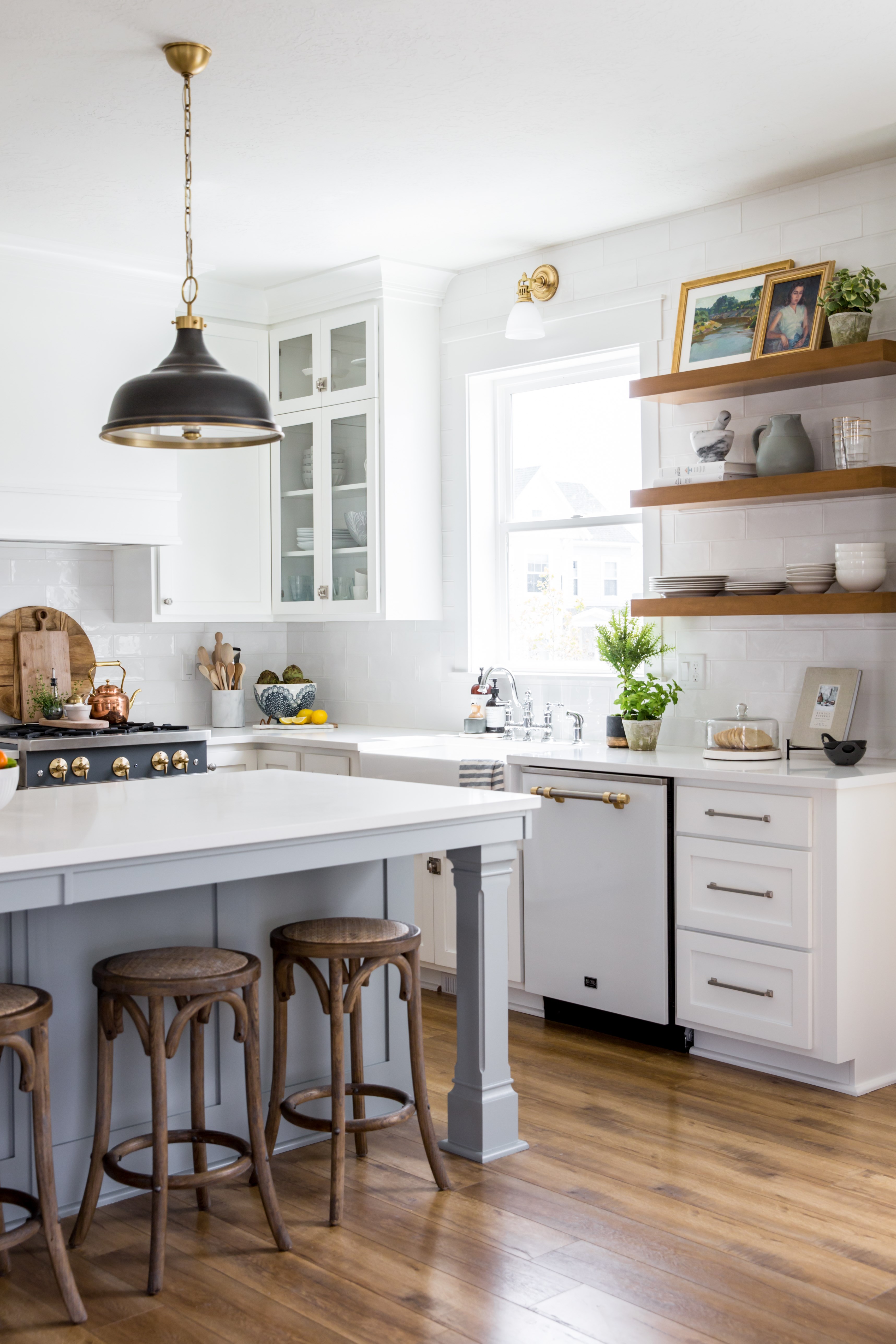
Design: House of Jade interiors | Pendant: Metal No. 1 (Mark D. Sikes for Hudson Valley) | Sconce: Pelham 

1. What are three words that best describe this kitchen?
Classic, charming, and airy.

2. Why did you choose these Mark D. Sikes pendants?
This kitchen had so much white, so we knew we had to bring in some contrast. The Mark D. Sikes pendants are stunning. The mixed finishes of the dark and antique brass really help ground the space. We also love how they have a slight vintage vibe which is perfect for this modern country kitchen.

3. Why did you choose the Gaines picture light and the Pelham sconce?
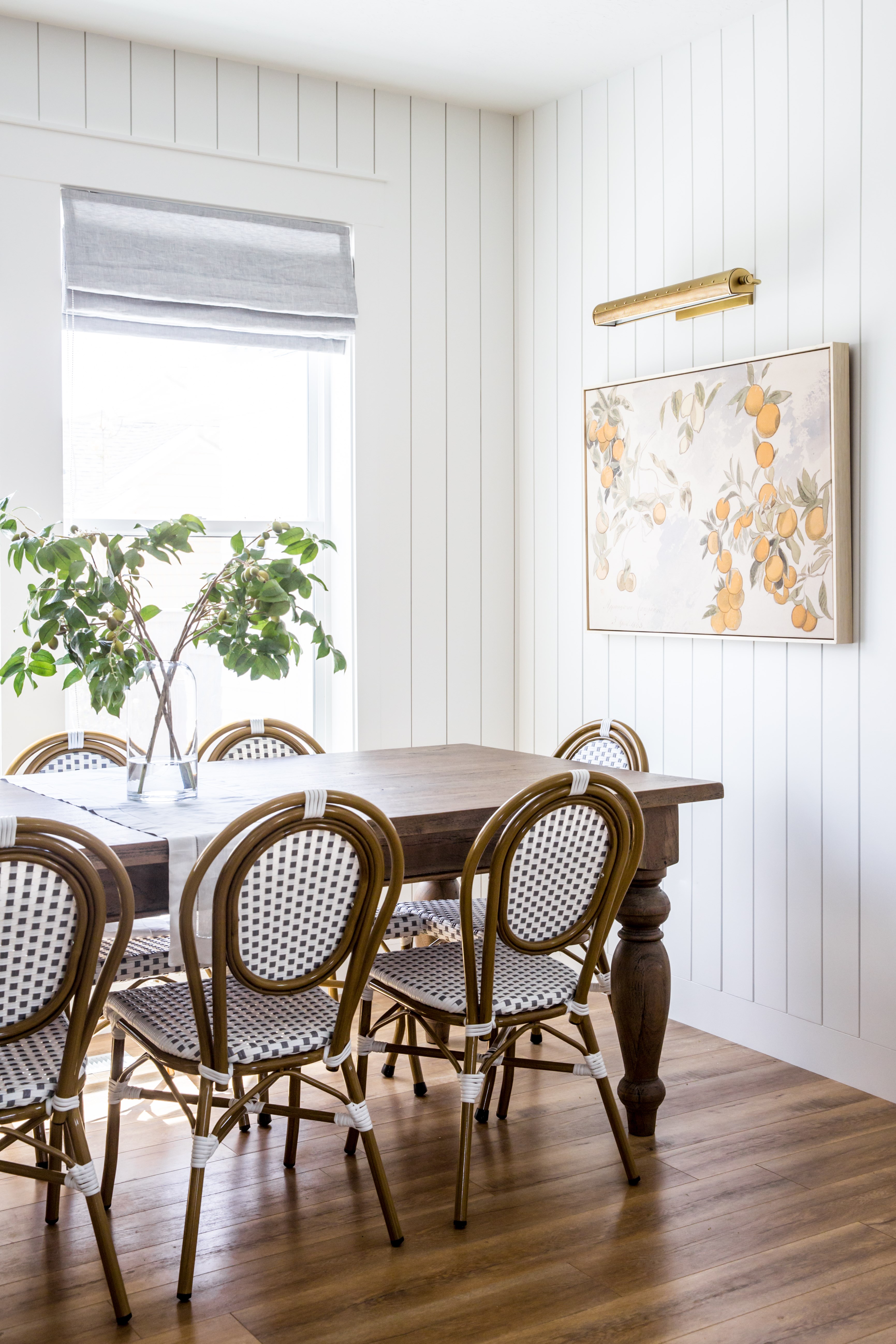
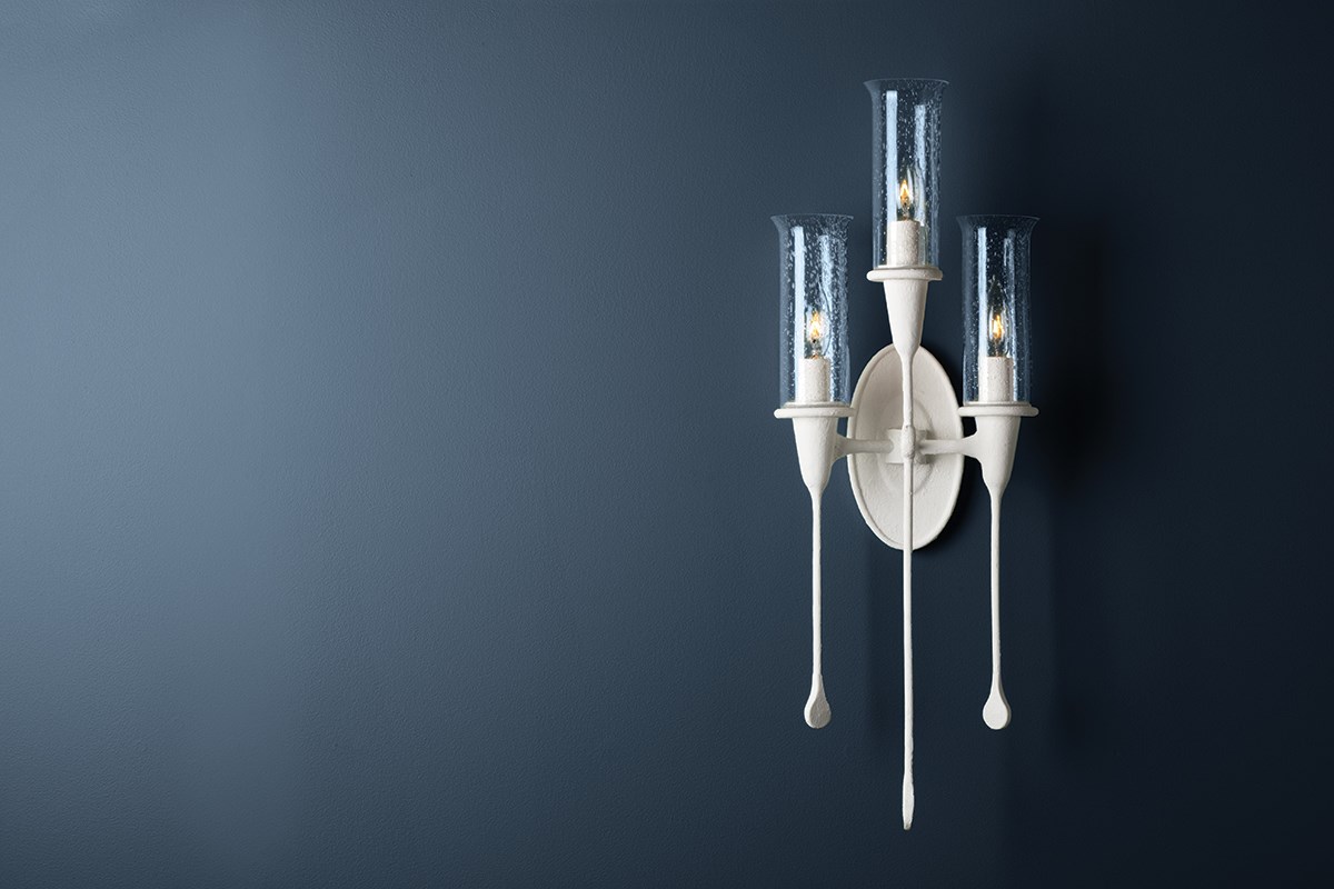
We've used the Gaines picture light for other clients in the past and we are just obsessed with the subtle details. The perforated metalwork and studded rivets give the fixture so much texture! The Pelham sconce screams "classic." It feels like it was plucked out of a charming home in Nantucket.

4. What inspired you to go with the vintage modern feel?
We are very drawn to kitchens that look like they're from a simpler time of life, when things like bringing in fresh garden vegetables and baking bread were daily activities. We didn't want it to feel like this kitchen was brand new so we brought in vintage elements like European-inspired appliances, vintage art, and classic subway tile. At the same time we wanted a kitchen that had all of the conveniences of modern day life. It was important for us to find the right mix of modern and vintage.

5. What are your tips and tricks for kitchen lighting?  
When choosing kitchen lighting, it's important to make sure each piece has the same feel and aesthetic. We mix finishes all the time but we try to make sure the lights come from the same "story." Find common themes like the small details or the shape of the lights that can tie them together. In our kitchen, we had rivet details on each piece to marry them all together.


Design: House of Jade Interiors | Picture Light: Gaines 

You can see their original One Room Challenge reveal post, where they explore all the nooks and crannies, here. Or, check out how they've given it a few subtle fall updates through accents and bringing the outdoors in here