"You know, grey is my favorite color." —"Mr. Jones," Counting Crows
The Best Neutral
Let’s talk about why grey is such a great color. It's elemental. It can be warm or cool, depending which tint or shade. It’s not too loud. It can be a wisp away from white. It can be woodsmoke on the autumn air. It can be a blanket. It can be dark and drenching, or soft and soothing.
There's a broad range of moods covered under the word "grey." Paint companies know people are interested in using it as a non-boring neutral, and they've risen to the challenge with a vast selection.
But if you're interested in going grey at home, prepare yourself. There are an overwhelming number of hues, tints, tones, and shades in the grey spectrum currently on market. It can be such a difficult choice for some homeowners, that Apartment Therapy jokes about picking out a grey paint being "a cinch." Choose carefully so you don’t wind up like Charlize Theron in The Devil’s Advocate, painting and repainting the living room until you're having a nervous breakdown.
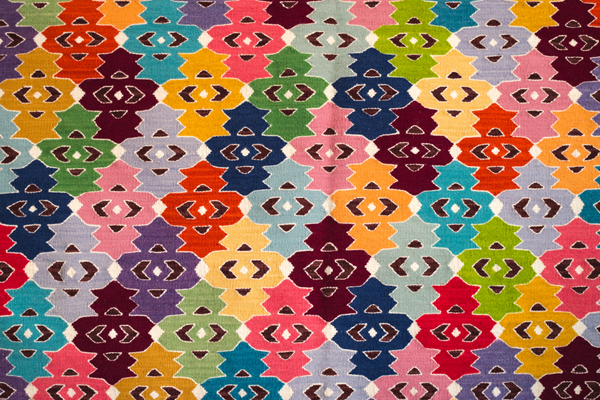
We've put together a Pinterest board to help you.

What's in a Name?
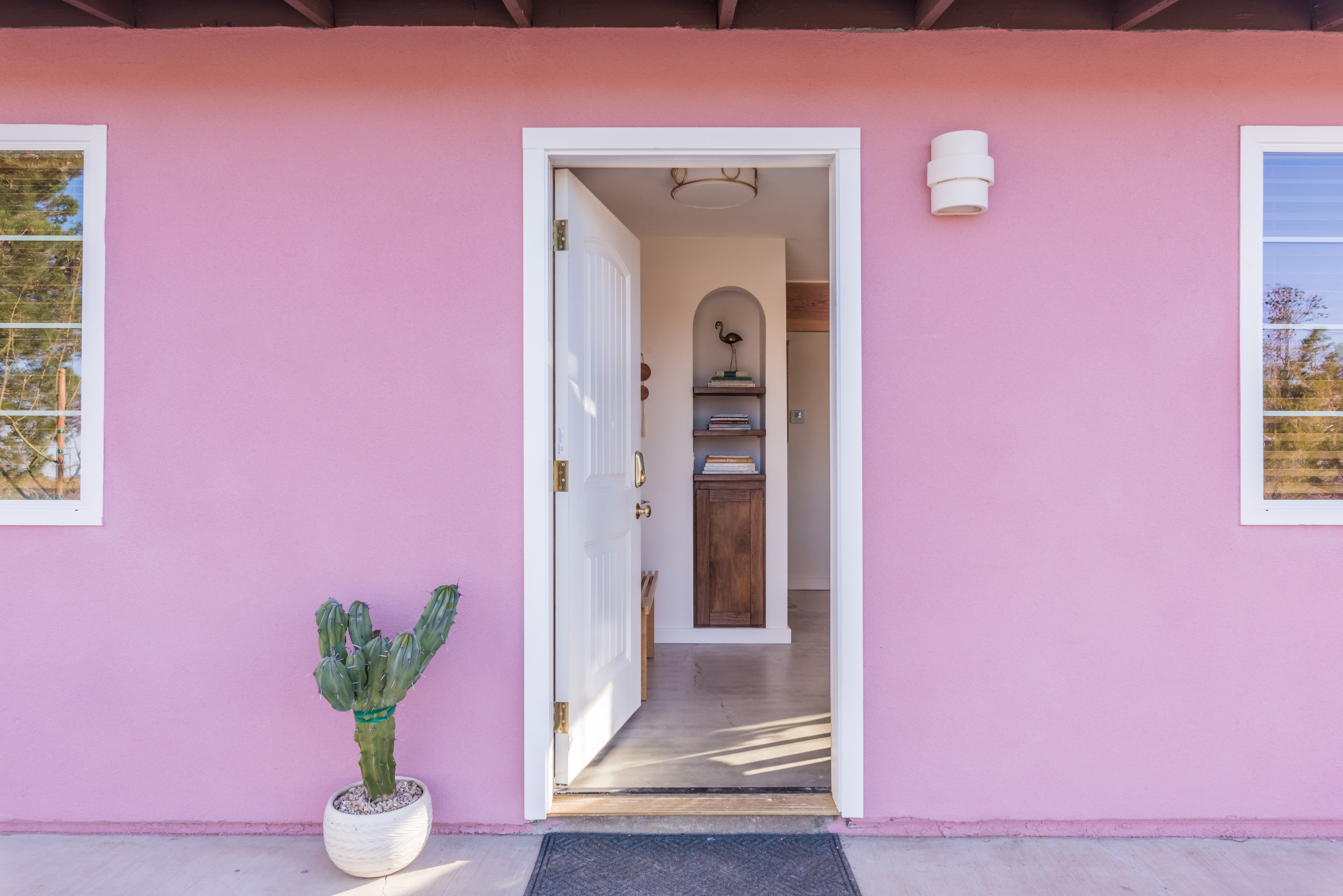
If you try to select a shade of grey for your home, prepare for a competition for Most Evocative Name. In this beautiful cottage in the UK, for example, they went with Farrow & Ball throughout the home. What was the name of the paint color they primarily used? “Skimming Stone.”
“Elephant’s Breath” is another from the venerable British paint company. You know an elephant is grey, but it's too huge and obvious for a subtle paint color name. You’d be oppressed by having one in your living room all the time. (We can’t even talk about this without tripping over clichés.) But an elephant’s breath? Ahhh...
The instant disippation of a grey exhalation on the cold wind. It’s like a zen koan.
There. Don’t you feel a bit twinkly? Ready to chase that grey?
Benjamin Moore makes it more tangible: "Barnwood." "Upper West Side." (About as concrete as it gets.) "Castle Gate." "Gothic Arch." (Read the product description for more one-hand clapping stuff.) Are you trying to sniff out the perfect grey? "Smoked Truffle."
The most straightforward names for tints and shades of grey paint are those in Sherwin-Williams's collection.
Pairing Grey with Wood, Blush, and Brass
Speaking of the elements (and "barnwood"), darker shades of grey are complemented by wood in the most beautiful way. Look how gorgeous this wooden slab of a sliding door looks against the grey around it.

Here, a grey, white, and black minimal scheme makes for a calming oasis. Our Lynden fits in perfectly for two reasons: its finish and its diffuser. The finish is polished nickel, which is a form of grey, but shiny enough to reflect white. Its diffuser defines the piece: a beautiful slab of alabaster stone, marbled with grey, which softens the light that shines through it.

Grey pairs so well with colors and metals that are resonating right now. Consider grey and blush.

We've already covered blush in our post on it here. This bedroom from the Netherlands edition of Elle Decor demonstrates the allure of grey and blush in the bedroom. It feels soothing, inviting. Don't you just want to linger in that bed until it's almost noon?

But the ultimate combination is grey with any kind of golden tone, like brass. Gold glints beautifully off grey, like the emerging sun off scudding billows of dark cloud. It's a charged contrast. We're not sure what it is, but something just looks so good and feels so right about this combination.

This means grey is a perfect choice for the kitchen and the bath, rooms where faucets, knobs, and pulls offer an opportunity to make that grey-brass statement. These rooms always need a thoughtful lighting plan, as well, and you could mix your metals or choose decorative fixtures with a matching brass finish.

We love the way our Alpine pendants in a brass finish stand out in this dark grey kitchen.
.jpg)
Grey's Cousin, Greige, is All the Rage
Is it grey? Is it beige? Well, it’s kind of a grey area. So, let’s just say it’s both and call it greige.
When you get into grey today, there's a lot of nuance and delicacy. There’s talk of subtle lilac infusions. It's like a sophisticated chef is talking about cooking up the perfect grey in his kitchen, or a scientist is inventing the most breathtaking grey in his lab—"the grey science."
Well, just the way any other hue might be added in greater or lesser proportion to a particular grey hue, trendy portmanteau "greige" covers a range of greys to which some version of brown has been added.
As this article from Business Insider points out, "greige" got started in interior design around 2010, but stemmed from the world of fashion (Armani in the 80s, in particular), as interior trends often do. The article also rightly claims that the trend shows no sign of slowing down. Use hashtags like #greige or #greigedesign on Instagram (or just "greige" or "greige design" as keywords on Pinterest) to find a ton of images to inspire you.
What do you think of greige? Of grey? We'd love to hear from you in the comments below.
*A note on spelling: The name for the color discussed in this post varies slightly in spelling. Typically, it is spelled "gray" in American English, "grey" in British English. To our eyes, the latter just feels closer to the color we're discussing here, while the former calls up the connotation of "Gray's Anatomy" and "gray matter." Ick.
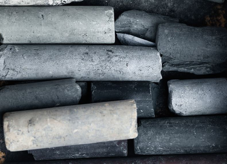
**Beautiful header image of charcoal pastels by Leslie Grow. More here.