BRANDS
  • View All
BRANDS
  • View All
BRANDS
  • View All
FIND A SHOWROOM
BUY ONLINE
INSPIRATION
Products
Brands
Where to Buy
Search
Lighting a Powder Room

A Space To Indulge Whimsy

Spring Summer 2021 Collection

Transformative lighting for spaces designed to live, work and play

Five Questions with Amy Peters

Creating a Beautiful Kid-Friendly Space

July 02, 2020
img

Five Questions with Amy Peters

Creating a Beautiful Kid-Friendly Space

July 02, 2020

Amy Peters created and continues to cultivate a beautiful home for her family out in Nova Scotia. Striking that balance between making your interiors swoonworthy while also being practical for two children is a tough challenge for people as dedicated to design as they are to parenting, but it's a sweet spot Amy has completey figured out.


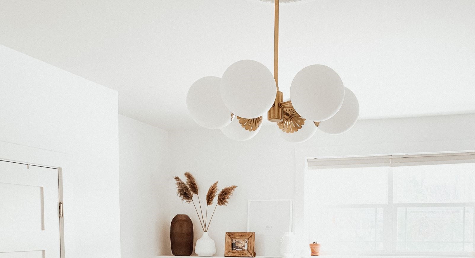
Design/Photo: Amy Peters | Astrid chandelier by Mitzi

Where do you get your design inspiration from?

When it comes to my design style, I source a lot of inspiration from other designers via Pinterest and Instagram since both sites are very visually appealing. Sites like Pinterest are a great resource for creating boards with the general theme and design elements that I am drawn to. For the most part I love timeless designs and bright spaces with lots of texture and natural elements such as wood, rattan, greenery, and different types of fabrics. As trends change over time, I've become more and more aware of the things I love versus what is stylish or trendy. I prefer our home to be timeless and "us" vs trying to keep up with all the current design trends. 


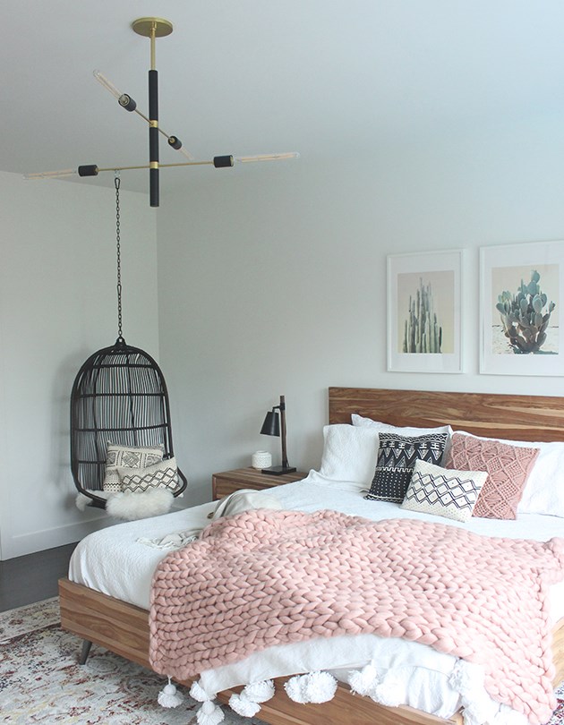
Design: Amy Peters | Chandelier: Paige by Mitzi | Sconce: Riley by Mitzi

What things do you do to make a space feel so calming, inviting, and cozy, yet still somewhat elevated? What made you go with a swing chair for your bedroom? What kind of vibe were you going for with your bedroom and guest bedroom?

My bedroom is my favourite room in our house. I love the warmth of the wooden bedroom set paired with multiple layers of textured fabrics through the bedding, blankets, and pillows. Everything looks luxurious but also has that "lived in" feel.

For years I wanted to have a hanging chair, so I was beyond happy that it worked so well in our bedroom. A little back story on this chair, I bought when it was on sale long before we even knew we were moving into this home. I bought it and had it in storage in "hopes" that one day I would incorporate it into our future home. It was worth the wait because it worked out perfectly in our master bedroom. I love how the touches of black throughout the room tie everything together—the hanging chair, Astrid light fixture, lamps, and hardware for our door and curtain rod. 

The vibe for our bedroom and guest room is cozy. Because we sleep and unwind in these spaces, we wanted these rooms to be the most comfortable. It was also important that these spaces are functional, warm, and inviting. I love layering different textures—it really creates a great look that you can continually add on, or change with the seasons. It just makes getting out of bed each morning a little more difficult. 


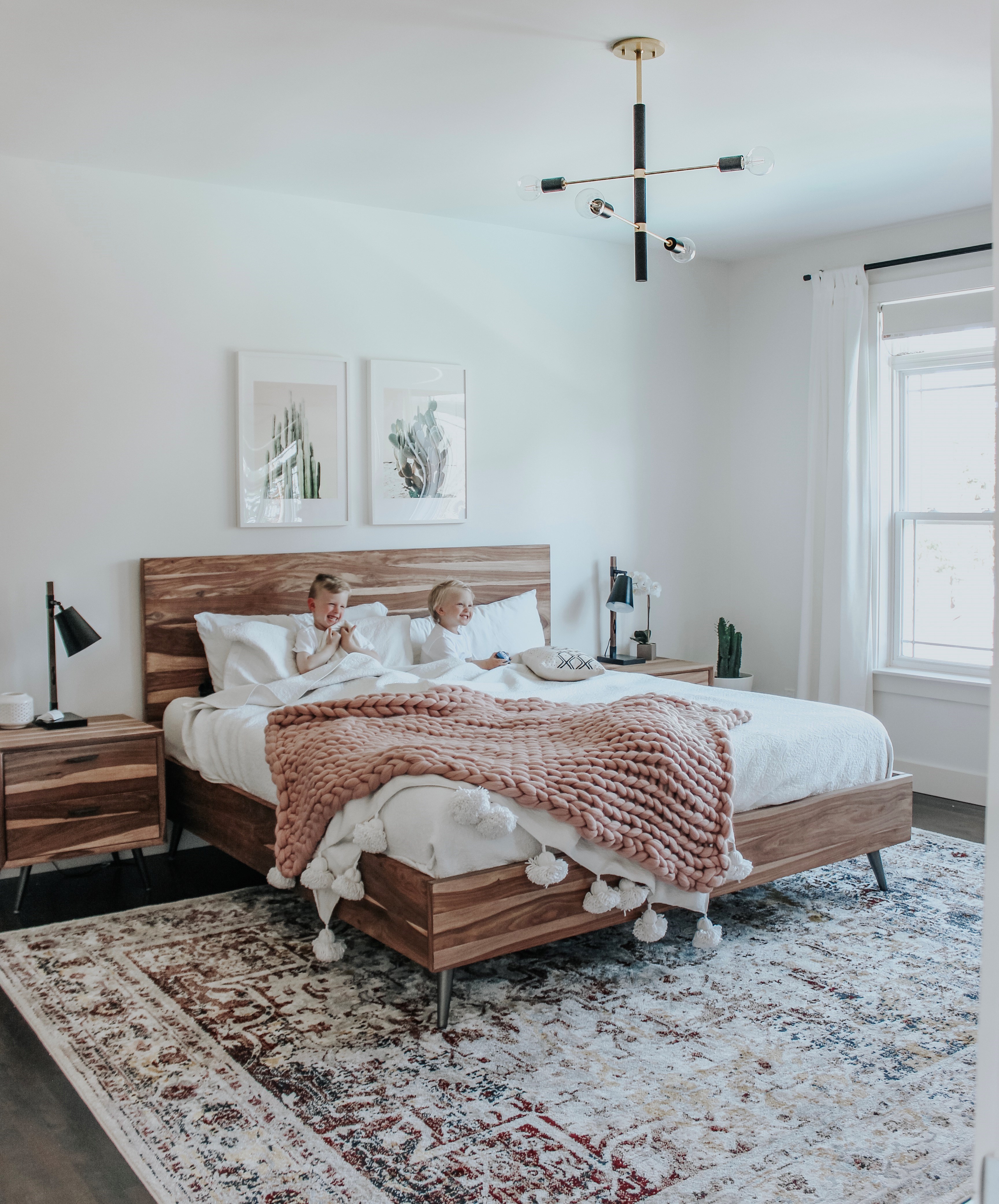
Design, Photo, Room: Amy Peters | Astrid chandelier by Mitzi | Note the beloved chair.

Tell us about the process of designing your bathroom. All of the elements work together so beautifully—was that a planned design or a happy accident? 

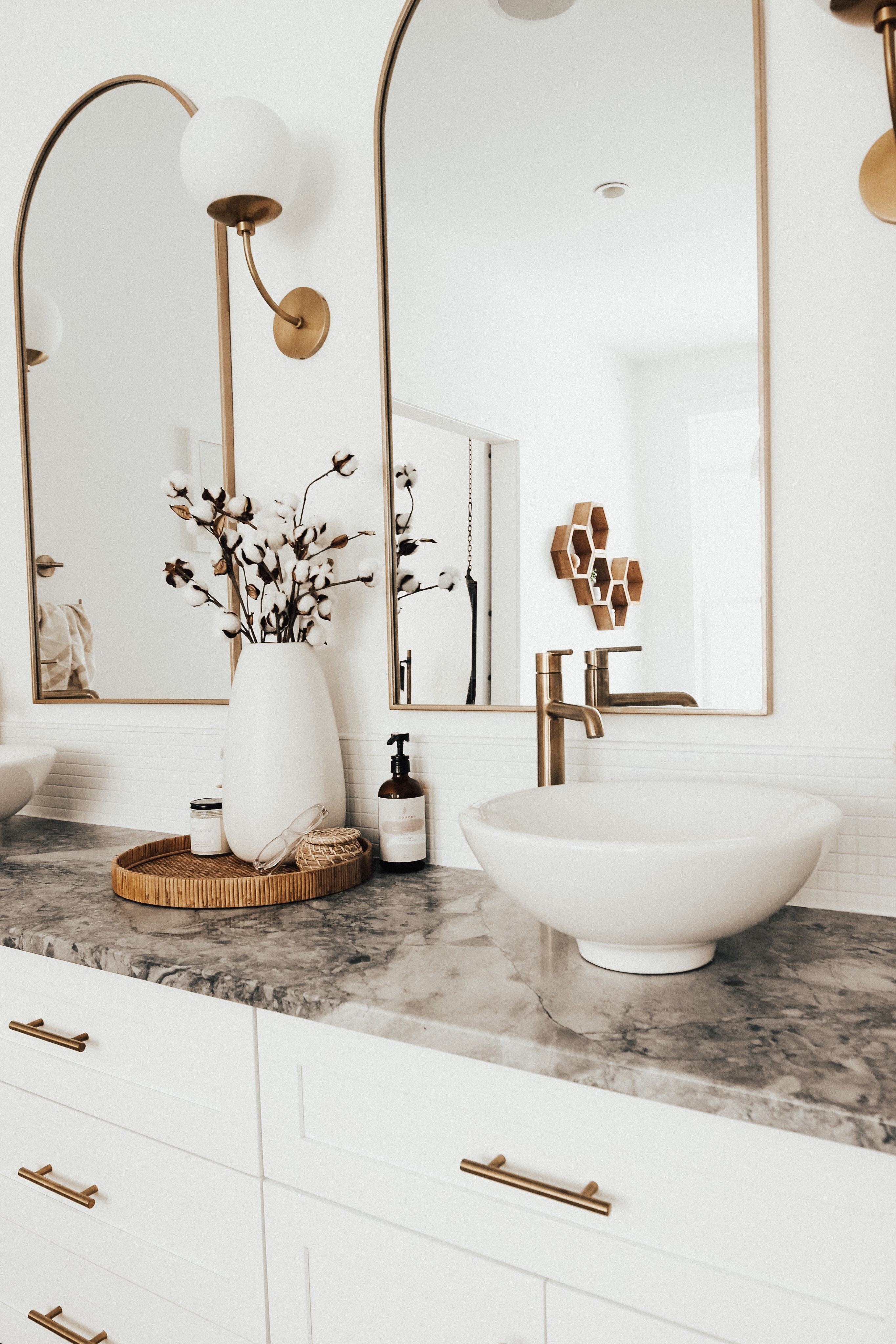
The bathroom was a project that I was keen to tackle the last couple years. I have been obsessing over arches in design right now and the arched mirrors was an easy way to incorporate that style into my home. In a sense there was a happy accident since I lucked out and found these mirrors at a local store and was so happy to grab them.


They were a great price and the perfect size. I spray-painted the frame so it would be more cohesive with the finishes of our Carrie sconces, vanity hardware, and faucets. We wanted to add a third sconce to balance everything and it couldn't have worked out better in my opinion.


Design: Amy Peters | Carrie sconces by Mitzi

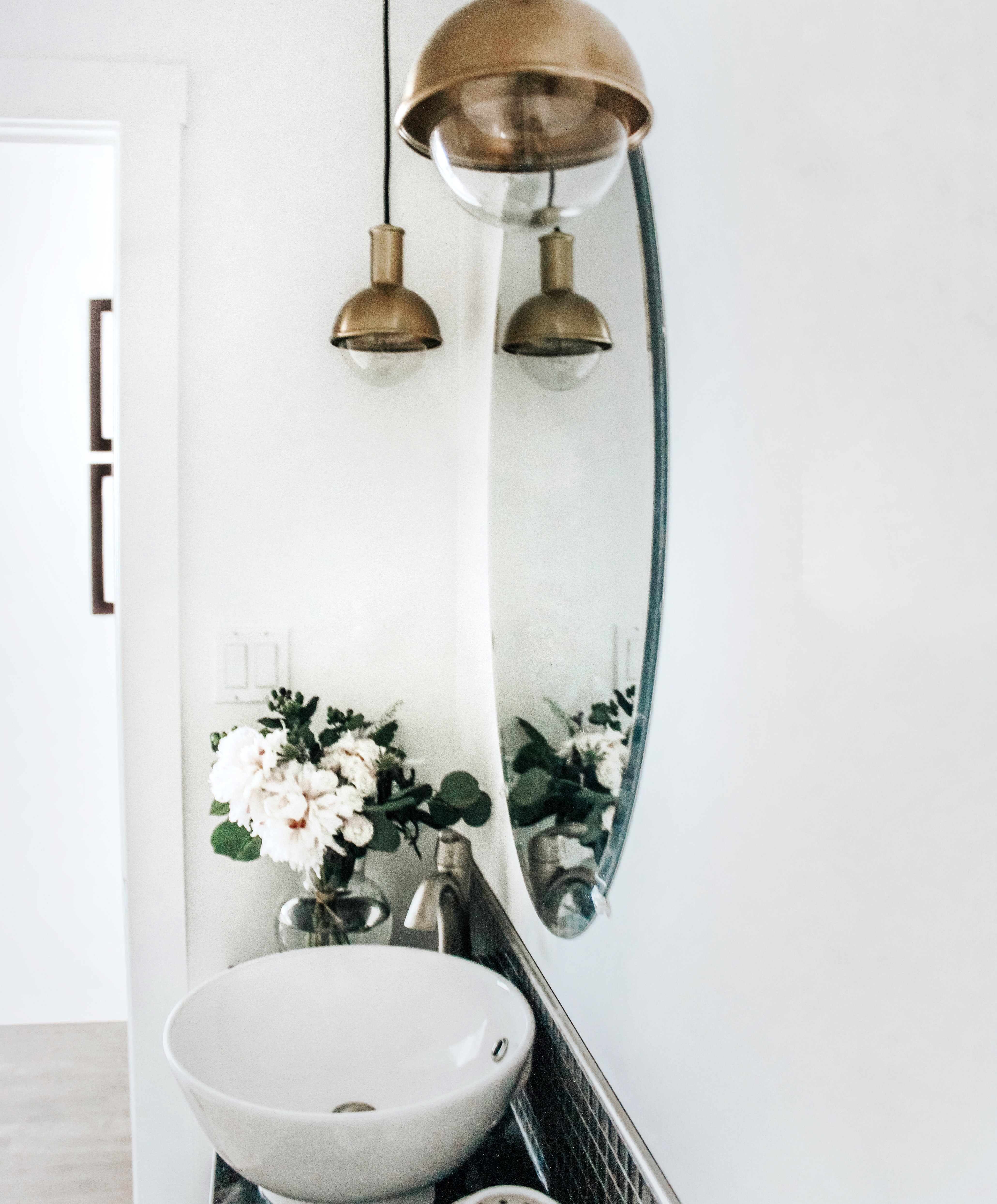
Tell us why you chose a pendant for your powder room rather than a typical bath sconce/bar?

I love how the Riley pendants look in our bathroom—something a little different and in this small powder room and unique in the sense that these pendants are a little unexpected in a bathroom and different from the other styles of lighting throughout our home. The main reason we went with a pendant style was due to the fact that the room was wired this way when we moved in. We simply swapped out the old pendants with new pendants that were our style. It was such an easy swap since the wiring was done. If it was wired differently, we would have stuck with a lighting option that was an easy swap, i.e., sconce for sconce. We love how the Riley pendants are a little different than the types of vanity lighting that we usually see in a bathroom or powder room. 


Design/Photo: Amy Peters | Riley pendants

When designing a kid's room, such as your son's, what are the most important things to consider?

As I was planning out both of our sons'  bedrooms I was very mindful to create a space that he will love and that they can also grow into. We've been living in our home for almost 2.5 year. And I'm very happy to say that even after time has passed we are all happy with how the children's bedrooms flow and how they've used their space. Even from a design view—I still love these spaces we created with these goals in mind. It is definitely important to consider the child's age, and investing in well-made furniture and décor that will last and also suits our style. In Avery's bedroom, I took a lot of time selecting this bold black fixture from Troy Lighting and it suits the space so well. 

Thank you, Amy Peters!

CATEGORIES
More