Last night was Oscar night, one of the few evenings of the year when people still gather around the TV to watch a live event. Different people bring varying levels of investment. On one end of the spectrum, you have people just hoping to be entertained or to see what the stars are wearing and those who come to it predicting who will win what award. On the other end, some people are watching to see if their personal beliefs about art are reflected by the Academy and others, before and after the event, who are looking to use the Academy Awards and its central role in our culture as a nexus around which to debate ongoing political and social issues.

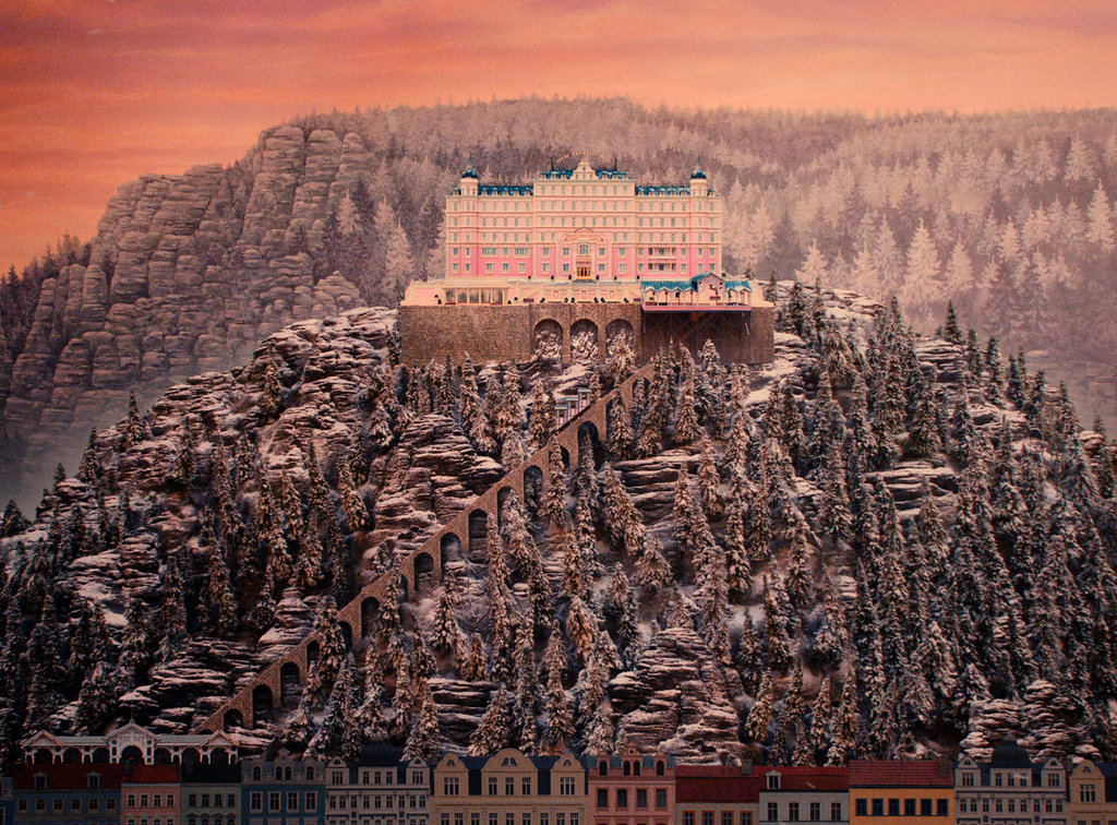
The two films winning the most Academy Awards were Birdman and The Grand Budapest Hotel, tied with four awards each. Birdman won on content (Best Picture, Best Original Screenplay, Best Director) and The Grand Budapest Hotel won on aesthetics (Best Costume Design, Best Production and Set Design, and Best Make-Up and Hair Styling) and Best Score. It didn't win all of the visual awards however, with Birdman yet snatching Best Cinematography and Whiplash winning Best Editing, both massive to the medium that is film.
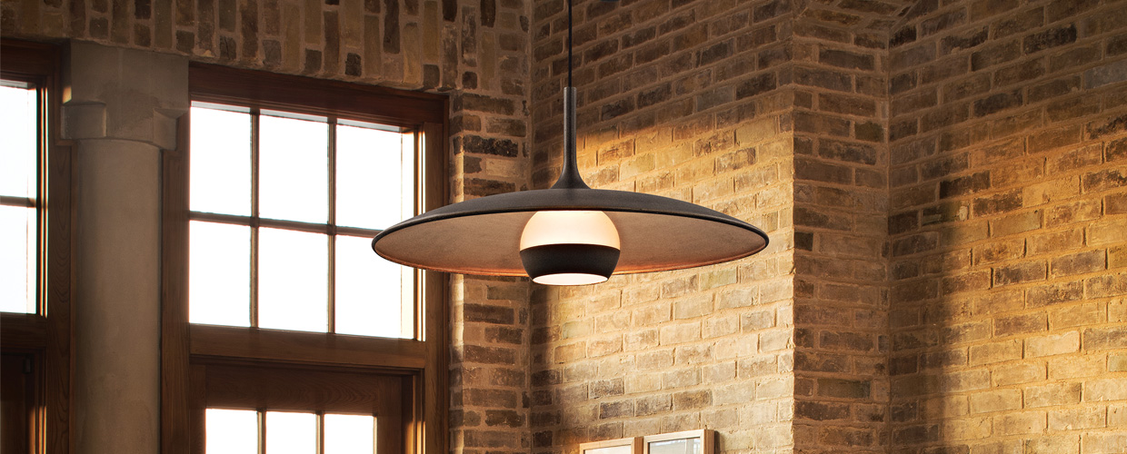
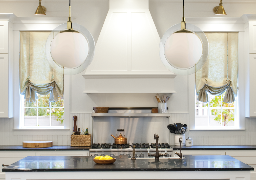
The Grand Budapest Hotel's wins were hardly surprising. Not only is Wes Anderson something of a film nerds' darling, the care that went into the composition and crafting of his films' sets and appearance is unarguable. We loved the set design in the movie and especially its use of lighting. So many shots featured some interesting pendant or chandelier right in the center of the image, while the amazing sconces, lamps, and natural light poured in from all around. Scope these shots below and this charming video made by The Guardian arguing for why it deserves Best Picture:


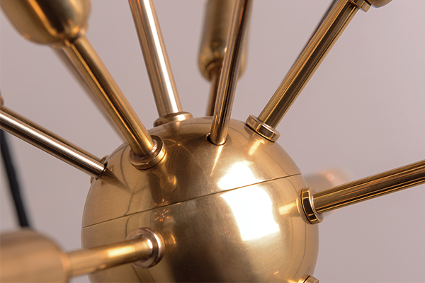
The modern opalescent diffusers, the dangling pendant globes, the factory-industrial task lighting, the classic chandeliers, the sense of old-world grandeur as seen through a modern perspective all add up to an almost intoxicating effect. “A spa for the mind” is a perfect description for the visual luminosity of this film. A hotel is all about ambiance and giving a sense of elevation from one’s day-to-day life. The right lighting is essential to this aim. While The Grand Budapest Hotel remains clearly a fantasy, the sets in which it takes place offer plenty of inspiration for one’s own home.
David Denby, reviewing The Grand Budapest Hotel for The New Yorker, nailed it when he wrote: “In this kind of errant spoof, design provides most of the meaning. The hotel lobby, with its chandeliers and red carpets, its grand staircase, is an enormous decorated box; Anderson also favors closets, prison cells, cable cars, train compartments and their adjoining windows and doorways. His visual imagination tends toward coziness and enclosure.”
Whatever else may be said about the film, it definitely encourages one to dream about how they can make their own home more cozy, more enclosed, more revivifying.
The Award Show itself, stunningly designed for the stage, is also worthy of note from a lighting perspective. We were especially fond of all of the Edison-style, exposed-filament bulbs, tubular in shape, suspended at staggering lengths behind Neil Patrick Harris much of the night. We can't seem to find a picture of him with his tux on and the lights clearly defined, so here's Adam Levine instead.

Check out our Grand Budapest Hotel inspiration board on Pinterest. Did you watch the Oscars last night or any of the nominated movies? What did you think?


