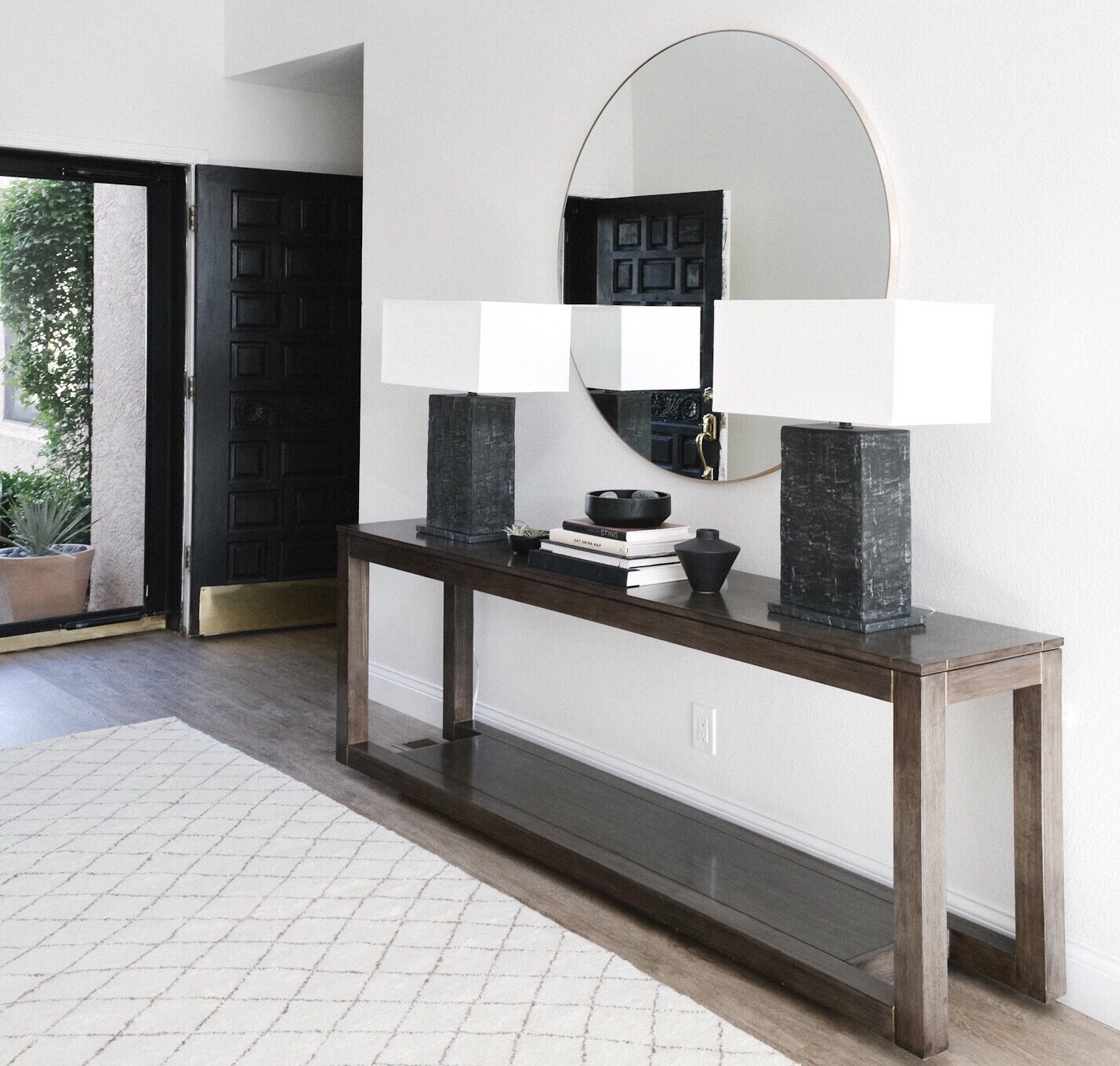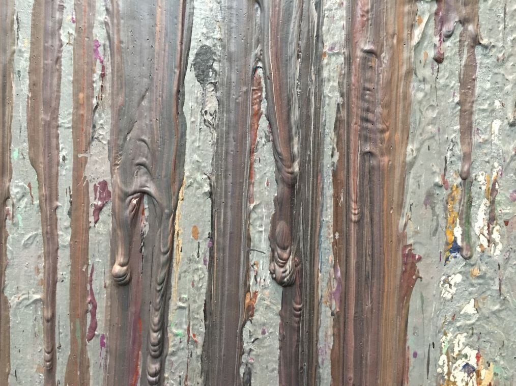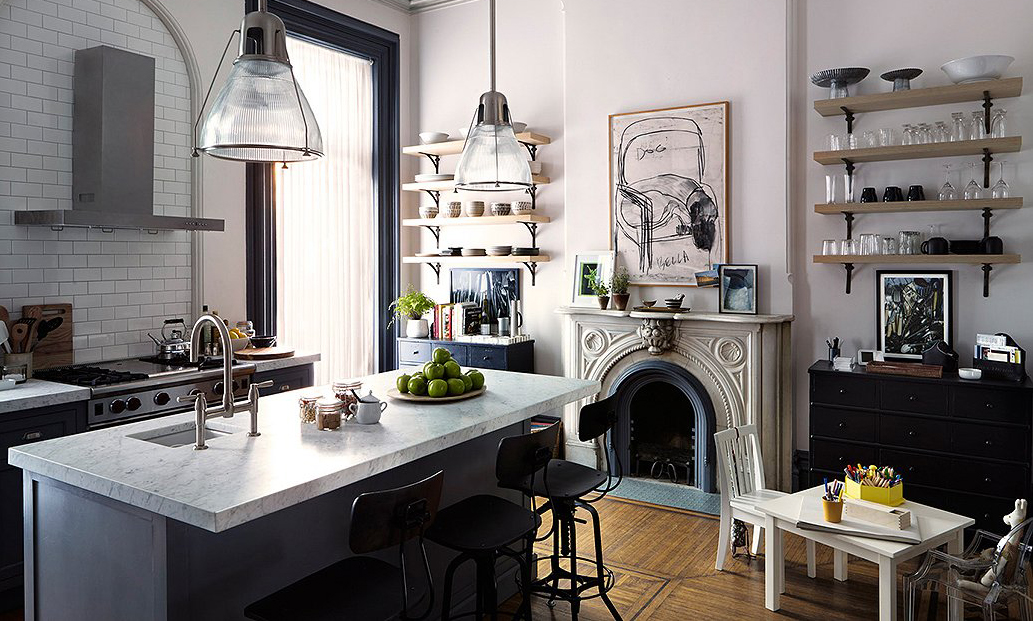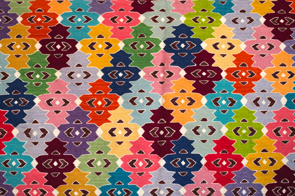
Of the elements that contribute to good interior design—line, space, shape, form, pattern, color and texture—the last of these, texture, is what conquers flat design. Texture goes beyond the tactile experience you have with a surface, beyond whether you feel it to be coarse, silky or otherwise. Texture contributes to your visual perception of a space and determines if you sense a room to be warm and inviting, cold and sterile, open and airy or tense and somber. It defines the depth of a room, as it is single-handedly responsible for transforming a room from bland and level to compelling and multidimensional.
Think John Lautner: famed American architect, student of Frank Lloyd Wright and master texture compiler. To explore his expertise in layering materials, matching surfaces and juxtaposing tactile sensations, look no further than Hotel Lautner in Desert Hot Springs, California. This mid-century gem from 1947 is a texture mecca—the perfect template for extracting ideas from this great on how to craft the perfect tactile palette.
An inviting bedroom dominated by deep wood in the Lautner Hotel
A sitting area in the hotel featuring large windows giving view to outdoor cacti
Lautner’s hotel showcases a rich contrast between fluffed, syrup-colored furs and crisp, white sheets, between soft, woven fabric textiles and hard, architectural edges. The hotel unites smooth, gleaming countertops with rich hardwoods and joins desert flora with polished metallics. Through all of this, in the balance of soft and sharp, smooth and jutting, Lautner shows us that dimension is created through objects, surfaces and furnishings that play on the senses.
Appreciating the reputation of Lautner and the ability of the team at Hotel Lautner to remain true to his original design vision, we at Troy Lighting want to offer a few tips on texture coordination that follow suit.
1. Create Contrast.
In order to eliminate the dullness of flat spaces, place distinctly dissimilar materials side by side to pump up contrast. Think in terms of difference: position jagged accents against feathery throws, metallics against mattes and simple block colors against dense patterns. In this case, opposites do not only attract, but bring out the textual “essence” in each other.
2. Focus on Naturally Rich Materials.
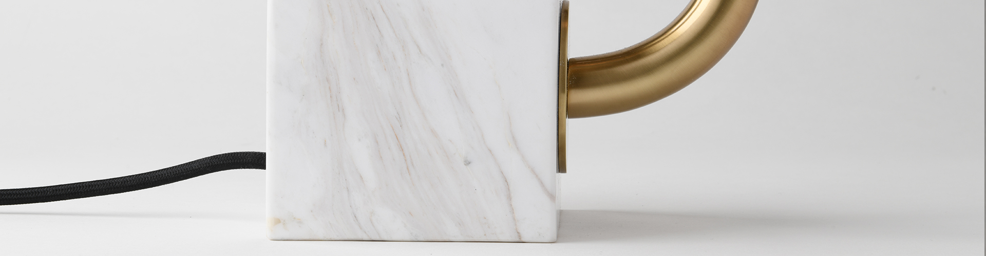
Don’t discredit the effect of natural materials in a space. Stained wood is decidedly rich, brass with a patina transforms and deepens with age and wool maintains a full and dense structure of fibers. Unlike synthetic materials, these elements from Mother Earth become more sophisticated and visually tactile with the passing of time.
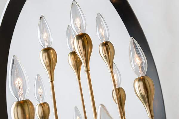
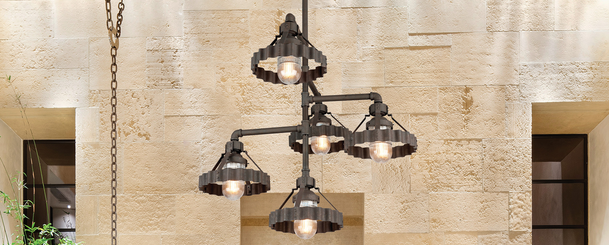
3. Incorporate Dimensional Lighting.
Textured pendants and sconces may not be the first thing that comes to mind when you think about adding dimension to a space, but lights with detailed metal, grooved glass and complex finishes imbue the interior with interest. While Lautner chose to center brushed, mid-century table lamps in his hotel, industrial-inspired pendants like Raleigh and Canary Wharf fit effortlessly into a similar texture scheme.

Raleigh, made of aluminum and handcrafted steel and finished in silver, shows intricate detailing across its surface.

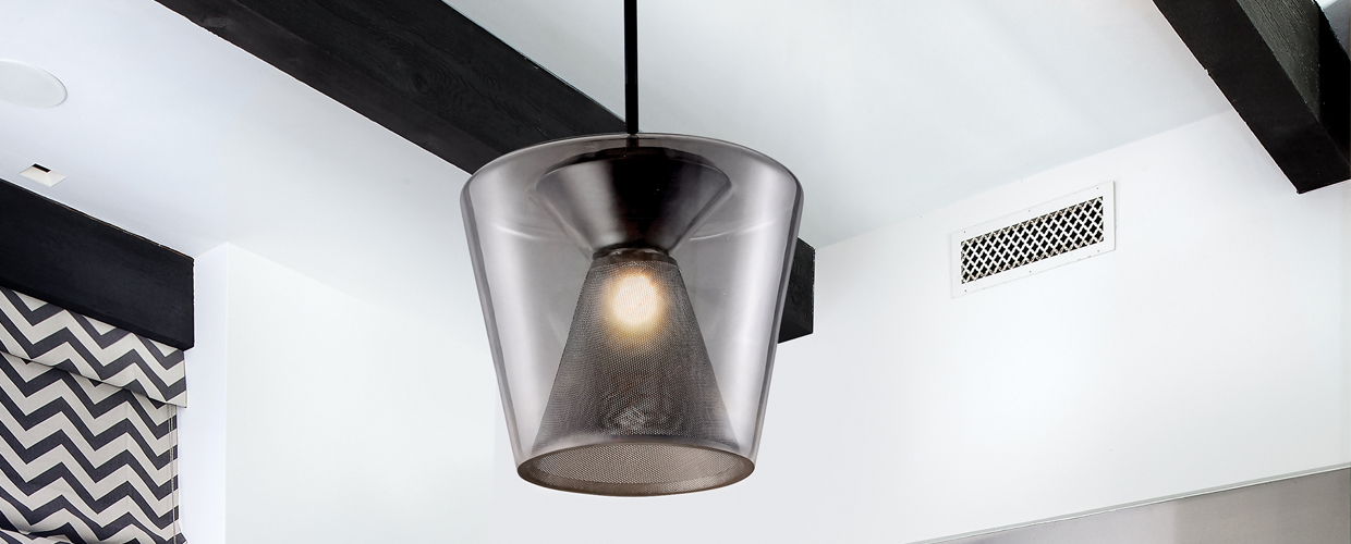
Canary Wharf, similarly industrial but with a retro feel, makes a strong impression through the corrugated band that serves as its focal point.
Both texture heavy pendants can be further amplified by following the first two tips above, meaning their tactile appeal can be increased by contrasting them with soft decor (made from furs and fabrics) and accenting them with other natural materials, such as dark stained woods. The end result? An interior true to the textual prowess of John Lautner.