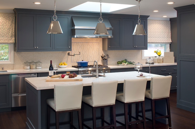
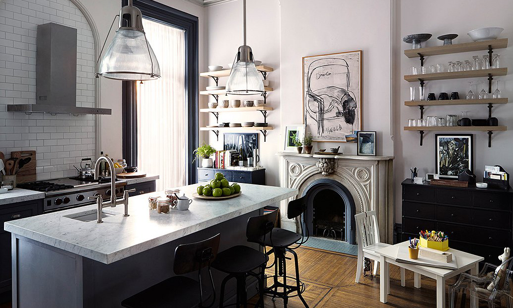
BRANDS
  • View All
BRANDS
  • View All
BRANDS
  • View All
FIND A SHOWROOM
BUY ONLINE
INSPIRATION
Products
Brands
Where to Buy
Search
The Space-changing Power of a Good Lamp

How the Versatile Stand-by May Save the Day

Kelly Behun x Hudson Valley Lighting

Sculpture Meets Light

Stunning Lighting for Every Space

Jewel Marlowe's HVLG Makeover

April 14, 2020
img

Stunning Lighting for Every Space

Jewel Marlowe's HVLG Makeover

April 14, 2020

You may recall Jewel Marlowe, of Jeweled Interiors, from her One Room Challenge reveals. Jewel has a tendency to go big, adding layers and textures, combining the classical and the contemporary, until her singular vision is fulfilled. 

We caught up with Jewel on the amazing transformations she achieved with her space. Gorge your eyes on her living room, powder room, and kitchen below, and read on as she dishes on her creative process and her design philosophies, guiding us through each space.


Design: Jewel Marlowe | Lamps: Faith by Mitzi

LIVING ROOM

Do you look at the bones of a space in its architecture and build your design from there, or start with a vision and figure out what you need to do to make it happen? 

As a military spouse, we've moved 13 times in our marriage. These assignments have been to all parts of the country and even overseas to England. It has been fun to see my style evolve with each transition. It has now changed to the point that I know what I like, regardless of if we are living in a military base house in Idaho or our forever home... wherever that may be. It is liberating to not feel restrained by one particular style or era for my personal aesthetic.

Having said this, when designing for others, I often take more cues from the existing architecture, so as to increase resale value.


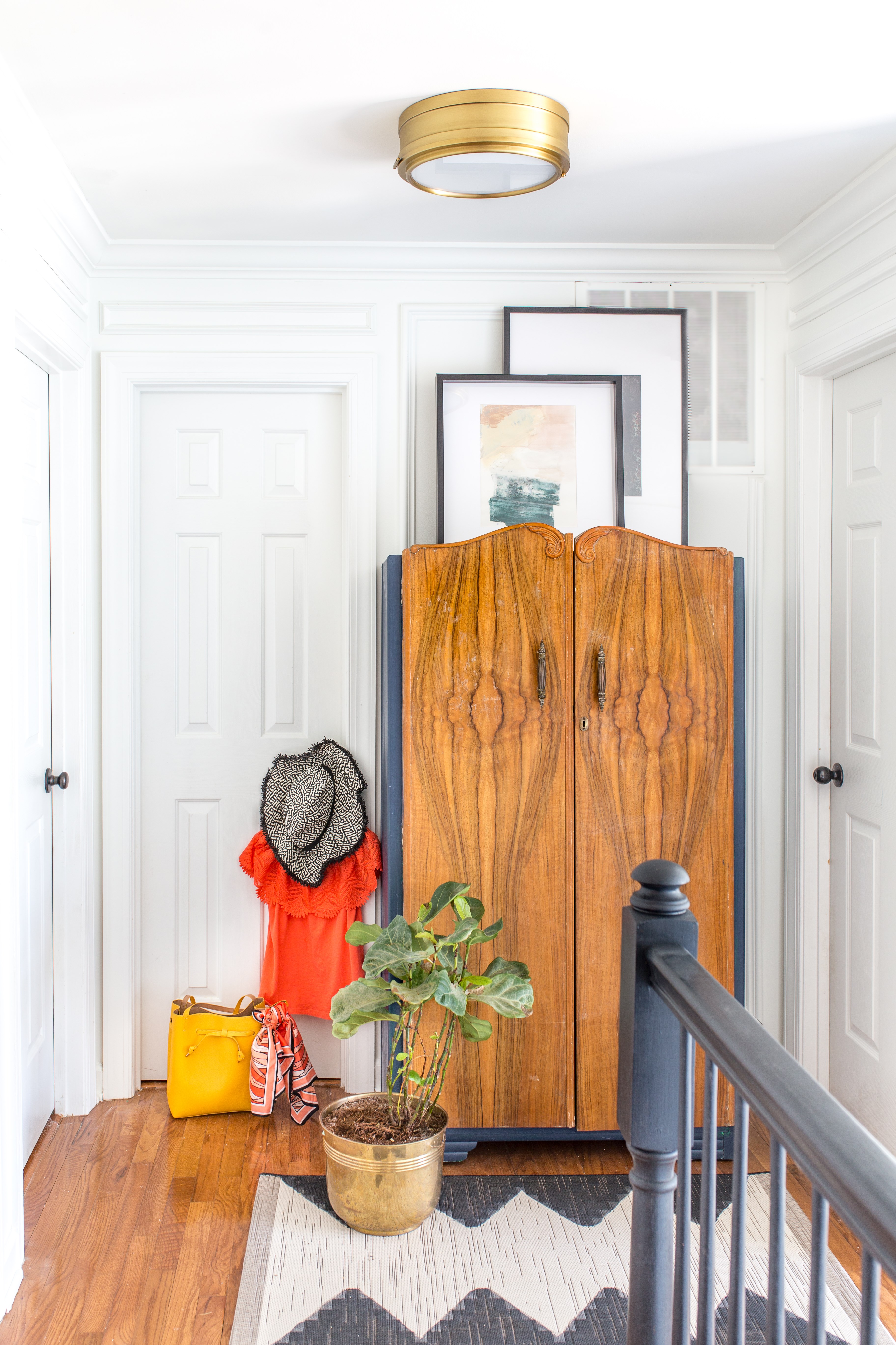
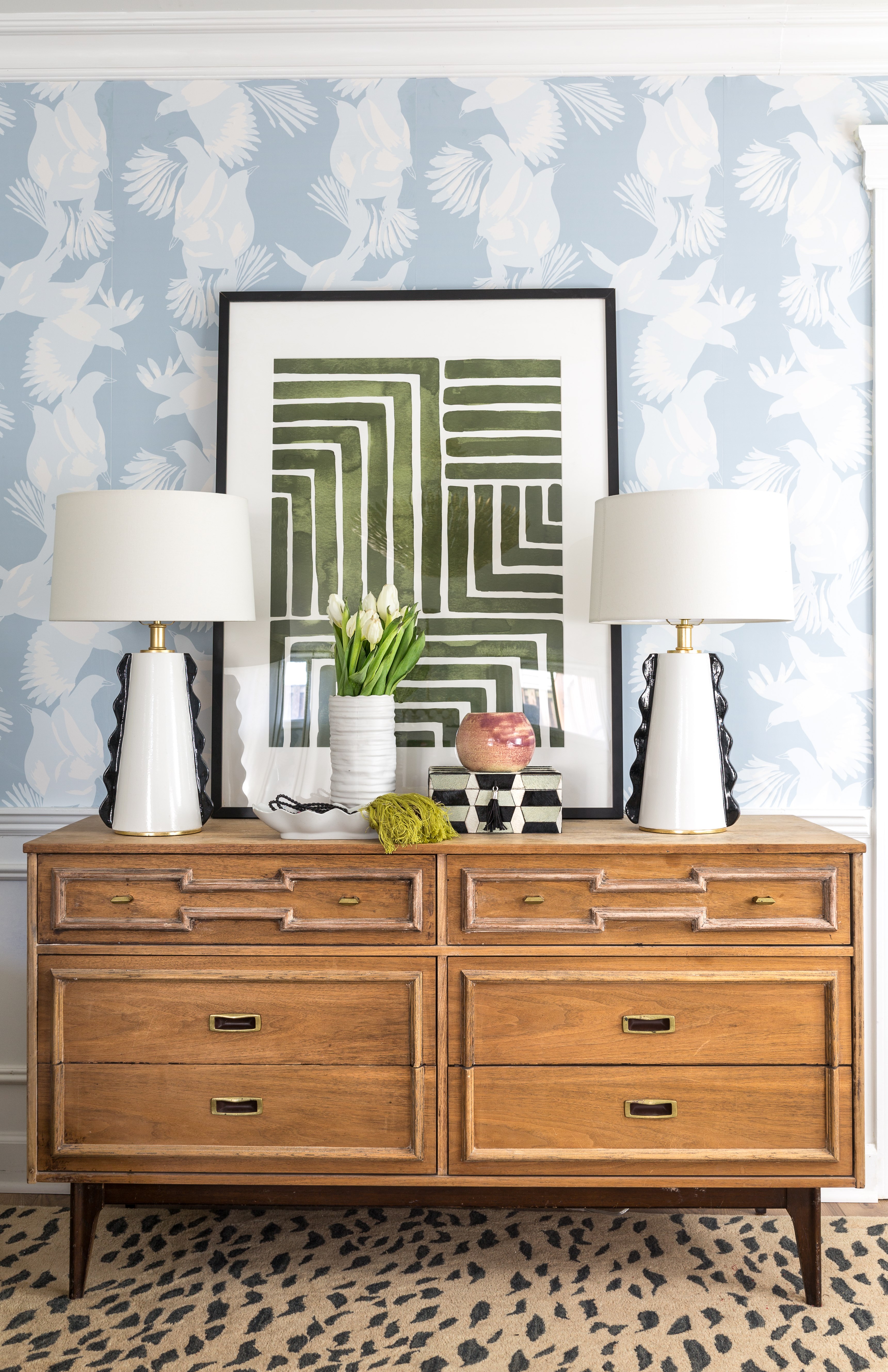
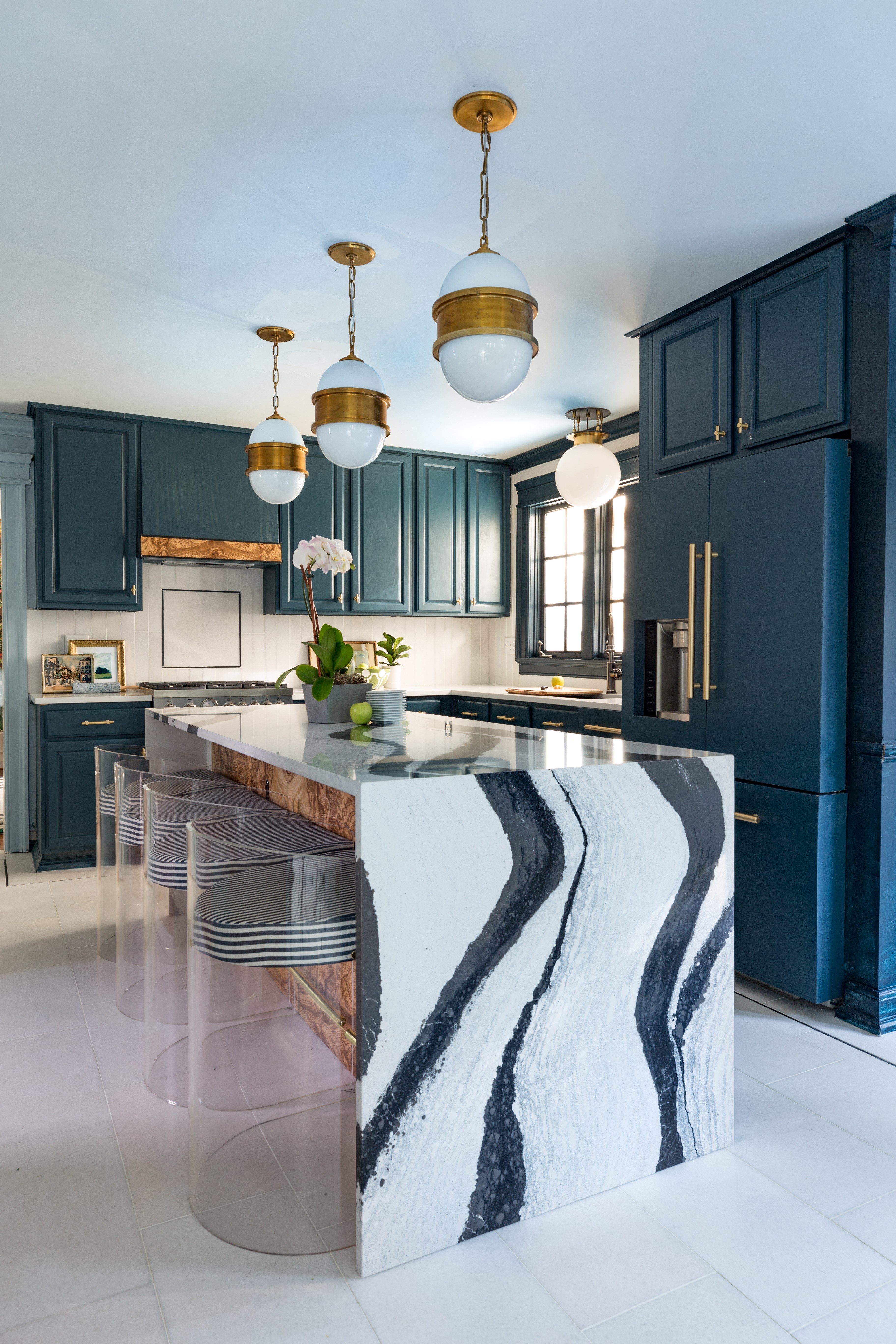
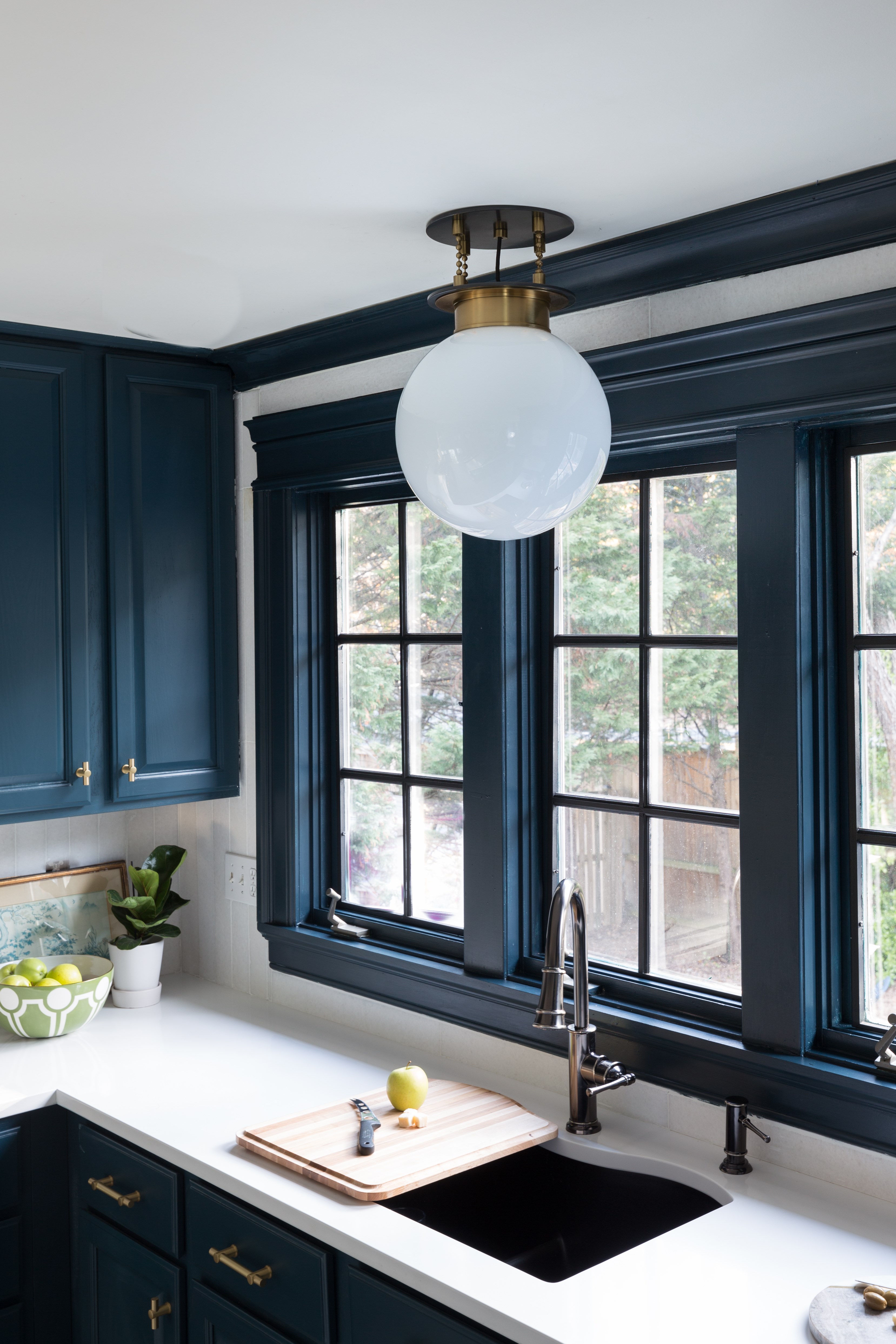
The mouldings and millwork have been a consistent addition throughout the house. Similarly, you’ve opted to install medallions around many of the fixtures’ canopies. Can you talk about these classical touches?

Perhaps I blame our time "across the pond" but I have long been attracted to moulding and millwork. I feel like traditional bones make the perfect backdrop for modern furniture and or lighting. For me, it is the tension between "old" and "new" that adds the energy and drama.


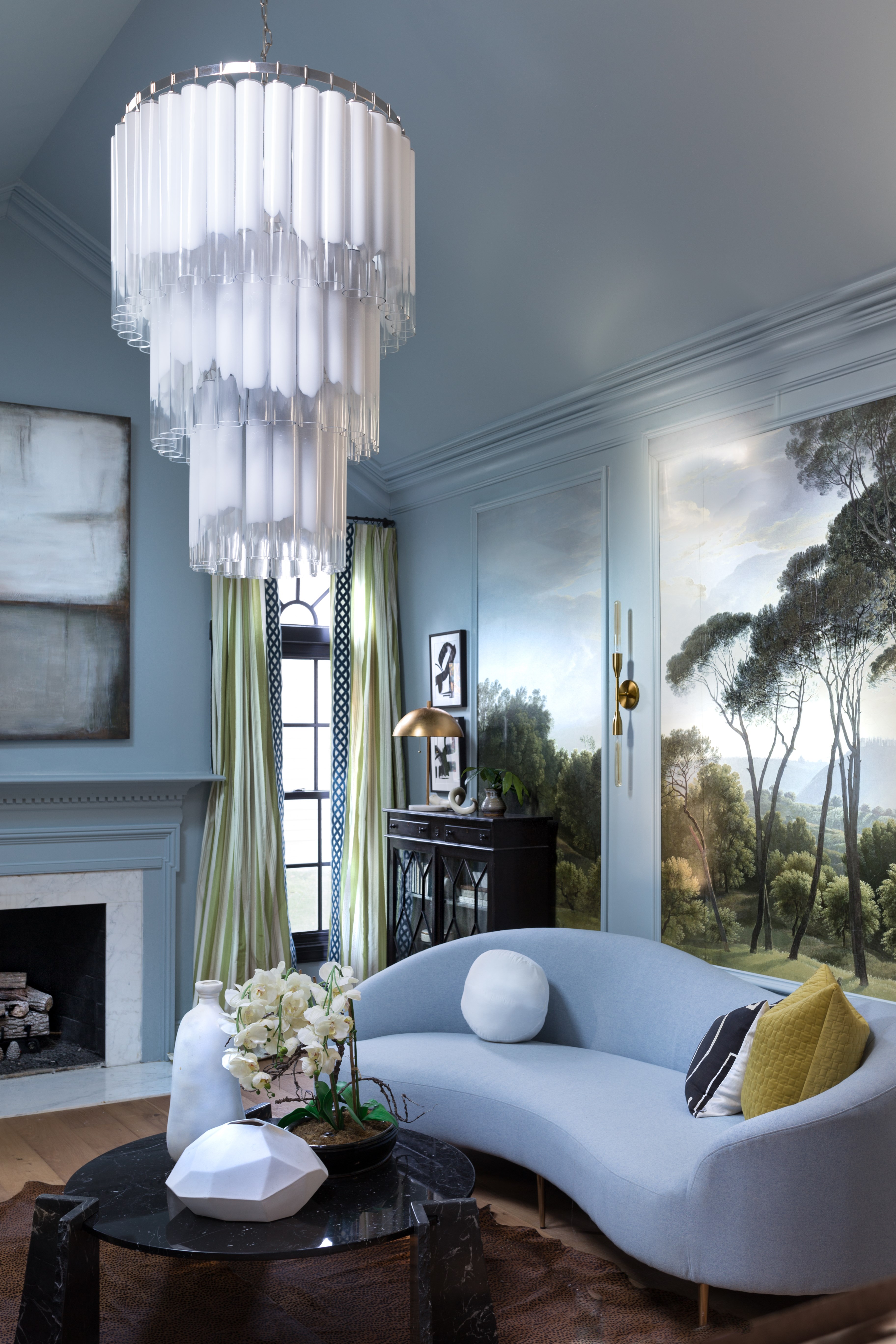
How did you decide to put in a triptych panel landscape painting? It’s breathtaking. Was it hard to land on sconces for in between panels? 

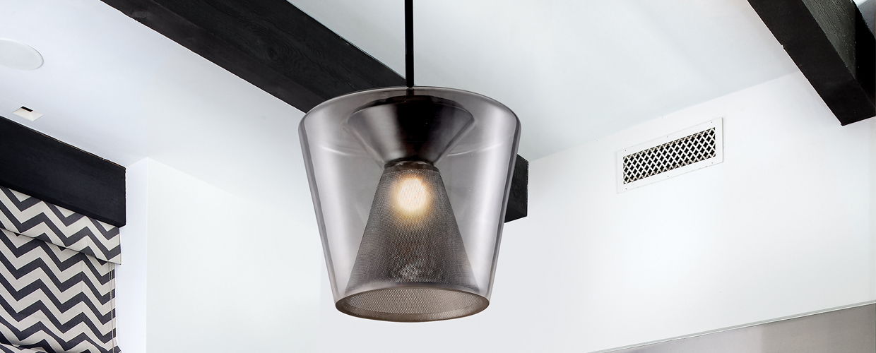
I found this wallpaper company (Robin Sprong for the Sarza Store) online and was immediately smitten. The colors, the scale, and landscape all spoke to me. It seemed that it would be both statement-making yet understated at the same time. Based on the size of my wall, I quickly realized that a triptych panel was going to be my best option. I knew exactly what I wanted for sconces (tall, slender, and modern) and was thrilled to find them at my "go-to" lighting source, HVLG. It was a happy coincidence that the cylindrical shape of the Tara bulbs pinged off of the shape of each of the Tyrell's tubes. 


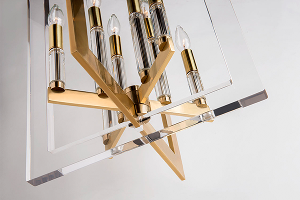
It’s been so great to see your enthusiasm (as well as your audience’s) for the triple-tier Tyrell chandelier. We love how you go bold and opt for statement-makers. In the end, it really blends in as one of the elements in your living room. What’s your philosophy on chandeliers? Can you try to describe the effects of the light through these unique glass pieces for our readers?  

I have had a crush on the Tyrell since January, when I first discovered it on the HVLG webpage. Obviously the scale is outstanding, but the intricate design blows my mind. Each one of the tubes appears to be hand painted. Also, I love Hudson Valley Lighting's choice to offer it in silver vs a warmer gold because it brings down the formality a tad. So, while the Tyrell is obviously the statement-maker in the room, it has a perfectly imperfect element about it that makes it relatable and effortless. It would have a complete different feel if it were brass and crystal vs silver and glass.

For me, lighting is one of THE MOST IMPORTANT design elements in a space. It adds instant drama and functionality.


Tell us about your thing with high-low price points and design aesthetics.

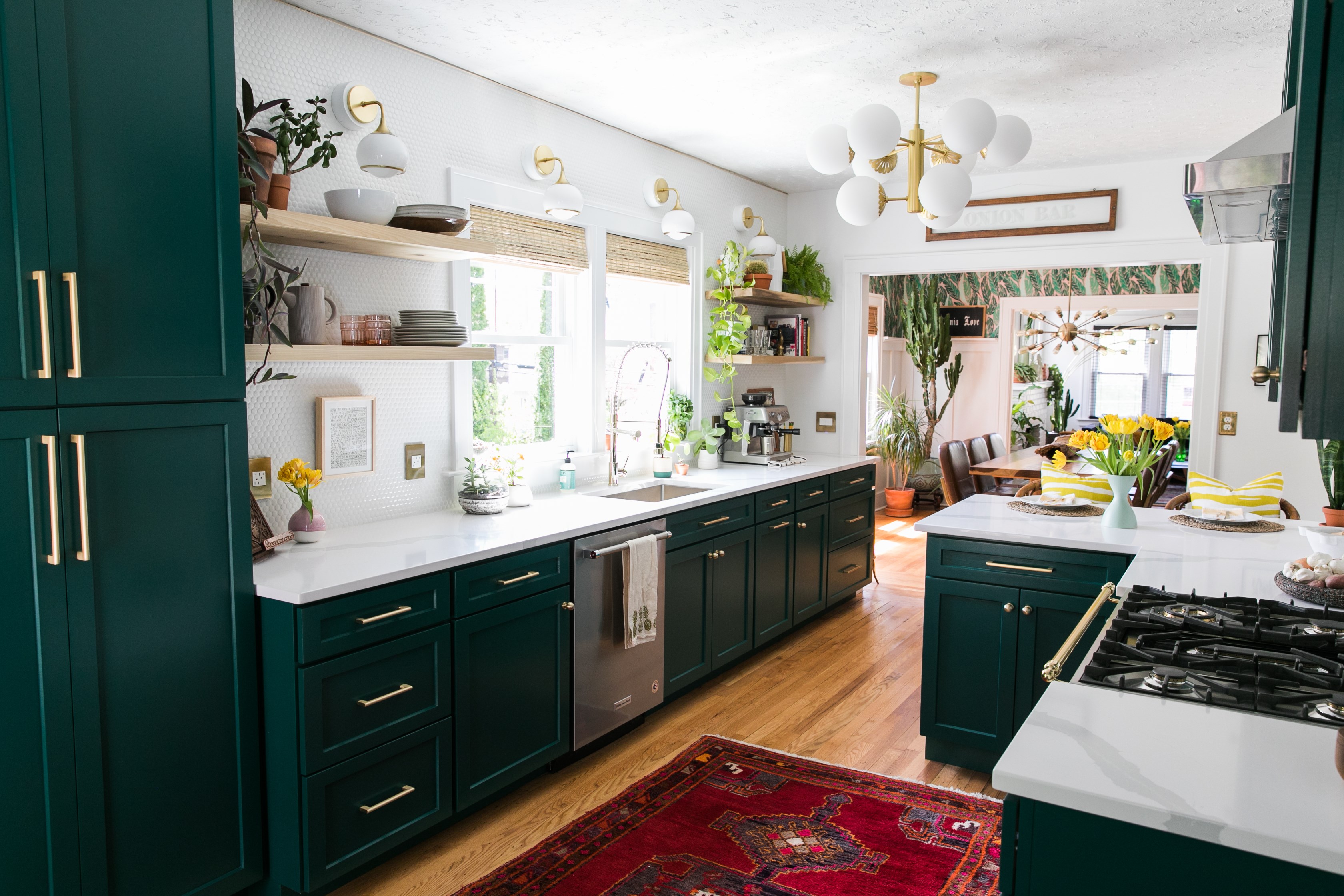
What is nice about the HVLG is that they offer lighting at several different price points. I have no problem with mixing a high-end chandelier and budget-friendly sconces as long as they play well together, stylistically. I think this price-point-mixing helps my designs feel more relatable for my blog readers and Instagram followers, be they designers or budget-conscious enthusiasts. Plus, let's be honest... who doesn't have a budget, be it big or small. If you can save on something like sconces, you have a little extra to use somewhere else. 


Design & Home: Jewel Marlowe | Chandelier: Tyrell by HVL | Sconce: Tara by Mitzi

POWDER ROOM

We need to talk about this powder room. Wow, what a jewel box of a powder room (no pun intended)! Every level is important, from your black marbled honeycomb tile to the wainscoting to that awesome wallpaper to the green ceiling, matching the wainscoting. Such bold choices. Tell us about the powder room and the commitment that goes on here. 

The powder room is my favorite room per square inch in the entire house.  It all started with the stunning wallpaper from Fine and Dandy Co. I could have opted for gray paint, but I usually try to avoid gray at all cost. Green seemed so much more lush and rich. That combined with the black marble and console sink... it all packs one sexy punch.
 

Also, what lead you to Easton as an attractive choice for this space?

I happened upon the traditional mirror, which seemed perfectly oversized for the small room. The only problem was that it felt a little stuffy with a ceiling medallion and chinoiserie wallpaper. I KNEW that I needed modern lighting to keep it fresh. The Easton was just edgy enough to tip the scale back to chic and cool. Also, the Easton emits a lot of light, a requirement for a room with only one light source.


Do you feel that ceilings are too often ignored as part of a room’s décor?

There is no better place to pile on the drama than a tiny half bath. I knew that I wanted the space to feel enveloping, and a dark ceiling was the solution. It feels so moody and daring.  What's not to love about that?!


Mix metals or match them?

I love mixing metals. The mix gives a room soul and character. However, I purposely didn't mix metals in my kitchen because I felt brass and gold accents were the perfect complement to the burl wood. Plus, the Schaub and Emtek handles and Broomley pendants truly pop against the Hague Blue cabinets. 


Homeowner: Jewel Marlowe of Jeweled Interiors | Easton by HVL

KITCHEN

This kitchen! Such a fun, glamorous, imaginative kitchen. Tell us about the vision for this. Was it a color (that color!), a material, something else? What’s the seed point here? 

The kitchen concept all started with the burl walnut idea. Obviously the room needed a wood element and I had a lightbulb moment when I realized that burl has long been my favorite type of wood. Who's to say that I couldn't put it in my kitchen!? I reached out to The Burl Co. in Texas and then all of the other elements started to fall into place.  

Interestingly, there was a moment in the design process where I feared the sexy Cambria Bentley island countertop would be too busy with the burl. Trusting my gut, I stuck with my mood board and crossed my fingers. I'm so glad that I did! While it breaks every design rule to put two busy elements on the same island, it somehow reads chic, sophisticated, and slightly naughty.


We love the way HVL’s Gunther over the sink complements the MLB for Corbett Broomley pendants here. What are you looking for in tying together different light fixtures in the same space?

Stylistically, I wanted the sink to have its own moment. Functionally,  I wanted the soft ambience offered by a pendant. The sink needed a sconce that coordinated but didn't read too "matchy-matchy" with the statement making trio of MLB for Corbett Broomley [endants. The spherical shape, scale, and brass/white color combo made the Gunther the winner. As a bonus, it holds its own, style-wise. The chain detail pairs so well against the thick blue casing, architrave, and crown moulding. 


Is there a story to those incredible stools and the staggering waterfall island?

Since the burl was the first element of the kitchen you see when walking in from the entryway, I didn't want to do anything to obscure the view.  Lucite seemed like the obvious choice. The unexpected detail, however, is the black and white candy stripe fabric from Milton and King. I find it hard to suppress my maximalist tendencies sometimes. 

I found the Bentley Countertop while looking at slabs at Reico Kitchen and Bath. I try to put a black and white element in every room, and the Bentley seemed like the perfect way to add cohesion to the rest of our home. The day they installed it I honestly started to cry happy tears.


Design & Home: Jewel Marlowe  | Broomley by Corbett


Design & Home: Jewel Marlowe | Gunther by HVL